 Sign In







 Ubersuggest
  AnswerThePublic

You’ve spent countless hours building your dream website.
All the pieces are in place. It’s a beautiful work of art.
You’ve researched the right keywords, you know your target audience, and you’ve even set up PPC campaigns to drive traffic.
It’s ready to go live, and you’re ready to watch the followers roll in.
You hit publish, but then… nothing.
Sure, you have some decent traffic, but it also looks like people are jumping ship pretty quickly.
Just look at the numbers from one of my friend’s blogs.
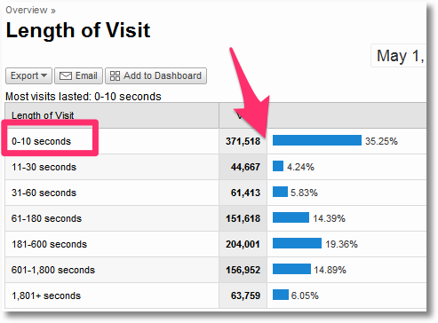
Why is this happening?
It’s kind of like unrequited love.
You love them, but they just aren’t buying what you’re selling.
They make their way through one or two pages, but they are not engaging in a meaningful way.
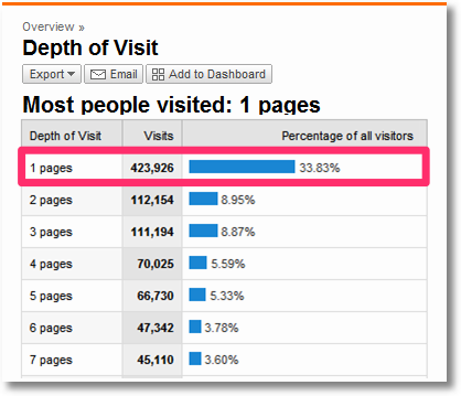
So why aren’t people interacting with your site the way you want them to? To get to the bottom of this, it’s important to take a step back and evaluate objectively.
Yes, you’ve put in a lot of hours. And, no, the fixes aren’t always easy.
But it’s necessary to make adjustments if you really want to see results.
Here are five of the biggest issues I see with sites that lose engagement quickly (and how to fix them).
1. Your content isn’t relevant to searchers
Much of the content on your site probably revolves around certain keywords.
That’s not a bad thing. In fact, it can help you bring in a lot of organic traffic.
The problem is that sites looking to rank for certain keywords often include them without having the content to back it up.
For example, if I search for the phrase “website optimization” I get these results:
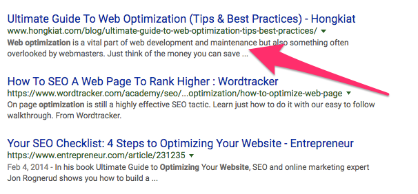
The Ultimate Guide to Web Optimization, you say? Let’s take a peek:
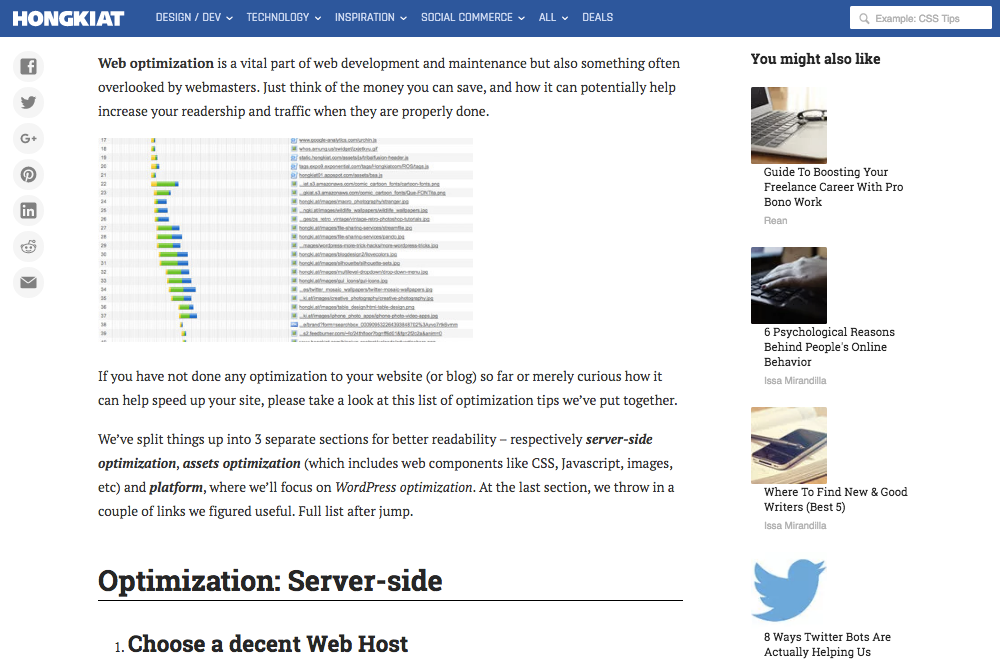
This is content I can use immediately.
Or, I can at least quickly scan through it to determine whether or not it solves my problem.
The target keywords are relevant to me, and the content on the web page is equally relevant.
I know what I’m going to get before I get there.
Your content should always be relevant to your keywords.
Let’s take a look at another example. If I type in “Nike shoes” the first results I see look like this:
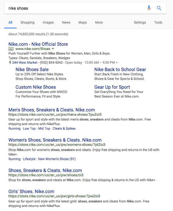
The keyword is in all of the headlines. It’s in the ad at the top.
If I keep scrolling down the page I see results from other retailers with my keywords:
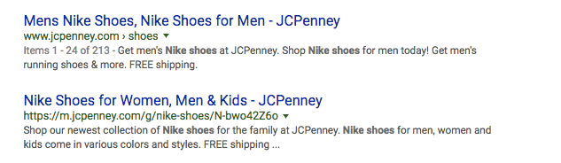
Clicking on any one of those links will lead me somewhere I can buy Nike shoes.
Everything is relevant.
If I clicked one of those links but it brought me to an Adidas site, for example, I might start to worry.
If you’re going to target certain keywords or audiences, you have to optimize your content for those keywords.
This means you have to understand user intent and why they are coming to your site in the first place.
You don’t just want to send people to your homepage and expect them to figure out the rest.
One study by Bazaarvoice found that 84 percent of searchers would rather land on a blog post or landing page than a homepage.

Directing traffic to your landing pages – with relevant content – instead of to your homepage can increase conversions.
So don’t just focus on getting people to your site.
Get them there with intent. And then be ready with high-quality information when they arrive.
2. Your site is hard to read on mobile
Mobile website views surpassed desktop site views last year for the first time ever.
And Google basically thrives on mobile responsiveness.
Not to mention the fact that mobile traffic accounts for over half of all website traffic globally.
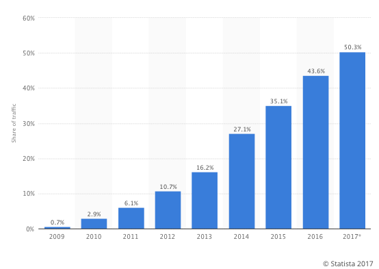
Google loves mobile. Your site visitors love mobile. Everyone loves mobile.
This probably isn’t news to you.
Mobile design isn’t always the easiest thing to pull off.
You could have a stunning website but a lackluster mobile experience and it won’t do you any favors.
This is one of those areas where you really want to learn from the pros.
Take a look at a site like Typeform:

It’s a good site. Really clean and well designed on a desktop.
Let’s see how it looks on a small phone screen:
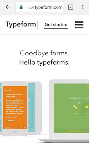
Looks great! All the content fits and looks like it was made just for the device’s size.
This is what I want to see.
And if I scroll down further, I get a more mobile-optimized menu, perfect for clicking:
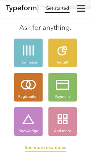
The layout and design are virtually the same as the desktop version, but not just because it is smaller.
Everything is rearranged so that I can scroll through it without any interruptions. My fingers can click and swipe as needed.
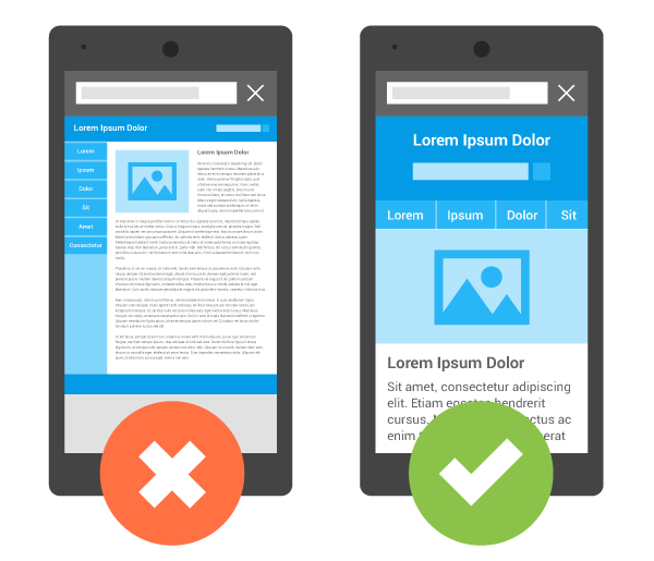
A mobile-optimized site will have the following characteristics:
- Responsive design (i.e., site design that changes depending on the size of the screen it’s being viewed on)
- Ease of use on a mobile device (I should be able to use fingers/thumbs like I would a mouse)
- Good site speed (just as fast as the desktop site, if not faster)
- Good interstitials
Here’s another example of a mobile website from Shutterfly done well:

Here’s what it looks like when I scroll down through the actual products:

Here’s an example of the desktop site:
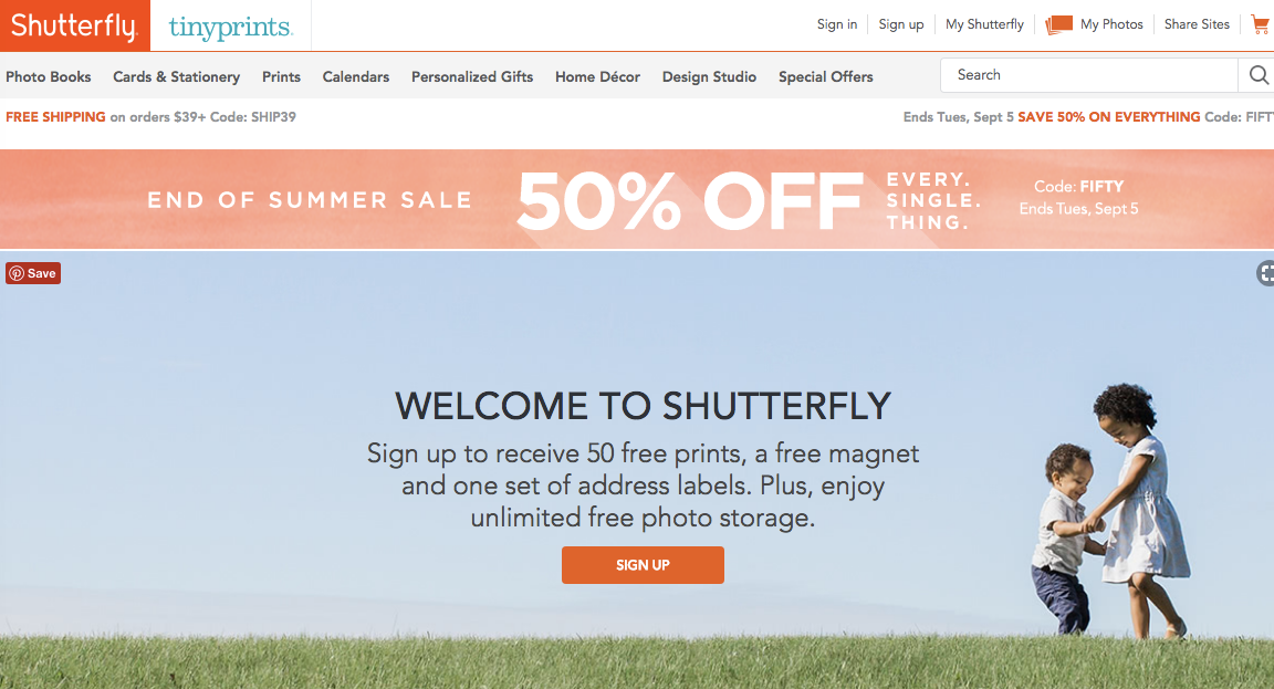
You can see that Shutterfly does a great job of rearranging content for their mobile site.
Things are stacked and easily scrollable but the design and feel are the same.
They even offer another mobile experience through their app.
Even if you don’t have the ability to offer an app, you can still provide this level of mobile-friendly design.
If your site doesn’t currently have these features, you need to make an update ASAP.
Google also recently conducted a study to find out what was most important for mobile users.
They found that mobile users are goal-oriented.
If they are coming to your site on mobile, they aren’t messing around.
They don’t want to have to zoom in and out a lot, and they don’t want the design or navigation to be too scrunched, making it difficult to click or select a feature.
If you want to check how your site stacks up, use Google’s Mobile-Friendly Test.
Type your site’s URL into the box and select “run test.”
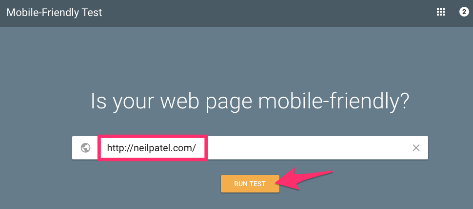
The results page will give you a preview of your mobile site and let you know where you stand.
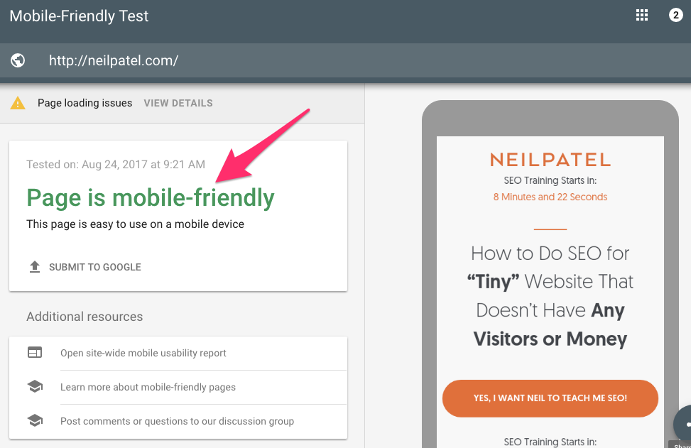
If it’s not mobile-friendly, the test will let you know.
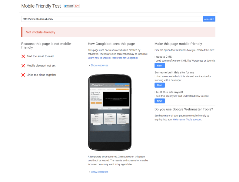
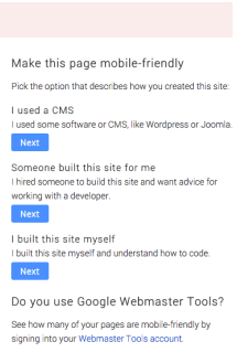
It will also give you the reasons why it’s not mobile-friendly and will walk you through how to optimize the page.
Don’t assume just because your website looks good that it looks good everywhere.
Mobile optimization should not be overlooked.
According to Google, 61% of users will not return to a mobile site if it’s poorly designed.
Even worse? 40% of them will head to a competitor’s site. A mobile optimized competitor’s site.
3. There’s no obvious conversion point
Gravity Forms is one of my favorite WordPress plugins of all time. Here’s what their site looks like:
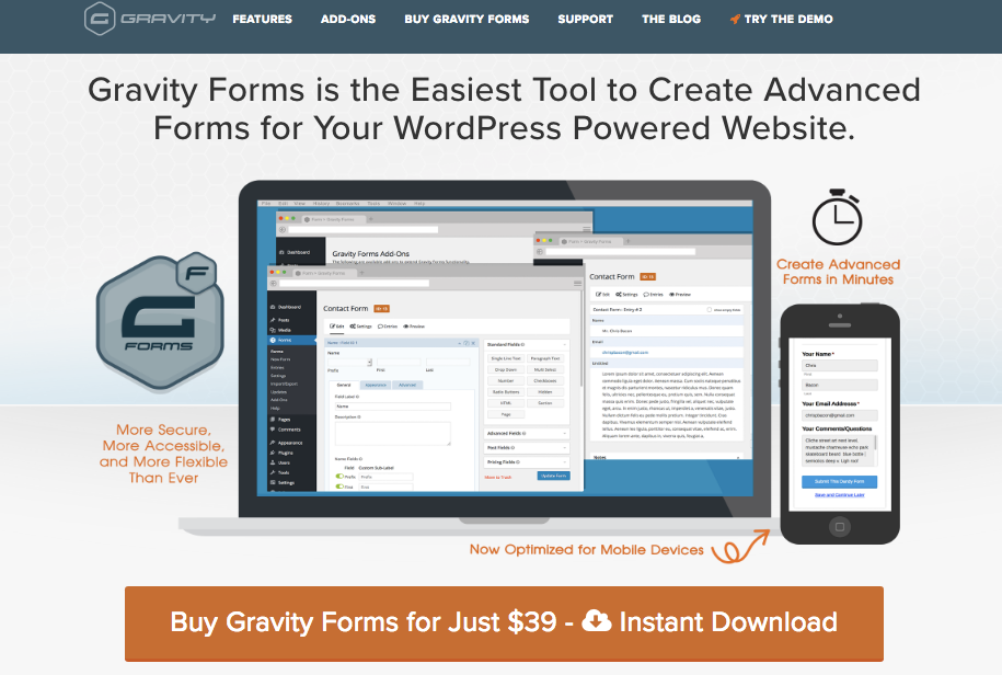
I can already tell a few things by just looking at this for the first time.
I can see that Gravity Forms offers a lot of features. They talk about offering secure and advanced forms that are quick to create and mobile-optimized.
But the biggest thing that jumps out is how to get started. There’s a big orange CTA button on the screen.

If I wanted to convert, I know exactly how to do it.
I don’t have to look through the site beyond this point unless I want to.
This should be the goal of your site.
You want your users to take immediate action (or as close to it as possible) whenever they come to your site.
Here’s an example from the homepage of another similar form-service, FormKeep:
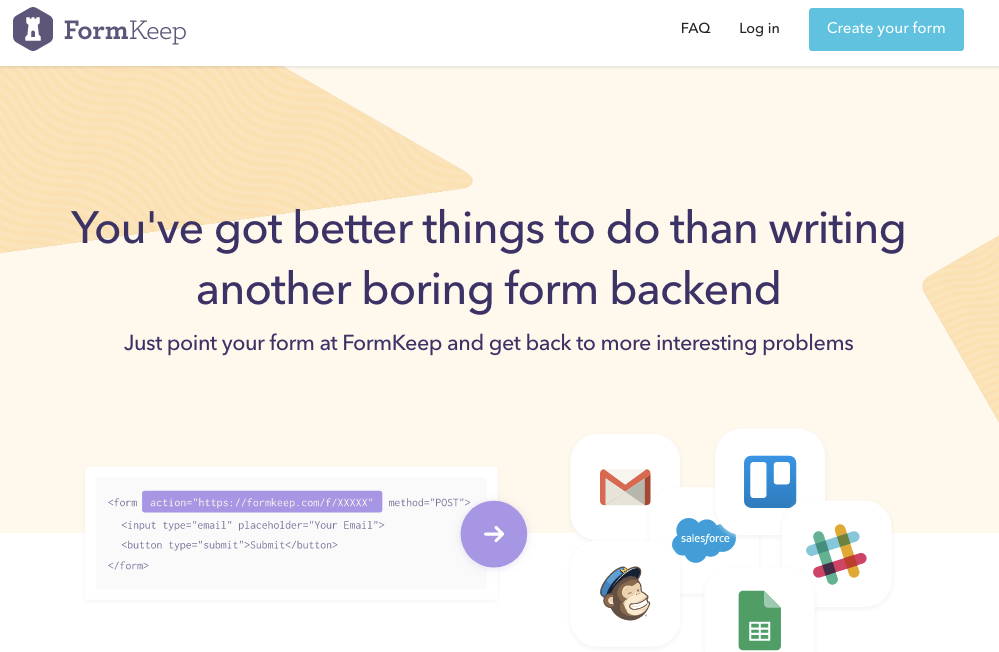
It doesn’t have the big, bold CTA the way Gravity Forms does, but it still does a couple of things well:
- It highlights the benefits of the service (not having to write complicated forms on the backend of your site).
- It has a CTA button that tells me exactly how to get started.
Yes, the CTA is in the upper right-hand corner. But it has a very direct message: “Create your form.”
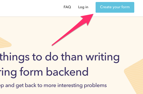
There’s no guesswork there.
I already know the whole point of the site is ease of use, so I can assume that it will be just as easy to build my form.
And with that, they’ve got me and their conversion.
Here’s another example from MailChimp that has a really simple but effective conversion point:
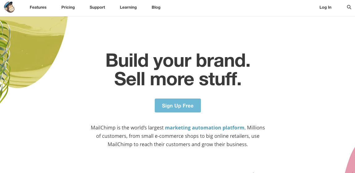
The value proposition is the first thing that you see: “Build your brand. Sell more stuff.”
I want to do both of those things. OK. Sold.
How do I do it? Easy, I click the “Sign Up” button right underneath it. The button tells me it’s free.
But what will I be getting if I sign up, exactly? The text underneath the button tells me.
I’m getting the world’s largest marketing automation platform.
Other people use it. Other people love it. I probably will too.
Boom. Sold.
The point is, if you’re going to have a CTA, make it big, bold, and easy to understand.
4. Your design is too simplistic (or too complicated)
I know that designers get a lot of criticism for making sites overly-complicated.
And it’s true that cluttered, busy sites tend to turn people away.
“A website that’s cluttered makes your customers feel anxious,” said Joe Ardeeser of Jordan Crown Design.
“They have a goal to achieve, but you’re making it harder for them to trust you. If your website is a mess, will working with you be the same?”
The obvious solution is to create something nice and minimalistic.
A good example of this is this site design from XWP:
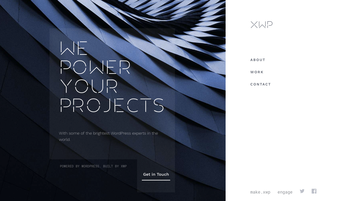
It’s clean. There’s a strong value proposition. The navigation is equally minimal.
So you know exactly what you get right away and where you need to go to find the information.
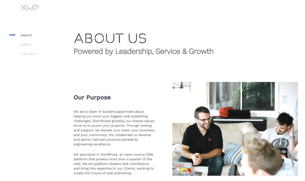
If I click on the “About” page I’m greeted with another minimalist but informative design:
If I want to know more about their work I’m greeted with simple case studies like this:
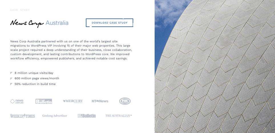
Even though there aren’t a lot of pages on the site, I’m given everything I need to know.
They’ve removed all the unnecessary information that might prevent me from making a decision.
Yet they’ve retained all the good stuff. The case studies. The value propositions.
All the essentials are there. It’s minimalism done right.
Look, I love minimalism.
There’s a reason my site looks like this when you first arrive:
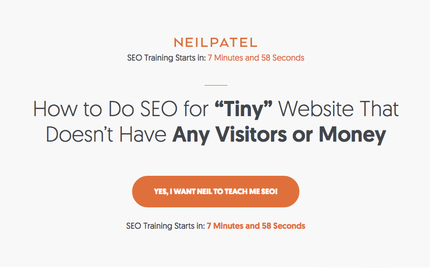
Minimalism is much better for conversions in general.
Too much information can be overwhelming.
But on the opposite side of the coin, there is a case to be made for being too minimal.
If you go too far into “nothingness,” you risk confusing your audience in the opposite way.
What I’m really looking for is a nice balance between “cluttered” and “nothing.”
For example, Nua Bikes is on the border of over-simplistic, but it still works because they really only sell one thing… bikes.
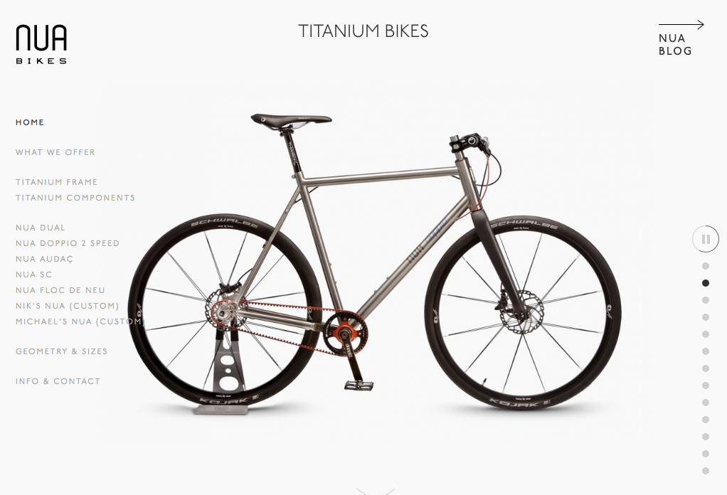
Their navigation is easy to understand. I can click through all their different bikes, and click on “Info & Contact” if I want to know more.
The whole site is basically images of various bikes in different colors and designs.
There’s information about each bike, its specs, and how to buy. But that’s about it.
I’m not wasting time on the fluff that a lot of other sites have. I’m here to buy a bike. And I will buy a bike I like.
Apple is another example of a relatively minimalistic site that works well:
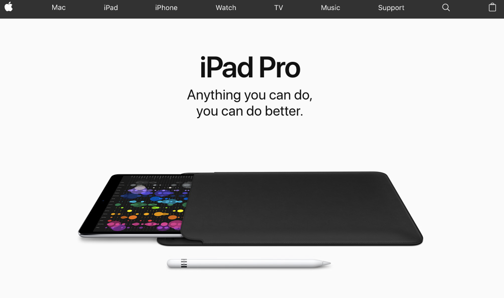
It’s not so simple that you don’t know what you’re looking for. Benefits are still listed. You know where to go.
They’ve also used the white space design feature, which helps viewers easily process the site’s information.
In other words, the important stuff is obvious. And the less important stuff fades into the background.
They strike a nice balance to avoid having too many competing decisions for the visitor.
It’s streamlined and clean. It’s the good kind of minimalism.
For your site, go with something in the middle: give your audience the information they need without bombarding them with too much.
Explain the benefits, give people what they want, and show them how to take action.
5. Your Site is Too Slow
I know what you’re thinking. “Neil, I hear this all the time!”
It’s a pretty common topic of discussion when it comes to why people aren’t converting on your site.
But hear me out here for a second.
I included this one last because even though it’s important, it’s not the main reason people are leaving your site.
The fact is that if you have content that’s engaging, a site design that’s intriguing, and you have a decent mobile site, page speed isn’t going to make or break conversions by that much.
Take a look at a test I ran on my own site using Google’s PageSpeed Insights:
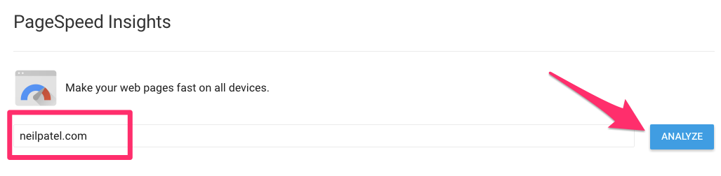
Here are my results:
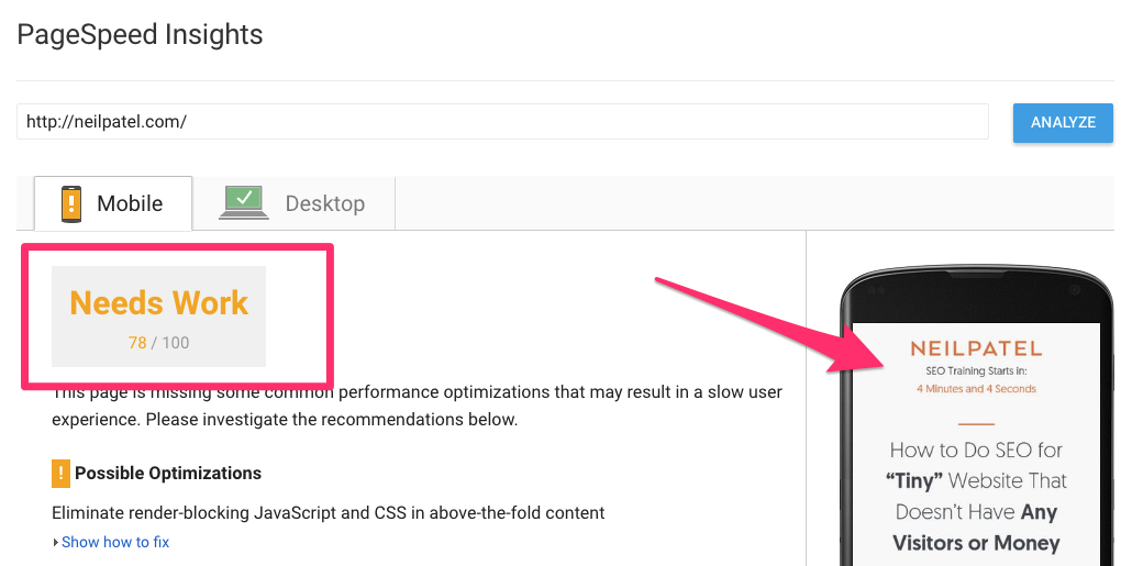
It looks like my page speed could use some work.
My mobile site is optimized, though (and looks pretty darn good!).
So why are things running slower than they should?
There could be a lot of things wrong here, and PageSpeed Insights will offer a few recommendations.
But the fact of the matter is that overall, the site typically converts just fine.
So ultimately, page speed won’t turn away visitors unless other things are a problem, too (see reasons 1-4).
But don’t go around telling everyone that Neil Patel said loading times don’t really matter.
In many cases, loading times do still matter.
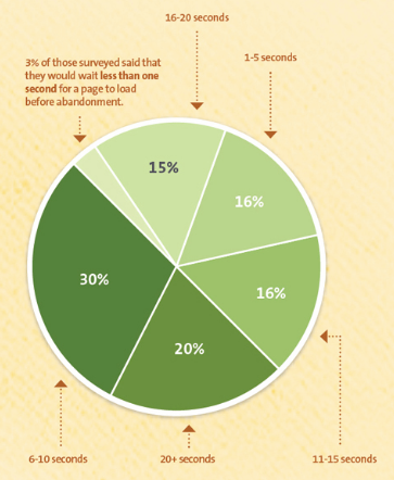
There are a couple of key factors that contribute to whether or not speed will affect your conversions.
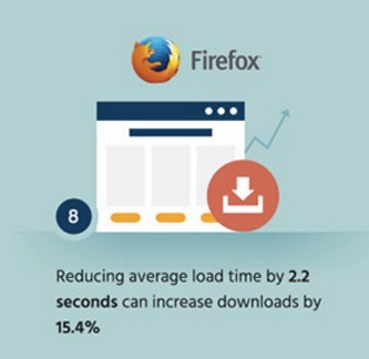
For instance, if you offer downloads, site speed matters.
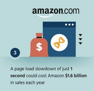
If you sell a lot of products online, site speed matters.
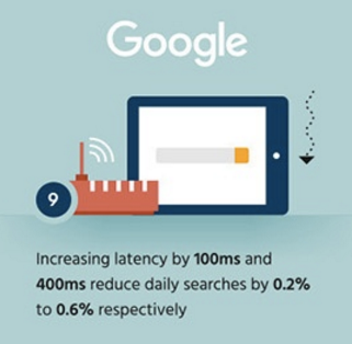
If people can’t search your site quickly when they need to, site speed matters.
Overall, site speed matters most when it affects the user experience.
Depending on the situation, it can be a factor in why someone would leave your site without converting.
So it is something you want to track on a regular basis.
But unless your site is painfully slow, you don’t have to freak out about it.
Optimize as best you can, and move on.
Conclusion
The reality is that people are going to leave your site for any number of reasons.
If you’re noticing a big drop-off between site traffic and conversions, or time spent on your pages, then it might be time to take a closer look.
First, check out your site’s value first. Make sure it offers content that’s compelling, combined with clear navigation.
Then, optimize your site for mobile. I can’t stress this enough.
After that, focus on the smaller bits and pieces, like site design and loading speed.
Bottom line? Make it functional, make it pretty, and (try to) make it fast.
What are your best tips for keeping people on your site longer and coming back for more?