


Key Takeaways
- An infographic visually presents data and information in a structured and engaging way.
- Think about your target audience and what you want to achieve from your infographic–this will help you find a good infographic idea.
- Once you’ve done this, you need to collate your data, double-check your sources, plan how your infographic will look, design your layout, and ask for feedback.
- Simplicity is key–your infographic should have a clear headline, a focused data set, and a straightforward design.
- Accuracy is essential–double-check your data (especially if you use AI) and cite your sources.
- There are lots of tools you can use to create your infographics including Canva, Adobe Illustrator, Piktochart, and Venngage.
Looking to showcase your expertise, captivate your audience, and generate valuable backlinks for your website? Infographics are the perfect tool to achieve all that and more.
With countless businesses leveraging infographics, standing out requires creativity and strategy.
I’ve been creating infographics for a long time. As a result, I know how to make a good infographic that gets people’s attention.
Join me as I show you how to plan and design the perfect infographic, as well as some strong examples to inspire you.
What is An Infographic?
An infographic is a visual representation of data, information, and statistics.
Take the example below, which lists the most popular guilty pleasure show in each U.S. state. If this information was in a spreadsheet or a block of text on a website, it would be hard to read.
However, as an infographic, it’s easy to understand and share with other people.

An infographic may be accompanied by additional information on a page, like a more detailed breakdown of data, additional sources, or a call-to-action encouraging readers to convert.
Benefits of Infographics
Infographics are big business – the infographic creation market is currently worth $1.2 billion and is set to grow 15 percent in the next five years!
But why do organizations like infographics so much?
- They’re easy to understand. 65 percent of people are visual learners, meaning infographics are a great way to get readers to recall key information.
- They encourage brand awareness. By using your logo, brand colors, and typography, you can get people to remember your brand.
- They enhance existing content. An infographic can make a blog post, service page, or landing page more memorable.
- They establish trust in your business. Credible, accurate, and reliable infographics help make you a voice of authority in your industry.
- They attract backlinks. Good infographics are highly sharable, leading to backlinks and a significant SEO boost.
How To Create An Infographic: Step By Step
Creating an infographic doesn’t have to be hard. All you need is a good idea, a computer for research, and a reliable graphic design tool!
Here’s how to make a good infographic in eight simple steps.
- Define your target audience and what you want your infographic to achieve. Setting a SMART goal can help here.
- Gather the data you want to use for your infographic. This can be primary data (data you’ve collected through studies and surveys) or secondary data (data provided by a third-party source).
- Plan your infographic layout. I find sketching it out using pen and paper is the best approach.
- Write your copy. You need a catchy headline and clear, concise wording to accompany your infographic and provide additional information.
- Design your layout. There are lots of graphic design tools you can use for this, with free templates you can customize. Alternatively, you can outsource to a graphic design agency.
- Choose your visuals. Add imagery that aligns with your branding and helps get your point across.
- Proof and revise. Check that your infographic looks good on a wide range of devices, check your spelling and grammar, and ask customers for feedback.
- Check and cite your sources. Make sure your data is accurate and include links to any third-party sources you’ve used.
Keep reading for some helpful infographic tips to help you make the most of your content.
Good Infographic Examples
What makes for a good infographic?
I asked Dominic Bromley, Senior Graphic Designer at NP Digital, to share his thoughts.
“An effective infographic is a harmonious blend of clarity and depth, transforming complex data into an accessible visual narrative. The true art lies in balancing simplicity and detail, ensuring every element works together to tell a cohesive story that engages, informs, and resonates with the audience.”
Here are some good infographic examples that balance the need for storytelling and clarity.
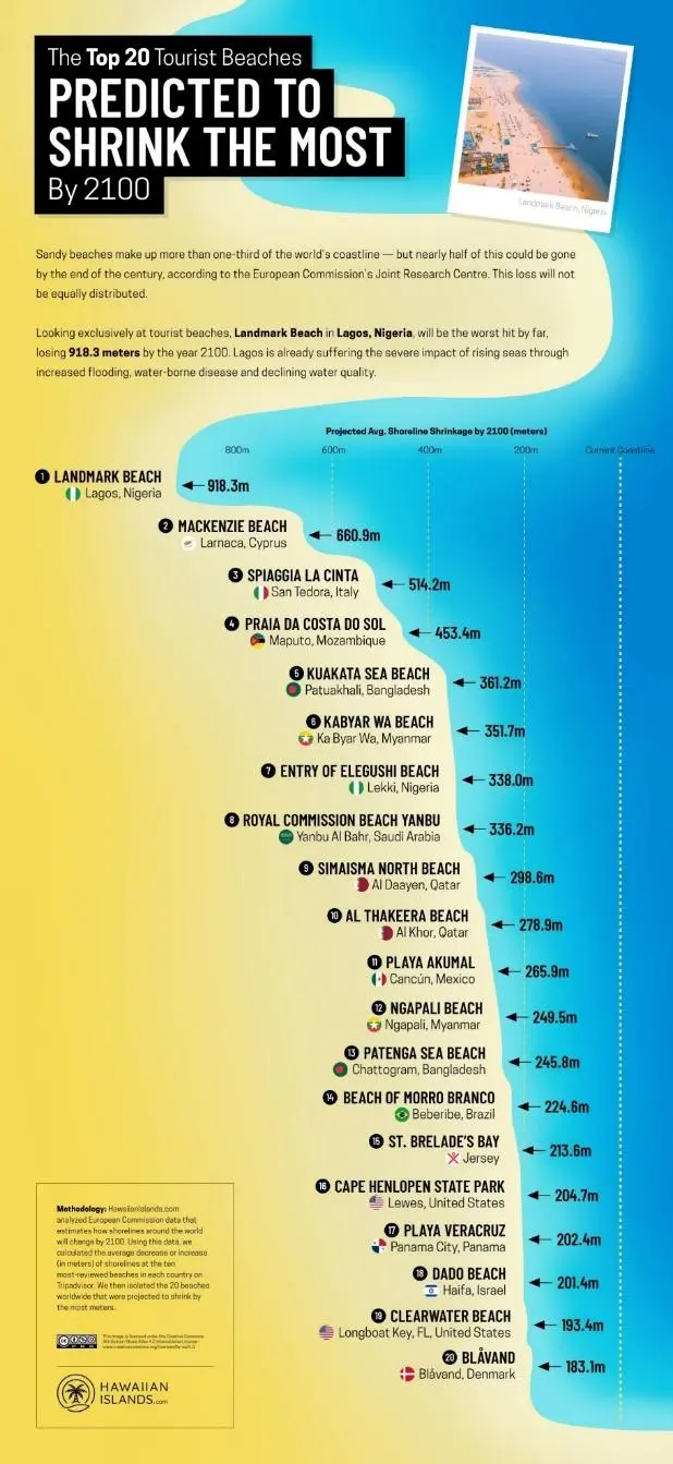
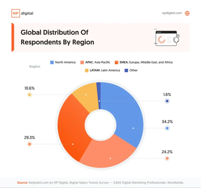
Climate change and the state of the planet are hot topics in search engines like Google right now, so this infographic about shrinking beaches is a smart and topical creation.
The infographic is bright, well-ordered, and easy to understand. It also explains the methodology behind the data, adding an extra layer of credibility.
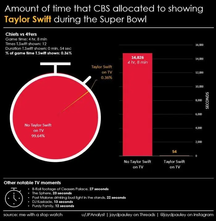
Infographics don’t have to be big, expensive, or complex.
This infographic was put together after Super Bowl LVIII and measured how much time Taylor Swift was on screen. Many people would be Googling this, meaning a lot of traffic and attention to this highly reactive infographic.
The “source: me with a stopwatch” made me smile too. There’s definitely a place for humor in infographics!
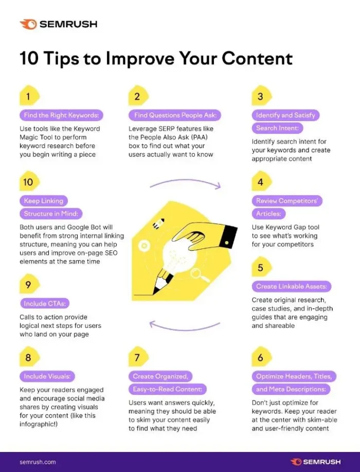
This infographic from Semrush isn’t heavy on the visuals, but it’s still easy to read and digest. The wording is clear, and the purple headings draw the eye.
I also like how there’s a clear link to Semrush’s website at the bottom of the infographic. That way, if other websites use the infographic, readers know where to go if they want to learn more.
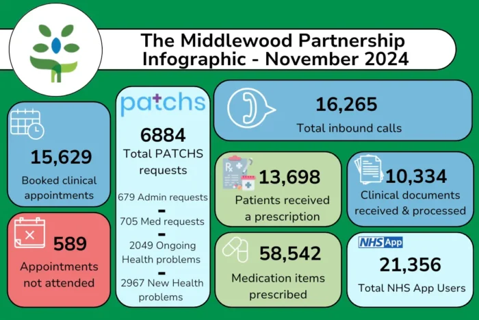
Businesses across all industries can use infographics to make their data more appealing. Traditionally a doctor’s office is not an exciting source of information, but this infographic breaks down the data in a clear and engaging way.
I also like how the date is mentioned at the top of this infographic so readers can see how up-to-date and accurate the information is.
Tips To Improve Your Infographics
A good infographic is well-researched, innovative, and easy to understand.
Let me share some of my infographic tips to help you create infographics your audience will love.
Make Sure Your Infographic Fits Your Target Audience
Coming up with an infographic idea is half the battle. The key is identifying a topic your target audience will be interested in.
One mistake I’ve seen people make when creating an infographic is choosing something too generic. This leads to a confusing, bland infographic that appeals to no one.
It’s better to focus on something more niche.
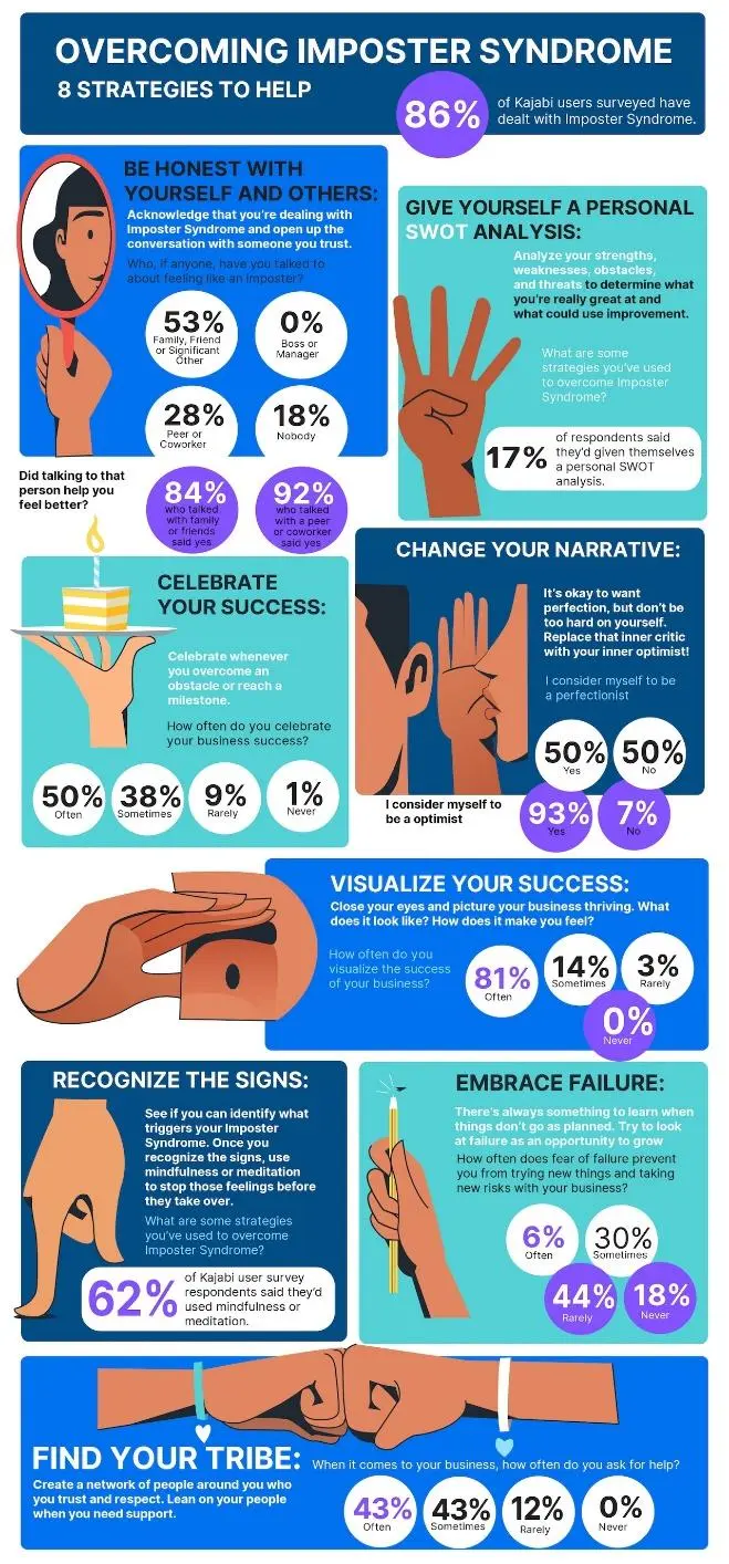
Take this infographic about imposter syndrome from Kajabi. It’s highly targeted, provides specific value, and gives readers actionable advice.
Here’s what to consider when coming up with infographic ideas:
- Understand your target audience – what problems do they have, and how can you help solve these pain points?
- Think about your goals – do you want your infographic to boost brand awareness, increase sales, or help establish your brand as a thought leader?
- Look at the most popular content on your website (as well as on your competitors’ websites) for inspiration.
- Consider an evergreen topic – one that people will be interested in for years to come. This will ensure your infographic stays relevant and continues to drive organic traffic and engagement.
Keep It Simple and Focused
“A good infographic distills information into clear, focused messages,” says Bromley. “It guides the audience through a well-structured flow that emphasizes key points without overwhelming them.”
While you might be tempted to load your infographic with information to provide value, you don’t want to confuse or frustrate your readers.
For example, this infographic would work better and be easier to read as four separate infographics.

In my experience, simplicity and focus are imperative. For example, this infographic from Hickory Farms looks at the best wines for each season.
One clear and specific idea, one infographic.

Pick the Right Colors and Typography
“When creating an infographic, it’s important to think about how your design choices enhance its readability,” says Bromley. “Consider limited color palettes, concise text, and a thoughtful use of imagery.”
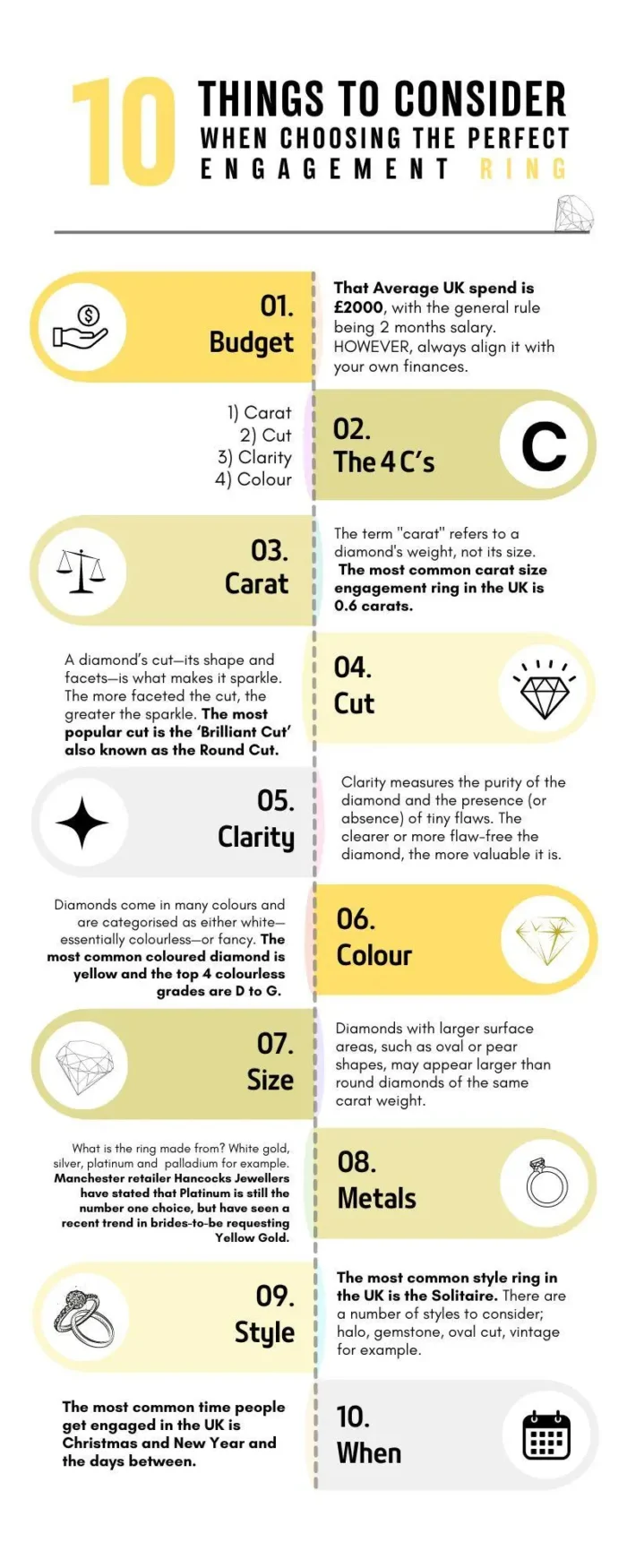
Take this example from Hancocks. The white background, black text, simple iconography, and yellow color scheme make this infographic easy to scan, read, and understand.
Choosing the right colors and typography can also help with accessibility. Legible fonts and color schemes with high levels of contrast mean more people can view your infographics.
Consistency is important too–you want your infographic to align with your existing brand identity, using the same color scheme, fonts, and imagery.
This makes your infographics easier to recognize, even on someone else’s website, and boosts trust in your business.
Make It Easy To View
The size of your infographic and the elements contained within it can affect how many people view it.
Make it too small, and people can struggle to understand it. Make it too large, and it may be too hard to download and view, especially on a mobile device.
What size should an infographic be? In my experience, 600 pixels wide by 1,200 pixels long is the sweet spot.
If you have a lot of content, you can stretch to 8,000 pixels long at a push, but any more than that, and you could run into usability issues. A good alternative in this situation is to split your infographic into multiple assets.
Image optimization is vital–choose the right image file type and compress your infographic so it loads faster. I recommend WebP as it loads quickly without compromising image quality.
Many infographics use a variety of font sizes. Make sure that the smallest font on your infographic can be seen without too much difficulty, especially if you resize it.
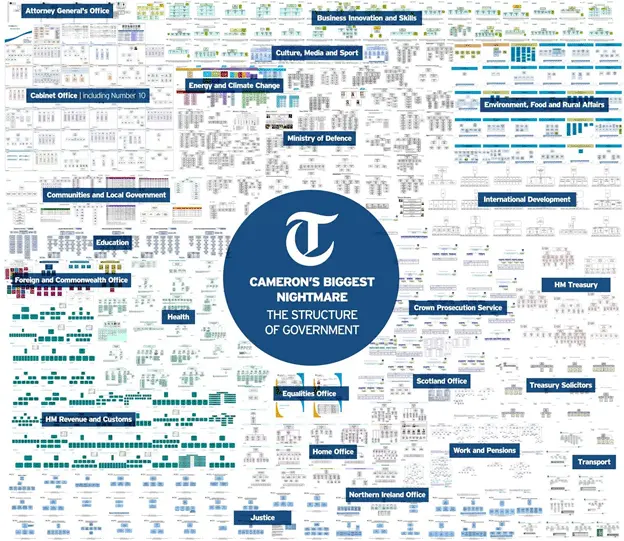
For example, the words in the infographic below are too small to read easily.
Finally, think about your use of white space. White space improves readability and stops your infographic from looking messy.
There’s not enough white space in this infographic, which makes it harder to comprehend.
Create A Killer Headline
When writing a blog or a piece of content, you want to create a headline that’s descriptive, attention-grabbing, and short enough to understand at a glance. The same logic applies to an infographic headline.
You want your headline to encourage people to read on and share your infographic with others.
Take the following infographic headline as an example. It’s far too wordy and complicated, which can deter people from looking at your infographic.

Here are some tips for creating a good infographic headline that compels people to check out your content:
- Prove your value – what can readers expect to learn by checking out your infographic?
- Use numbers to make your title more engaging.
- Ensure your title is under 70 characters. Keeping it low also ensures your title doesn’t get cut off in the search engine results.
- Test multiple headlines and see which ones your readers respond best to.
Define Your Visual Hierarchy
An infographic should be like a good story, seamlessly taking you from one point to another.
However, some businesses throw a bunch of vaguely related information together, meaning no flow and no reason to keep reading.
Treat your infographic like you would any piece of content. Implement a logical order and eliminate any elements that may distract readers from getting to the end.
Here’s a great example of an infographic with a precise beginning, middle, and end. This infographic from Unbound Solar starts by answering frequently asked questions, segues onto how solar power works, and finishes with a clear and definitive call-to-action.
Each section is well-defined, with clear headings and imagery, making it easy for readers to move through it.

Check Your Facts and Figures
It’s vital to make sure the data you use and present in your infographics is accurate. Otherwise, you run the risk of annoying readers and losing their trust.
This is especially relevant if you use artificial intelligence (AI) to gather or analyze data for infographics. While AI is becoming more accurate, it’s not always 100 percent right.
If your infographic relies heavily on numbers and data, double-check your data using multiple sources.
Also, make sure you use sources that are as up-to-date as possible. Using old stats, especially in an industry where information is constantly changing, makes you seem out of touch.
Citing your sources reassures readers that you’ve done your research and signposts them towards additional information if they want to know more.
I usually cite the source of my infographic data at the very end of the infographic. You can also cite sources within the body of the infographic, as long as it doesn’t distract from the flow.
Have A Testing And Refinement Process
It’s important to review and refine your infographic before you start publicizing it.
Have your internal team think about how your customer base would react to your infographic. Would they share it with others or promote it on their social media feeds?
This helps ensure your infographic is optimized for maximum engagement.
A/B testing is a fantastic way to see what elements of your infographic your target audience likes the most.
Create two virtually identical infographics with one key difference, for example, a different headline or background color. Send half of your customers to one infographic and the rest to the other.
You can then see which infographic leads to the most conversions, shares, and engagement.
Promote Your Infographics
Infographics don’t automatically go viral. Sadly there are a lot of good infographics out there that are languishing in obscurity because the creators never took the time to promote them.
You can promote your new infographic by:
- Sharing it across your social media platforms.
- Asking relevant influencers, content creators, and bloggers to share it.
- Optimizing it for SEO so it ranks well in the search engines.
- Featuring it in your email newsletter.
- Submitting it to infographic directories like Infographic Bee, Cool Infographics, and Infographic Journal.
Don’t forget to include share buttons on any pages where your infographics appear. This encourages visitors to share them with a single click.

Tools To Help With Your Infographics
You can create a good infographic even if you don’t have design skills or a massive marketing budget. There are a wide range of tools out there to help you get started.
Here are some of my favorites:
- Canva. Easy to use, you can choose from an extensive collection of infographic templates that you can edit to suit your requirements.
- Adobe Illustrator. One of the things I love most about this platform is that you can create eye-catching charts to present your data. A great investment if you’re serious about infographics.
- Visme. This platform uses AI to help you design infographics, meaning you can create consistent, high-quality content even if you’re not a designer.
- Piktochart. Designed especially for infographics, you can upload your documents and Piktochart will automatically turn them into amazing infographics full of data.
- Easel.ly. This platform lets you create infographics and other visuals using drag-and-drop technology, or alternatively, you can call on Easel.ly’s team of designers to help.
- Venngage. This platform has over 10,000 templates and over 40,000 illustrations to customize your infographic. With plans starting from $10 a month and a limited free version, it’s also highly affordable.
- Infogram. Interactive infographics are highly engaging and stand out from static images. Infogram makes it easy to animate your infographics and add clickable elements.
- ChartBlocks. With ChartBlocks you can upload spreadsheets and databases and transform them into clean, easy-to-understand infographics.
- Snappa. Offering a range of pre-made infographic templates and royalty-free images, Snappa enables you to create a high-quality infographic in minutes.
FAQs
What Makes a Good Infographic?
A good infographic is:
Well-promoted.
Relevant to your target audience.
Simple and focused.
Well-designed, flows seamlessly, and is aligned with your brand identity.
Accurate, up-to-date, and cites its sources.
How Do I Create an Infographic?
You can create a good infographic in eight easy steps:
Cite your sources.
Define your audience and the goals you want to achieve.
Gather the data you want to use.
Plan your layout and design style.
Write your infographic copy.
Design the infographic.
Choose your visuals.
Proofread and revise for optimal reach.
What is the Best Tool to Create an Infographic?
There are a range of infographic tools for all skill levels and budgets.
Canva is great for beginners as it’s free and has hundreds of pre-made infographic templates and customization options.
If you have graphic design experience and want more control over your designs, I recommend Adobe Illustrator is a great option.
Conclusion
Anyone can create a good infographic. It’s a case of choosing the right subject matter and presenting the information in a way that engages with your target audience.
Let me leave you with one final infographic tip.
Check your metrics to see which infographics people engage with the most. Social media shares, number of backlinks, and time spent on page can help you identify which infographics people are most keen on.
Keep this guidance in mind and you’ll be well on the way to creating infographics that prospective customers love!
Are You Using Google Ads? Try Our FREE Ads Grader!
Stop wasting money and unlock the hidden potential of your advertising.
- Discover the power of intentional advertising.
- Reach your ideal target audience.
- Maximize ad spend efficiency.