 Sign In


 Ubersuggest
  AnswerThePublic

Mobile internet traffic is nearly double that of desktop.
That means it’s highly likely the majority of your site visitors are using a mobile device.
If you want to improve user experience, rankings, and those all-important conversions, mobile site speed optimization is non-negotiable.
Key Takeaways
- Start with an audit on PageSpeed Insights and implement mobile diagnostics.
- Build a fully responsive mobile design and test it across different devices.
- Opt for VPS or cloud hosting with a fast provider.
- Streamline the optimization process with plug-and-play plugins where possible.
What Is Mobile Site Speed?
Mobile site speed measures how quickly users can load and interact with your website when using a mobile device.
It’s closely related to mobile page speed, which measures the speed of individual pages. Site speed is an overall measure, typically drawn from a sample of pages.
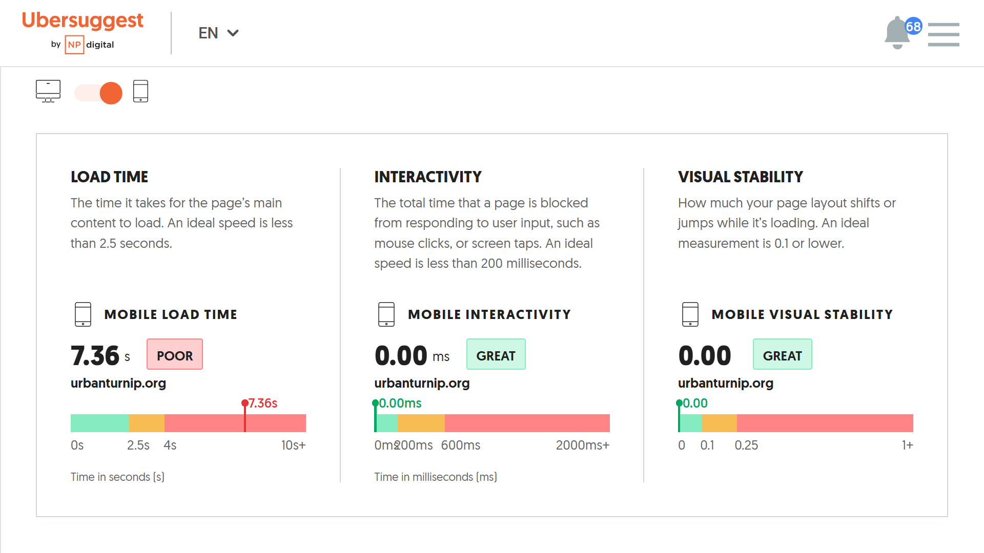
You can see your mobile site speed in Ubersuggest by going to Site Audit, scrolling down to the SITE SPEED section, and toggling to the mobile option.
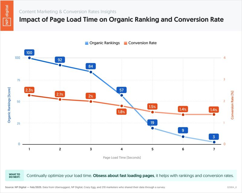
So why does site speed matter?
In a nutshell, because it affects conversions and search rankings. My team found a direct correlation between site speed (on mobile and desktop) and both organic rankings and conversion rates.
Mobile accounts for 62.22% of global internet traffic, compared to only 36.06% for desktop. In addition, 75% of ecommerce traffic is via mobile, which has significant implications for revenue.
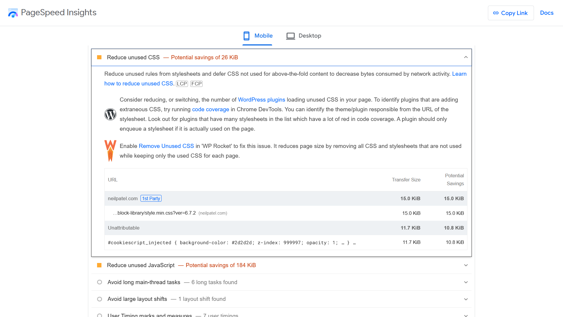
1. Implement Mobile Suggestions From PageSpeed Insights
PageSpeed Insights is a powerful Google tool. It measures mobile page performance across three core metrics—called Core Web Vitals—and provides tailored optimizations based on the results.
Here’s a quick overview of Core Web Vitals:
- Largest Contentful Paint (LCP): How long it takes for a page to load completely.
- Interaction to Next Paint (INP): Response time of on-page elements like collapsible sections on mobile.
- Cumulative Layout Shift (CLS): How stable a page is once loaded, meaning elements don’t “jump about.”
Together, these three metrics paint a comprehensive picture of a mobile page’s speed over its whole user “lifecycle.”
To get started, type your site URL into PageSpeed Insights and hit Analyze. Make sure you select Mobile once you receive the results.
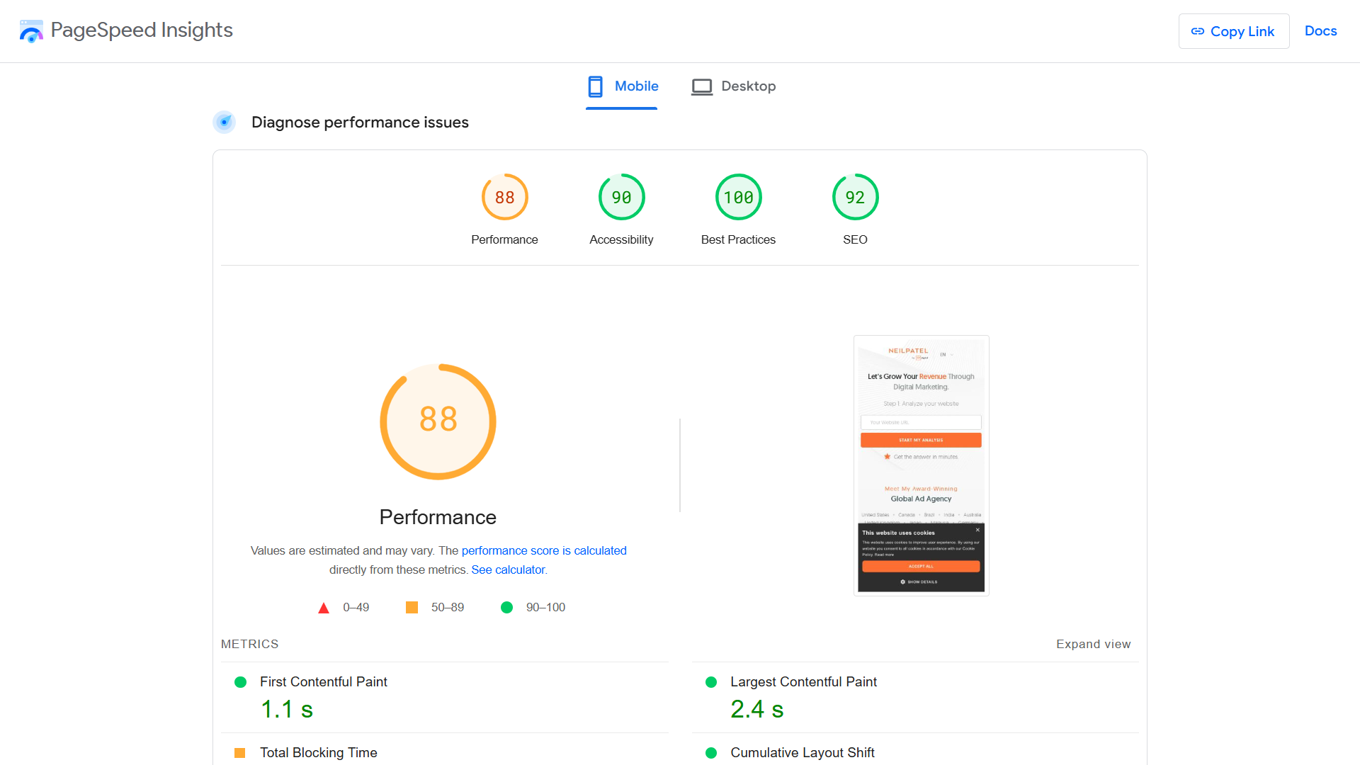
Scroll down to the Diagnostics section for a comprehensive set of optimizations. Prioritize the suggestions with red triangles, which indicate the opportunities for the biggest speed improvements.
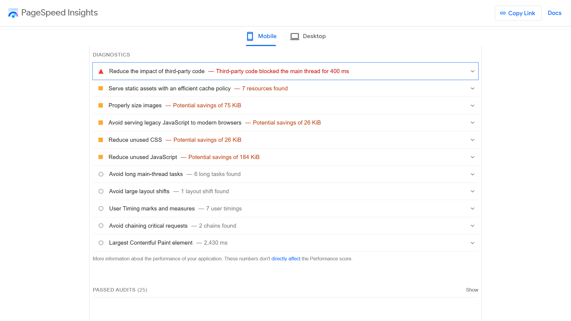
Google also provides specific instructions for correcting page speed issues, often with plug-and-play WordPress suggestions, so make full use of these.
2. Ensure Your Site Design is Fully Responsive
A responsive site is one that adapts to mobile browsing. The layout and content (fonts, text, images, etc.) of a mobile-friendly site adjust to fit the screen of the device on which it’s rendered.
Here are the main elements of responsive site design:
- Correctly configured viewport meta tag that enables scaling
- Flexible grid layout with percentage, em, and rem measurements
- CSS media queries that stipulate design rules for different screen sizes
- Auto-adjusting images with relative width values, such as 100% and auto
- Simple navigation with a three-line “hamburger” icon or similar
- Large screen-width buttons (especially CTAs) that can be tapped with either thumb
- Font sizes optimized for mobile reading (usually between 12 and 16 pt)
ASOS is an excellent example of a responsive site. The desktop category pages are fairly complex. Among other elements, they have a large navigation header, search bar, promotional banner, images above the fold, category options, and filters.
Here’s the women’s “New In” category page:

The mobile version of the website, however, simplifies the page significantly:

Responsive sites are by far the most common form of mobile-optimized websites. If you’ve used a popular site builder or content management system (CMS), such as WordPress, Wix, or Webflow, your site is likely already taken care of. But it’s still important to check.
3. Compress and Lazy-Load Images
Large image files are one of the biggest speed killers. This is especially the case on mobile, where users often rely on 5G cellular connections with limited bandwidth.
Compressing images and using next-gen file formats is one half of the battle when optimizing images. Lazy loading, which only renders images on the visible part of a page, is the other.
Follow these steps to optimize images on your mobile site:
- Compress images with a tool like Tinify before uploading.
- Alternatively, install a plugin like Imagify that compresses images as you upload them.

- Use space-saving image formats, such as WebP for photographs and SVG for graphs and diagrams.
- Set image sizes to auto or 100% so they scale to different screen sizes.
- Use the srcset attribute to serve smaller images on mobile.
Lazy loading is particularly important on mobile because it allows browsers to render on patchy connections. Mobile users also tend not to view content towards the bottom of a page, making images there redundant in many cases.
Setting up lazy loading simply involves assigning the loading=”lazy” attribute to <img> tags. It can be enabled with the click of a button in many site builders and content management systems.
4. Minify Text Files Like CSS, HTML, and JavaScript
Minification cuts unnecessary characters and spaces from text files—CSS, HTML, Javascript, and so on. This in turn increases the data transfer speed. When you do this across hundreds or thousands of files, the time savings can be significant.
Here’s an example of CSS code that isn’t minified:
/* This is Neil Patel’s style sheet—isn’t it amazing? */
body {
font-family: Arial, sans-serif;
background-color: #f5f5f5;
color: #333333;
margin: 0;
padding: 0;
}
header {
background-color: #ffffff;
padding: 20px;
text-align: center;
border-bottom: 1px solid #dddddd;
}
h1 {
font-size: 2em;
margin: 0;
}
And here’s what happens after minification:
body{font-family:Arial,sans-serif;background-color:#f5f5f5;color:#333;margin:0;padding:0}header{background-color:#fff;padding:20px;text-align:center;border-bottom:1px solid #ddd}h1{font-size:2em;margin:0}
There are several straightforward ways to minify your files. You can use a WordPress plugin, a code editing tool like Minify-All, or a CDN with built-in minification.
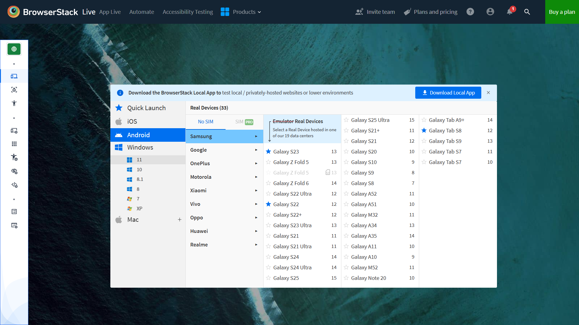
5. Test Your Site on Different Devices
Sometimes your site will encounter problems on a specific mobile device or browser. These incompatibilities are difficult to predict and can be due to anything from browser issues to outdated hardware.
The only way to identify problems is to run a comprehensive mobile device test. You don’t need to run these every month, but they should be done somewhat regularly to catch issues.
A tool like BrowserStack lets you quickly run tests across hundreds of different devices and browsers.
6. Troubleshoot Interactive Elements
Site speed isn’t just about how quickly your pages load. It’s also a measure of how easily users can interact with your site once it’s rendered. And there tend to be significantly more interactive elements on mobile compared to desktop.
For example, the mobile version of the Wikipedia page uses expandable sections liberally to make browsing easier:
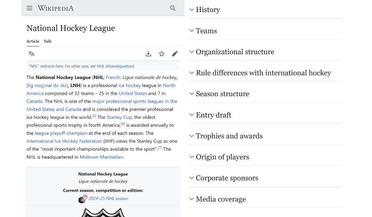
A low Interaction to Next Paint (INP) score is the strongest indicator that something is going wrong with interactive elements.
Manually test all of the following on your pages:
- Hamburger menus
- Accordion menus
- Collapsible sections (content headings, FAQs, product specs, etc.)
- Slide-out sidebars
- Modal (full screen) popups
- Horizontal carousels
- “Load” and “Read More” buttons
- Form success notifications
Also keep in mind that if you’re using welcome popups on your mobile device, you may be detrimentally affecting user experience. Popups do have a place, but ensure they’re not affecting your page speed and bounce rate, and consider exit intent popups as a next-best alternative.
7. Pick a Fast Host
You can’t control the speed of your host’s servers. It’s the only critical factor related to site speed that isn’t under your control.
That’s why it’s important to pick your provider carefully. A well-reviewed, reputable host can save you a myriad of issues further down the line.
Here are three key tips for picking a host:
- Avoid shared hosting plans. These are inexpensive but more prone to storage and traffic spike issues.
- Opt for VPS or cloud hosting. VPS hosting provides you with a dedicated virtual server. Cloud hosting (a middle ground between shared and VPS hosting) offers additional bandwidth on demand, usually via a pay-as-you-go model.
- If you run a large site, consider a dedicated server. This gives you full control over software and resources.
- Use a CDN With a Good Track Record
A content delivery network or CDN stores a cached version (essentially a copy) of your website on servers around the world. This reduces the time it takes for a browser to request site files over a large distance.
Here’s a list of the best CDNs available:
- Cloudflare
- Akamai
- Amazon CloudFront
- Google Cloud CDN
- Microsoft Azure CDN
- Fastly
- StackPath
- KeyCDN
If you use a website builder or CMS, look for a CDN that provides a plugin or native integration, as this will reduce setup time. Cloudflare, for example, offers a WordPress plugin.

Finally, if your audience resides in a particular location, such as North America or Southeast Asia, check for wide coverage in these areas.
9. Enable Browser Caching
Browser caching is a simple tweak that instructs browsers to save a copy of your site. This makes load times for return visitors much quicker. Caching works for both mobile and desktop browsers.
The easiest way to enable browser caching is to use a free plugin like WP Super Cache or modify the settings in your site builder (browser caching is usually enabled by default).
Alternatively, you can manually set HTTP response headers by modifying your .htaccess file.
10. Use a WordPress Plugin
According to W3Techs, 43.4% of websites use WordPress. If you count yourself in that number, a well-chosen plugin stack can save you a substantial amount of time and technical headaches.
Here’s an overview of the top site speed plugins and their main features:
- WP Rocket: An all-in-one speed optimizer
- W3 Total Cache: A comprehensive caching plugin
- Autoptimize: A plugin focused on minification (CSS, JavaScript, and HTML)
- Imagify: A dedicated image compression tool (a lazy loading plugin is also available)
- Perfmatters: A popular plugin that identifies and cleans unused site elements
If you only choose one plugin, go with WP Rocket. It’s arguably the most powerful all-in-one WordPress speed optimization tool available, has excellent support on the pro plan, and is recommended by Google.
What is mobile site speed?
Mobile site speed refers to how quickly your website loads and becomes usable on a mobile device. It includes everything from how fast your images appear to how responsive your buttons are. A fast mobile site ensures a better user experience, higher engagement, and stronger SEO performance.
How do you improve mobile page speed?
Start by running your website through Google’s PageSpeed Insights and follow the mobile-specific recommendations. Focus on compressing images, lazy loading content, minifying CSS and JavaScript, and enabling browser caching. You should also use a responsive design, test your site on various mobile devices, and choose a fast host or CDN to serve your content efficiently.
What is a good mobile site speed?
A good mobile site speed typically means loading in under 3 seconds. Ideally, you want your Largest Contentful Paint (LCP) to occur in less than 2.5 seconds, have minimal layout shifts, and ensure that interactive elements respond quickly. The faster your site loads, the better your chances of keeping users engaged and improving conversion rates.
Mobile Requires a Targeted Approach
Mobile and desktop site speed optimization are similar but not identical.
While certain steps, like using a CDN and picking a fast host, are the same irrespective of device, others aren’t.
Site admins often overlook this point. And that’s why many mobile sites underperform compared to mobile.
It’s important to complete all “generic” site speed tasks. But don’t overlook mobile-specific jobs like device testing, responsive design monitoring, and implementation of mobile PageSpeed Insights diagnostics.
Also keep in mind that more than 60% of internet traffic is mobile. For a commercial site, that’s a lot of revenue.
Unlock Thousands of Keywords with Ubersuggest
Ready to Outrank Your Competitors?
- Find long-tail keywords with High ROI
- Find 1000s of keywords instantly
- Turn searches into visits and conversions
Free keyword research tool


