


Google Analytics is a staple in every experienced digital marketer’s set of tools. This is primarily because it provides a wealth of data, covering virtually everything you might want to know about how visitors interact with your site.
Cohort Analysis is a particularly useful feature for marketers and small businesses. It can tell you how well your website is performing overall. It also gives you in-depth insights into user behavior on your site.
What is a Cohort Analysis?
To understand what a cohort analysis is, it’s necessary to define a “cohort” first.
This term refers to a subset of people grouped together because of a shared value.
Google defines it as a group of users who share a common characteristic, identified by an Analytics dimension.
A cohort analysis, then, is the process of analyzing the behavior of groups of users.
You can compare groups to one another and look for differences and trends.
If you identify any patterns, it can help you determine which changes and behavioral differences led to different results.
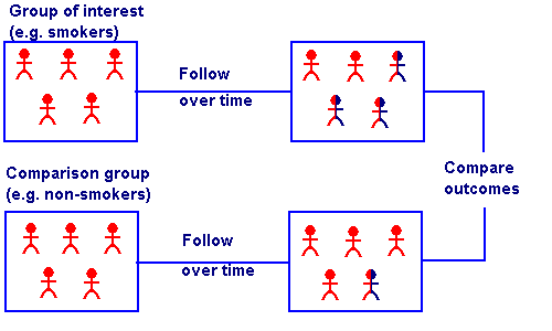
To be clear, this process is not unique to digital marketing. You can run a cohort analysis to compare many different types of groups.
In fact, the term originates from medical studies, in which researchers compare groups of people like smokers and non-smokers to identify differences between the two.
Keep in mind that the cohort possibilities are limited to the data you can collect from your visitors while they browse.
For example, cohorts in Google Analytics are grouped based on Acquisition Date, or the users’ first visit to your site.
New acquisitions’ cohort type can be extremely helpful in giving context to data. Analyzing specific segments, instead of your audience as a whole, will give you a clearer idea of what makes a great customer for your business.
A cohort analysis also goes beyond basic data points to suggest the reasons for changes in your site visitors’ behavior.
As a result, comparing cohorts can help you learn more about what influences specific behaviors and the impact your marketing campaigns and strategies have.
For example, when the children’s online clothing store Spearmint LOVE wanted to identify trends on their site, they created several cohort analysis reports:
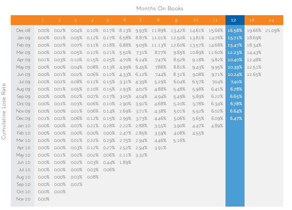
Using this analysis, they were able to determine how long the average visitor would continue to return to their site, as well as the average time between purchases.
They also used this insight to break their cohorts into “custom windows” based on the different purchasing behaviors of moms during pregnancy and the first few years of their children’s lives.
This way, they could more accurately predict what the cohorts’ next purchase might be, then base their ad campaign content and timing on those predictions.
And while this was only one of several strategies Spearmint LOVE used to improve their marketing, the end result was 991% YoY growth from 2015 to 2016.
How to Run a Cohort Analysis in Google Analytics
Running a cohort analysis in Google Analytics is a fairly simple process.
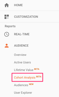
Under the Audience Tab, select Cohort Analysis.
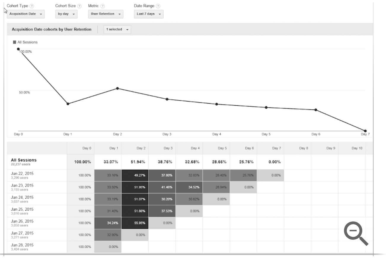
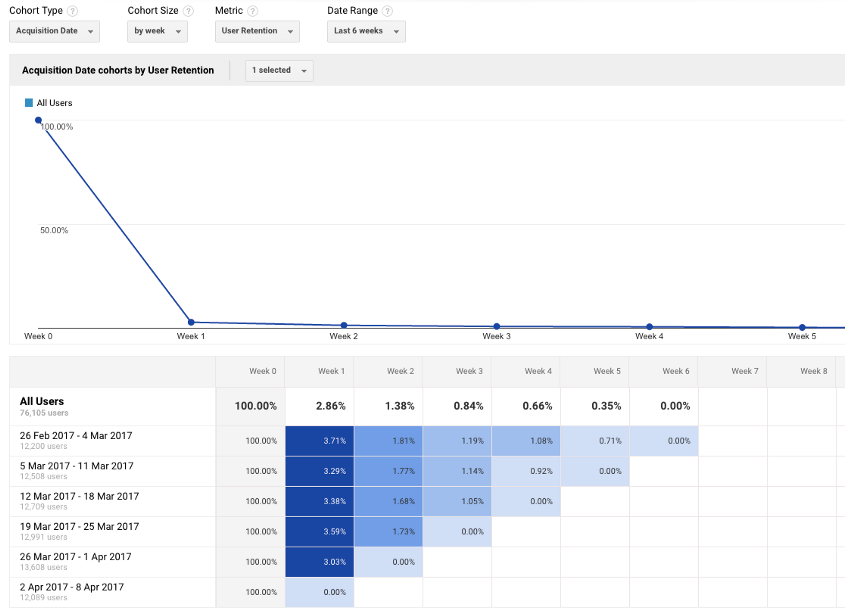
By default, the main dashboard for this report will show a graph with your site’s Acquisition Date cohorts by User Retention.
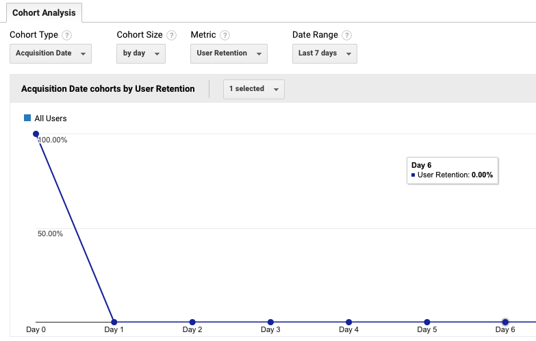
In this case, Day 0 represents each user’s first visit to your site, and the subsequent days show whether they returned.
If you notice a decline in this chart, don’t be alarmed.
Cohorts inevitably drop over time as users stop returning to your site.
Maintaining a steady flow of return visitors is challenging for even the most experienced marketers — so don’t be surprised if this number gradually declines for most of your cohorts.
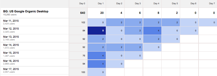
Below this chart, the report will also display a table showing your site’s user retention, divided into groups based on the date of users’ first visits.
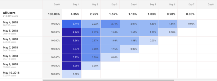
In this case, each row represents a different cohort of users by Acquisition Date.
If you notice that any rows show significantly different retention rates from the rest, this can be a great starting point for analysis.
This is especially true if you run any major marketing campaigns.
For example, a high-performing cohort can indicate that the campaign you ran that day was particularly effective at attracting engaged traffic.
Then, at the top of this dashboard, you can adjust the data included in your report.
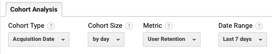
Right now, the only Cohort Type available is Acquisition Date or the date of a user’s first visit to your site.
But you can adjust the Cohort Size to reflect groups of users by day, week, or month.
This is especially helpful if you launch and run new campaigns on a timeline that meets one of these durations.
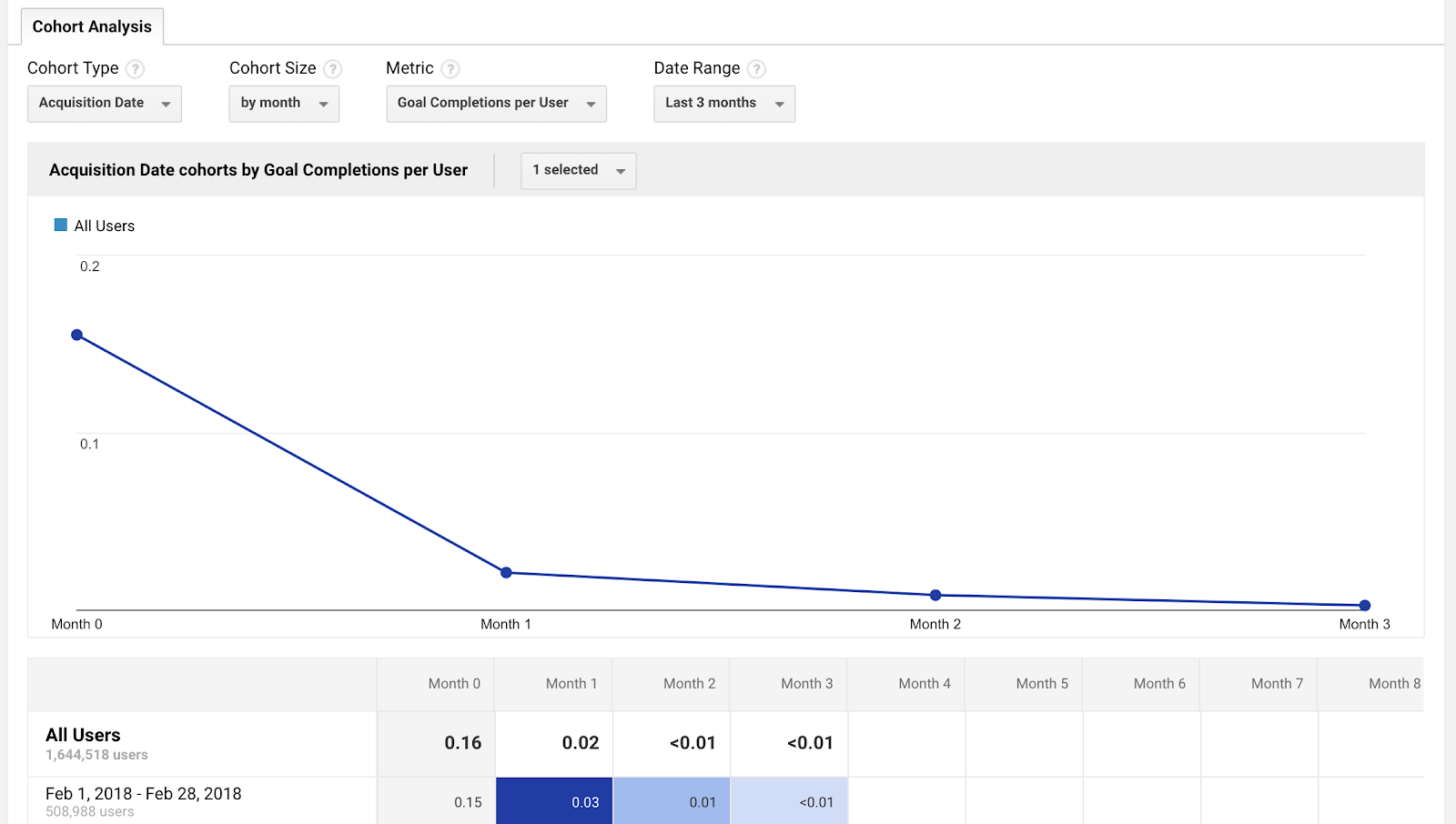
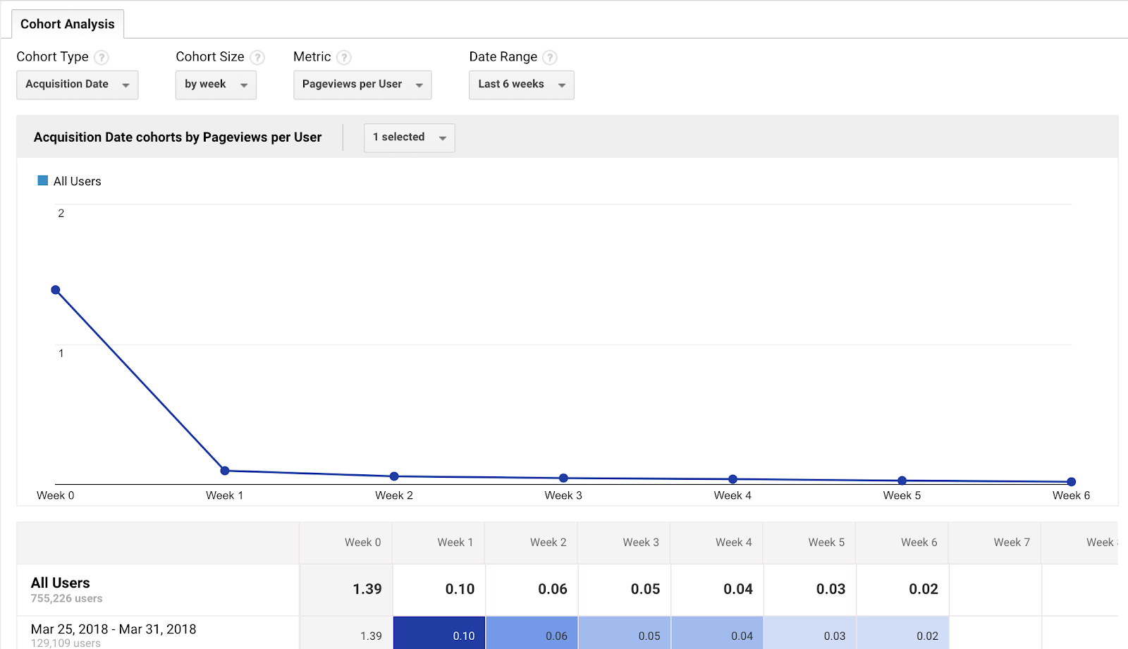
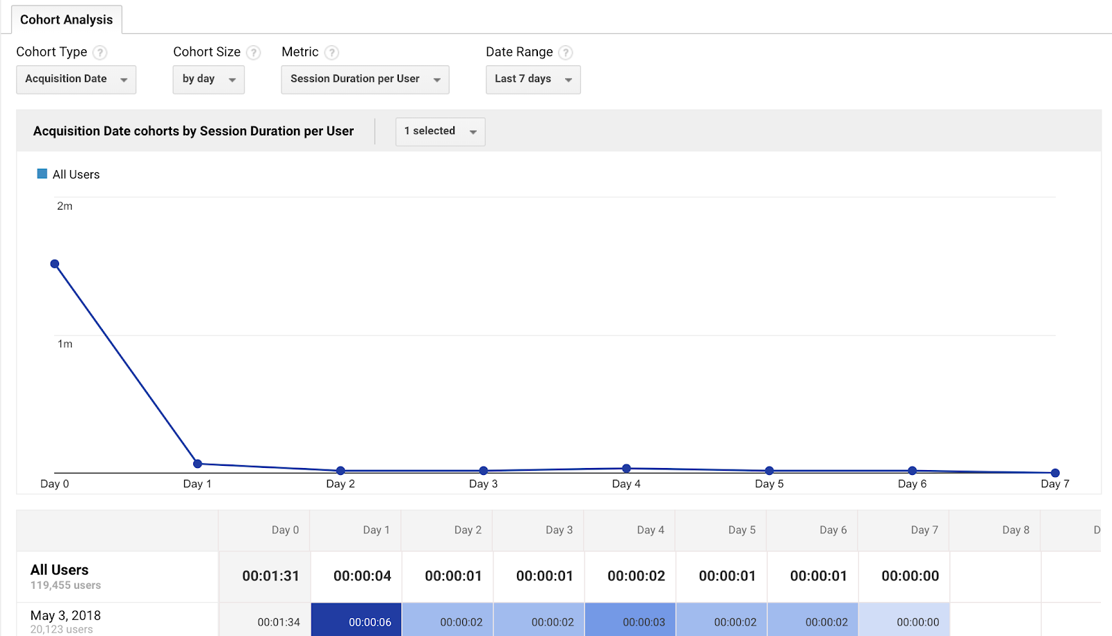
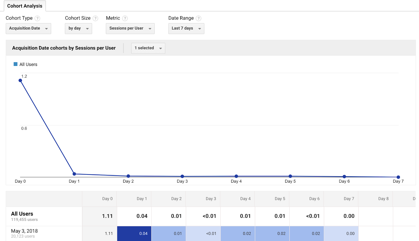
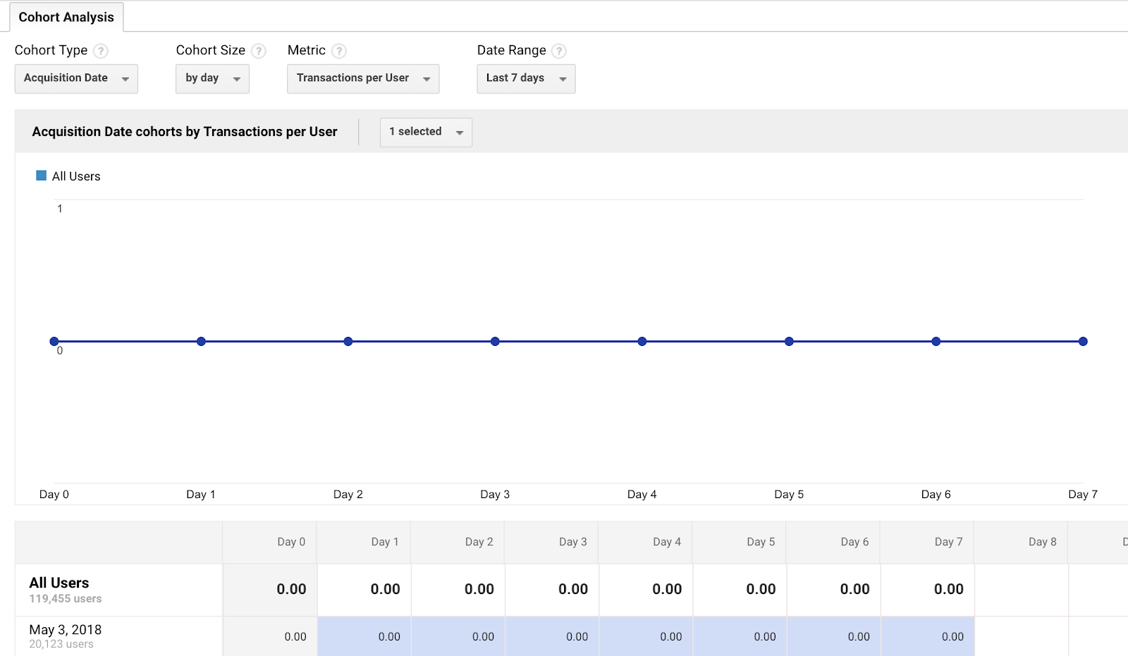
Next, you can choose from a few different metrics by which to analyze your cohort.
The default metric is user retention, which shows the percentage of a cohort that returns on subsequent days following their original visit.
If one of your primary goals is increasing your overall traffic and maintaining a steady flow of return visitors, this report can be extremely helpful.
For most site owners, however, the next two sets provide more valuable insights as they relate to the actions a user takes beyond simply visiting your site.
The “Per User” set of metrics will show the average number of actions each member of a cohort took on your site, including:
- Goal Completions per user:
- Pageviews per user:
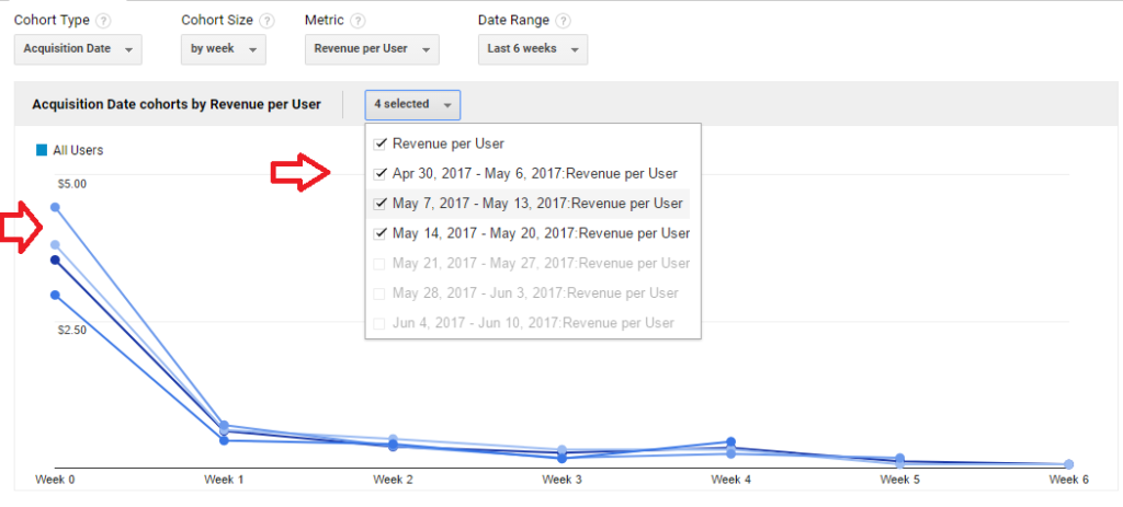
- Session Duration per user:
- Sessions per user:
- Transactions per user:
Instead of analyzing your cohorts based on whether they consistently return to your site, you can focus on the actions that have an impact on your most important goals.
The next set of metrics is similar, but instead of showing an average per user, it will show the total for the metric of your choice, including:
- Pageviews
- Revenue
- Session Duration
- Sessions
- Transactions
- Users
Finally, you can adjust the date range of your report to include data from the previous week, two weeks, three weeks, or month.
The range you choose depends on the scope of data you want to analyze, as well as the size of your cohort. One week may provide plenty of data if your cohorts are broken down by day, but you’ll need to select a larger date range for any larger cohorts.
Tips for Getting the Most Benefit from Your Google Analytics Cohort Analysis
To get useful and actionable information from your cohort analysis, you should take a few best practices into consideration.
1. Use Additional Segments to Learn More about Your Audience
The fact that the current setup only allows you to create cohorts based on Acquisition Date may seem like a limitation.
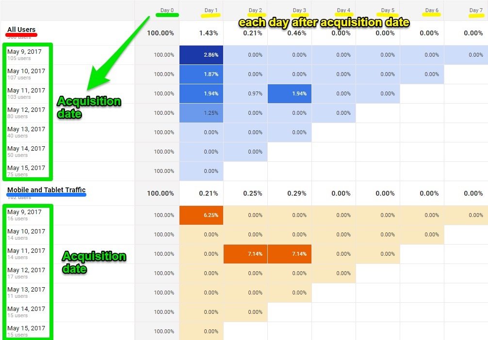
Fortunately, you can use additional segments to segment your data further. In fact, Analytics currently allows for up to four segments in the cohort analysis report.
As you add new segments, each one will appear in a new table below the “All Sessions” table.
For example, you can dig deeper into your cohort analysis by segmenting mobile traffic vs. all traffic.
You’ll receive a comparison chart like this:
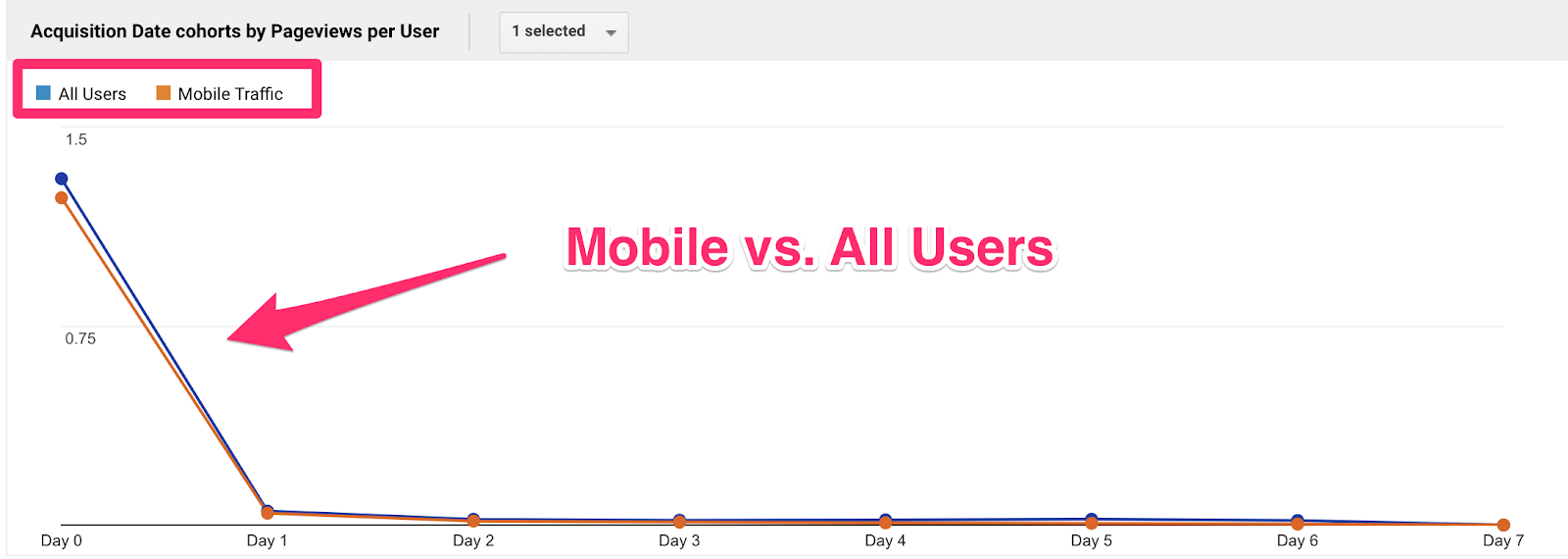
If you scroll down to the columns, you can see the data for the individual cohorts.
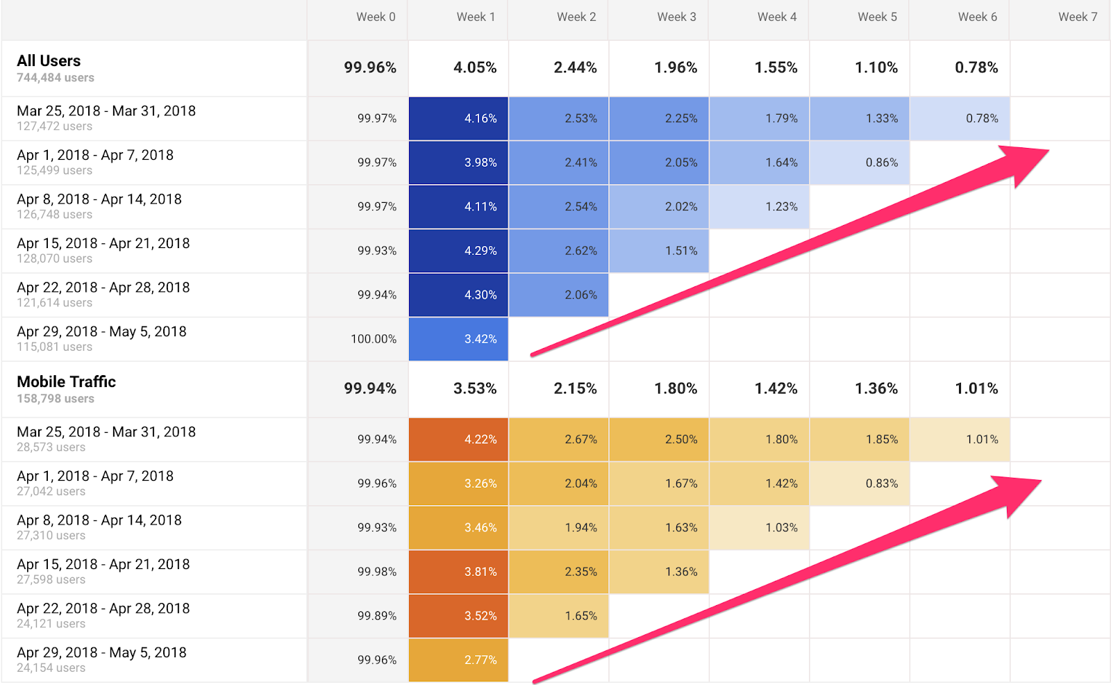
This report shows that 3.98% of the 125,499 desktop users who signed up the week of April 1 – April 7 came back on Week 1, 2.41% came back on Week 2, 2.05% on Week 3.
When you compare that to mobile, you’ll see that desktop is still retaining users better than mobile.
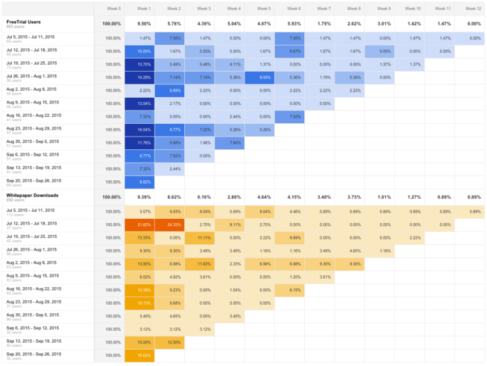
Beyond the pre-set options we’ve discussed, you can also apply any custom segments you’ve created in Analytics.
This means you can use the cohort analysis report to access data on sets of users you’ve already identified as valuable for your site.
For example, below you can see a comparison between a site’s visitors who signed up for a free trial and those who downloaded a whitepaper.
Regardless of the segments you use, you’ll want to keep an eye out for any that perform significantly differently from the “All Sessions” report.
This will help you identify groups of users that differ from the average user’s behavior, either in positive or negative ways.
If a group performs better, by returning to your site at higher rates for instance, then you’ll want to dig into the potential causes for that difference. Next, you can use this insight to replicate that behavior across other segments of your traffic.
2. Gauge Responses to Short-Term Marketing Efforts
The cohort analysis report can also be helpful for analyzing how your audience responds to short-term marketing efforts, like email campaigns.
With each email you send, you reach a slightly different set of users — and monitoring the behavior of the users you reach as a result can be a great way to gauge your success.
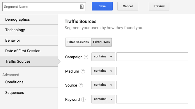
As long as you use UTM tracking for your campaigns, you can keep recreating a new segment within the cohort analysis report, and selecting “Traffic Sources” from the left column.
Enter your campaign’s parameters, then compare this segment to your site’s overall traffic.
So, for example, if you run an email campaign for three days offering a 25% discount, you can track the behavior of users who used the discount during this period.
If the users you reached with your campaign performed better for your target metric, this is a solid indicator that it was effective in reaching the kind of traffic and customers you want.
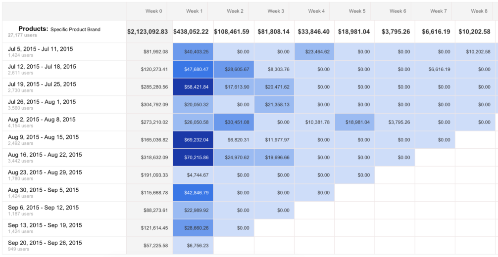
3. Learn About E-Commerce Shopping Habits
One of the best features of the Cohort Analysis report is the inclusion of e-commerce-specific data, including revenue per user, transactions per user, total revenue.
Looking at transactions per user by acquisition date can show the average amount of time it takes for a user to make a purchase.
For instance, in this example, purchases spiked five days after the acquisition date.
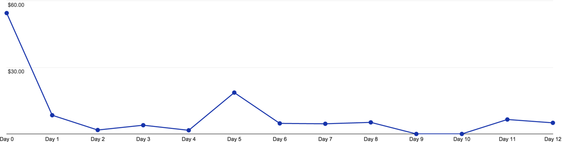
It’s important to consider other factors that could’ve caused this spike, like a promotion or remarketing campaign. Having this data can give you a stronger understanding of your audience’s purchasing behavior and the average time it takes them to make a decision.
You can also take things a step further by cross-referencing this data with the Lifetime Value (LTV) report.
For example, let’s say you notice in a cohort analysis that over the span of a 12-week campaign, you saw significant drop-offs in user retention
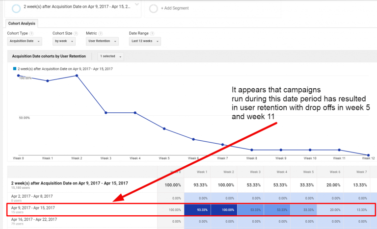
You can hop over to the LTV report for the same time frame, then determine if there are any channels or campaigns seeing the same low-performing weeks.
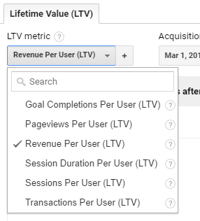
To access this data, select LifeTime Value from the Audience menu.
Next, decide which metric you want to use to determine the value of your users. For e-commerce sites, this will likely be revenue per user.
Your next step is to sort your data by acquisition channel, source, medium, or campaign.
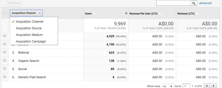
This can give you an idea of which channels you need to improve to eliminate drop-offs in site performance and increase your user retention and revenue.
4. Use Annotations to Monitor Impact
As you analyze your cohort reports, it’s essential to keep in mind any factors that could be impacting the data you see.
Fortunately, you can make annotations to keep track of these factors and easily see the dates of specific events, campaigns, and site changes.
nb
For example, the following chart shows three significant events for a company’s marketing efforts.
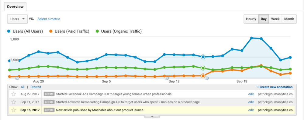
In this case, it shows the date on which the agency had an article published on a third-party platform.
A few days later, they saw a significant jump in traffic.
Although this could be confusing while looking only at the cohort analysis report, the annotation ensures that users looking at this data don’t forget to consider that significant factor and analyze the data accordingly.
5. Save Reports for Your Most Important Cohorts
If you plan to use the Cohort Analysis feature frequently, saving your reports is an excellent way to save time.
It also ensures that you’re consistently looking at the same data sets so that you don’t draw any inaccurate conclusions simply because a setting in your report is slightly different.
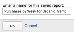
You can save a report by clicking the “Save” button at the top of your dashboard and creating a name.

This will keep all customizations intact, including advanced segments, secondary dimensions, and sorting — so that the next time you want to use the cohort analysis feature, you won’t need to waste any time recreating your data set.
Conclusion
If you’re looking for a way to segment your data into more manageable chunks, the cohort analysis feature in Google Analytics is a great way to focus on specific subsets of your audience.
You can use it to learn more about segments (aka cohorts) you’ve already created and see how their behavior differs from other segments, as well as your site’s traffic as a whole.
It’s also useful for gauging responses to specific campaigns, learning more about e-commerce shoppers’ behavior, and monitoring the impact of any other significant events related to your business.
If you need help to create and manage the data you get from your analysis — or incorporate it into your overall marketing strategy — we are here to help.
How do you use the Cohort Analysis report for your site?
Are You Using Google Ads? Try Our FREE Ads Grader!
Stop wasting money and unlock the hidden potential of your advertising.
- Discover the power of intentional advertising.
- Reach your ideal target audience.
- Maximize ad spend efficiency.