 Sign In












Which CTA Color Converts The Best
Info
-
Source: NP Digital
-
Date: December 2024
-
Category: Ecomm & User Behavior
-
Study Methodology: Sample size: 2,588 A/B tests; Timeframe: past 6 years; Collection method: Tested CTA color variations across landing pages and measured conversion rate changes.
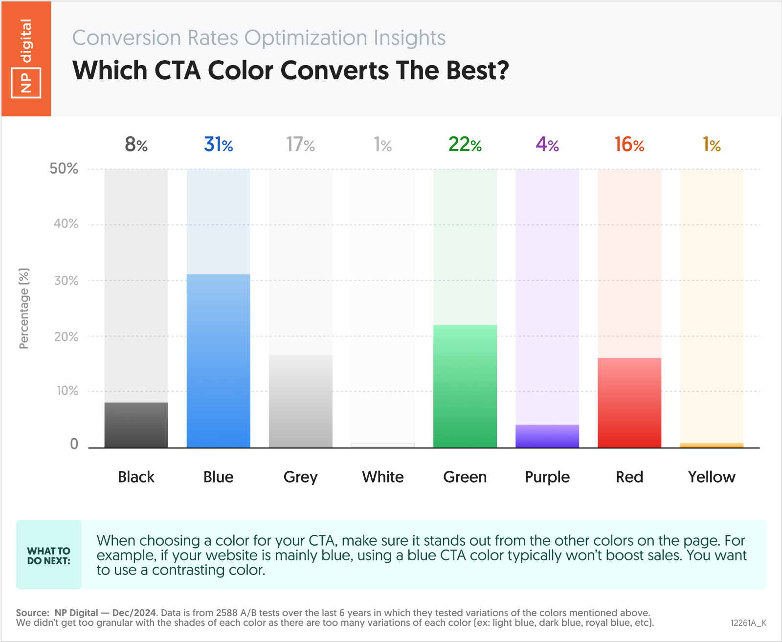
This chart compares CTA conversion performance across common colors. Blue and green outperform other options, while white and yellow lag significantly. The data shows that contrast and context matter more than any single color choice.
Essential Statistics
- Blue CTAs deliver the highest conversion lift at 31%.
- Green CTAs convert at 22%.
- Red CTAs generate a 16% lift.
- Grey CTAs convert at 17%.
- Black CTAs convert at 8%.
- White and yellow CTAs convert at just 1%.
Key Takeaways
- No single CTA color wins in every context.
- High-contrast CTAs outperform subtle designs.
- Blue and green consistently lead conversion tests.
- Neutral colors underperform as CTAs.
- CTA visibility matters more than brand alignment.
- Testing outweighs design assumptions.
Actionable Insights
- Choose CTA colors that contrast with your page design, because visibility drives clicks more than brand consistency. Prioritize standout placement over aesthetics.
- Test blue and green CTAs first, because they deliver the strongest average conversion lifts across thousands of tests. Use them as baseline variants.
- Avoid white and yellow CTAs, because they blend into page backgrounds and convert at just 1%. Reserve them for non-primary actions.
- Use red selectively, because it performs well but can signal urgency or friction depending on context. Validate with A/B tests before scaling.
- Evaluate CTA performance by page type, because conversion intent varies across funnels. One color will not win everywhere.
- Continuously test CTA colors, because performance shifts as layouts, audiences, and devices change. Lock nothing in permanently.
People click what they notice. If your CTA blends in, it does not matter how good the offer is. – Neil Patel