

Key Takeaways
- A high-converting landing page has been optimized for conversions. It helps your business grow by securing more leads and conversions, enhances SEO, and establishes your brand. Some of the main elements are eye-catching headlines and images, a simple sign-up form, and easy-to-read content that resonates with your target audience.
- Designing a high-converting landing page starts with understanding your audience and addressing their pain points.
- Design best practices include choosing the right background color, selecting legible fonts, and considering calls to action and link colors.
- Mobile-friendliness, market research, and A/B testing are essential to high-converting landing pages.
- Different variants of a high converting landing page include video, text, click-through, and SEO landing pages
Do you ever wonder what the big secret is behind landing page optimization? I expect every online marketer does at some point, especially when they first start out.
If the same question is bugging you, I have some answers. I’ve also got examples, tools, and tips to help you create high-converting landing pages.
What are you waiting for? Let’s dive in.
What Is a High-Converting Landing Page?
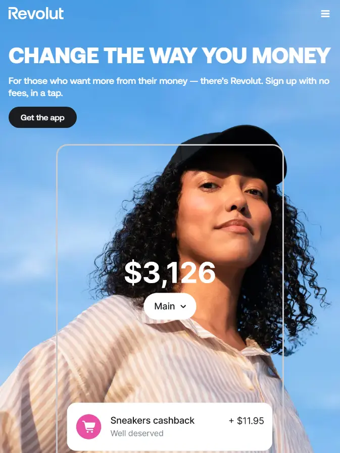
A landing page is a webpage that aims to get visitors to act in a certain way. For instance, signing up for a newsletter, inviting people to a conference or webinar, making an announcement, offering a discount, making a purchase, or signing up for your app, like in this example from Revolut:
Landing pages also help you capture leads.
A high-converting landing page is optimized for conversions. Some core elements include a compelling call to action, a signup form, an attention-grabbing headline, and subheadings. It also contains easy-to-read content formatted for readability, images, and perhaps a video.
Additionally, for maximum visibility, you should place your sign-up form above the fold (the visible part of the webpage when you first see it).
The best-converting landing pages secure leads and can turn them into customers. They allow successful conversions like new subscribers and give you fresh leads, which you can nurture through your sales funnel until they’re ready to buy.
I’ll cover some optimizations to improve your landing page later on.
Types of High-Converting Landing Pages
If you want to create a high-converting landing page, you have several options. Different types of landing pages are:
Text-Only Landing Pages
These types of landing pages don’t include videos or large graphics, just a couple of images to appeal to the section of your brain that processes visual information. Copyblogger is a typical example. It uses a CTA button instead of a text link.
Lead Generation
Lead generation landing pages collect details like a name, email, and phone number. Typically, these are landing pages that convert prospects into leads by offering a free lead magnet, such as templates, a short course, eBooks, or access to a webinar.
This is how workhuman uses them:
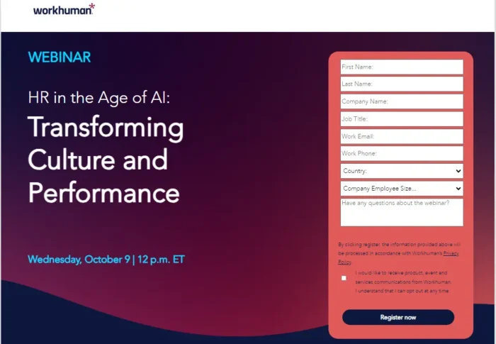
Although the form is relatively extensive, it makes segmenting and targeting easier. It has a basic but striking design and manages to keep it clutter-free while detailing the essential information.
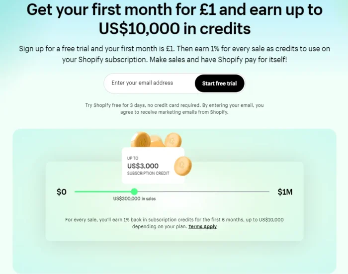
Click-Through
Click-through landing page conversions aim to get people to click through to another page. Once there, visitors are invited to sign up for a freebie, such as a product demo, event, or to buy a product.
Typical features include a clear CTA, a captivating headline, and magnetic content designed to persuade the reader.
For example, Shopify uses an enticing discount offer for new users and has a one-field sign-up form and a simple but tempting CTA button.
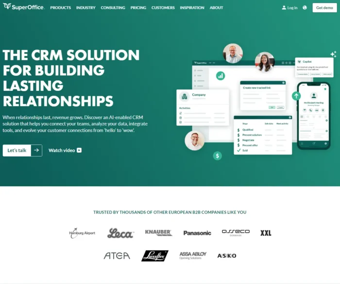
Long-form Landing Pages
It’s common to find long-copy landing pages in the digital marketing industry. It’s a great format when trying to showcase the benefits of your products or services to close a sale.
These longer pages use strong headlines and subheadings, features and benefits, images, social proof, like reviews, and CTAs throughout. They might also include case studies, trust badges, and a video chat option, like SuperOffice.
Video Landing Pages
These types of pages feature video as their main elements. Why use video? Well, if you want to create high-converting landing pages, video can improve engagement and conversions. They can also help keep visitors on the site longer and create increased trust.
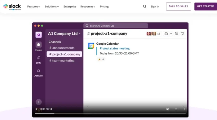
In addition, videos can show prospects how your product works, which is a must if you have a product/service that the buyers need to install or configure. For example, when you visit Slack, you can watch the video to learn what the messaging software can do for you and how to use it.
Another reason to use video marketing in your landing page is the sheer volume of traffic it attracts, with a worldwide audience of 3.3 billion.
And people aren’t tired of it yet.
A recent HubSpot survey shows that 89 percent of consumers want more videos, 75 percent watch videos on their mobile devices, and 62 percent have watched video content to discover more about a brand.
Campaign vs. SEO Landing Pages
Landing pages offer you flexibility for different types of campaigns depending on your marketing goals. You can optimize a page for SEO and specific campaigns.
An SEO landing page attracts organic traffic, provides targeted answers to questions, and needs ongoing optimizations. It’s aimed at getting long-term traffic.
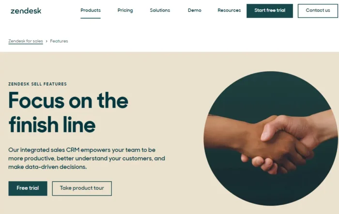
For example, on its landing page, Zendesk lists features to attract organic traffic from search engines. Its simple, clean design and page structure include short text paragraphs.
In addition, the page is regularly updated when new product features are added (continuous optimization) and provides answers for people looking for information about Zendesk features.
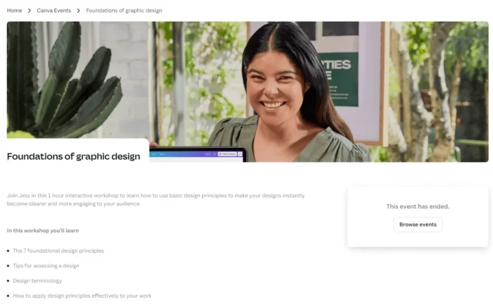
In contrast, a campaign landing page for a specific product or marketing campaign aims to attract traffic quickly. They rely on paid advertising and online marketing to gain targeted traffic and use frequent A/B testing to find the best-performing page. Like this example from Canva:
How to Create Landing Pages That Convert
Ready to start work? In the next section, we’ll talk you through the steps for effective landing page optimization.
1. Choose Your Tools
If you need help building high-converting landing pages, check out these tools.
1. Unbounce: A landing page drag-and-drop builder with no-code A/B testing, AI optimization and copywriting, and real-time analytics.
2. OptimizePress: Easily capture leads with conversion-optimized landing pages, create SEO-optimized page structures, and set up funnels and memberships.
3. PopUpDomination: helps you convert more subscribers and gain more customers. It works with every web host and email provider and offers a 14-day free trial (credit card required).
4. OptinMonster: lets you build your email list, capture more emails, and boost sales.
5. Instapage: For ‘Landing pages without limits.’ You can build, optimize, and scale personalized landing pages. Free 14-day trial available.
6. Leadpages: Offers optimized landing page templates. Use it to deliver lead magnets, track analytics, and manage leads.
7. Getresponse: Builds high-converting landing pages. Comes with a drag-and-drop creator and an AI content generator.
2. Conduct Market Research
What’s the secret behind landing pages that convert? Market research.
Every good landing page starts with a thorough understanding of your target market and customers so you create value and provide a desirable customer experience. Research helps you spot pain points and barriers to conversion. For example, your product might be outside of your customer’s budget.
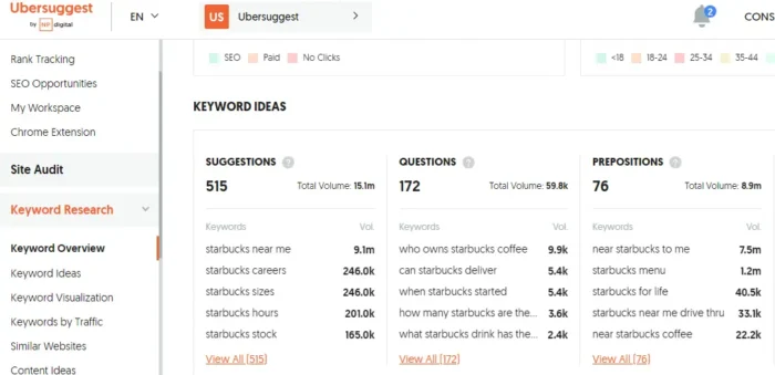
Before you start writing your content, do some keyword research (including long-tail keywords, too). Use this time to do a competitive analysis and to find content gaps. My free tool, Ubersuggest, can help you.
Then, analyze your data.
Here, you’ll look at metrics like bounce rate, engagement, and conversion rates. You could also use usability testing to assess your site’s intuitiveness and identify areas for improvement.
3. Design With Conversions in Mind
In this section, we’ll look at the anatomy of creating landing pages that convert and discuss each element individually.
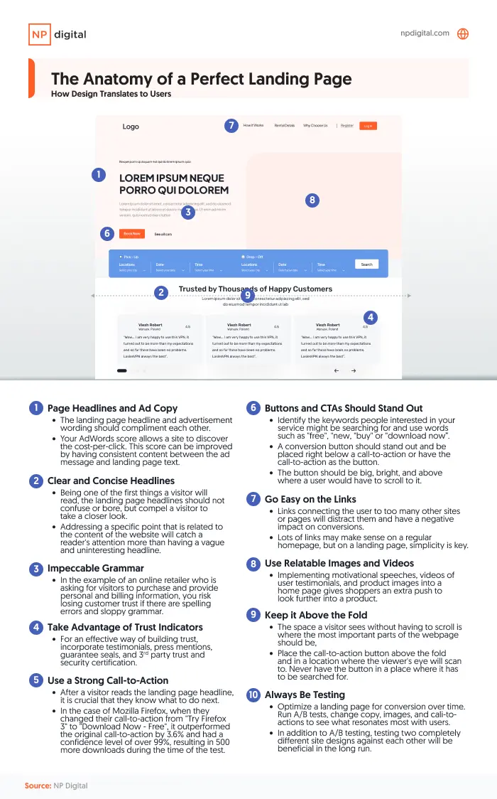
- Add a call-to-action button: Use a contrasting or bright color like red or green. Keep the text simple, like ‘download now’ or ‘Buy now.’
- Add videos and images: Use your landing page to showcase your product and feature testimonials in videos. Consider including a hero image (a large eye-catching image that visitors will see first). Headshots also work well.
- Include Trust badges: Add any awards, trade badges, company logos, etc.
- Run a grammar check: If you want your text to appear professional and polished, you need to at least run a basic grammar check.
- Headline: Make it bold, clear, and benefit-driven. It also needs to be creative, to the point, and create urgency. Alternatively, use it to target specific customers and offer a solution to their problems.
- Subheadlines: Take the same approach with subheadings and keep them short and direct.
Read this piece for more tips on creating high-converting websites.
4. Ensure Mobile-Friendliness
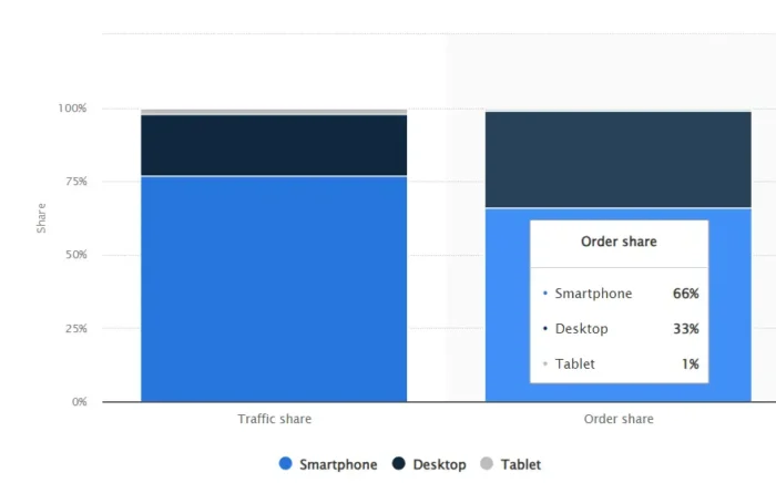
Smartphones are responsible for 77 percent of worldwide retail site traffic and generate two-thirds of online shopping orders.
Considering this stat, you’ll need to optimize your landing pages to ensure visitors get a mobile-friendly experience.
It’s easy to do by implementing these tips from Google:
- Design your page so it’s clutter-free, easy to read, and fast-loading. Google advises avoiding pop-ups.
- Include intuitive navigation like a ‘home’ page button on every page and a drop-down menu.
- Create punchy, relevant copy and focus on tone.
- Consider using Google Sign-In for easy data collection.
Visit Google for more tips on optimizing your mobile landing page.
5. Test and Optimize
Testing and comparing page variations is crucial to landing page optimization. This lets you see which converts best, and you can use the results to inform future landing page designs.
This is what we call A/B testing, and it enables you to make subtle or even not-so-subtle landing page optimizations, like:
- Using a different color call to action button
- Choosing long or short sign-up forms
- Organizing the content in a completely different order, adding different images, or using another script.
Run a test for two weeks, and then compare the conversion and engagement rates so you can make data-driven decisions. Optimzely, Crazy Egg, and HotJar all offer A/B testing tools.
Best Practices for Landing Page Optimization
Below you’ll find some best practices for landing page optimization.
- Know your customer: When you know your customers’ problems, what they’re looking for, and how your product can help your buyers, you’re in a much better position to create content that connects.
- Use a clear user interface: For your landing page to work, ensure the user interface is clutter-free. The focus is on your visitor, not you. You must align every element on your landing page to appeal to the end user.
- Test elements: Use an A/B tool to test headlines, calls to action buttons, text, and colors.
- Use SEO: Optimize your landing page with keywords by performing keyword research and understanding search intent.
- Test your landing page on different devices: You can check how your landing page appears on various mobile devices using MobileTest.me.
- Add a simple Navigation: Keep your navigation user-friendly. You can learn from David Risley, founder of Blog Marketing Academy. His landing page looks professional, has a visual focus, a clean design, and is easy to navigate.
- Include offers: To motivate visitors, offer something in exchange. An offer can be a discount, a free trial, a whitepaper, or a matching gift.
Finally, keep a narrow focus. The clearer and simpler you make your page, the more likely you’ll get someone to take the action you want.
Ryan McHugh, Director, CRO, NP Digital explains further:
“One of the biggest mistakes site owners make when building landing pages is not having a clear, single focus for the page. Landing pages should have one primary objective, whether it’s capturing email addresses, getting sign-ups, or making a sale. When a page has too many distractions, including links, navigation options, or too much information it can confuse visitors and decrease conversions. Keep the content blocks concise and relevant. Focus on a clear value proposition and be sure to place a consistent and action-oriented call to action prominently on your pages”.
Here are some tips to achieve a clean layout:
- Minimize the navigation bar
- Move non-essential information to the “About” section
- Keep forms short
- Focus on the CTA and place additional links below the fold
Design Best Practices
The right colors and design elements are integral in creating high-converting landing pages. Consider these tips when designing them:
- Think about color psychology: Colors can change brand perception and increase sales. For example, If your page’s background color is wrong, it may not convert as well. When using a solid color on your landing page background, ensure it won’t interfere with the text; if it’s a deep color, make sure the text contrasts nicely.
- Use clean and legible fonts: The most popular fonts for a landing page are Roobert, GT Super, Graphik, and Inter.
- Keep your page clutter-free and avoid distractions.
- Call-to-action colors: Your CTA’s color can inspire people to click or discourage them. For example, several online payment merchants use a calming blue for their call-to-action buttons to give end users (customers) peace of mind.
- Add a freebie form above the fold offering a free download, such as templates, an eBook, or a short course.
- Consider link color: Linking from your landing page is not a good practice, especially when you want to accomplish a special goal (e.g., capturing email leads). However, if you want to link, start with the web convention of using blue for underlined links and maroon for followed links.
- Ensure your site looks good on various devices. You can use BrowserStack for this.
- Add demo videos or images of your product out of the box and in use.
One more thing: use tidy visuals.
If you have spent more than 30 minutes on the Internet, you likely have seen one of those ads with an annoying GIF or click-bait headline like “Lose 50 lbs with this one weird trick.” Avoid distracting elements on your website that may sidetrack visitors from the main message.
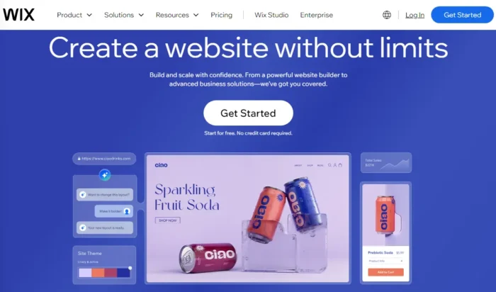
Here’s how Wix does it: It uses a limited but eye-catching color palette, a contrasting CTA button with an enticing offer, and adds inspirational language.
Finally, be mindful of mobile users. I can’t tell you how discouraging it is to visit an online store on my tablet only to find that the call-to-action button overlaps with the pricing.
Copywriting Best Practices
You need to follow copywriting best practices when crafting high-converting landing pages. Below are some tips to guide you:
Include VIAs: Very Important Attributes
Showcase the Very Important Attributes (VIA) that appeal to visitors. Identify two to five key features, benefits, or pain points, and highlight them on the front page rather than overwhelming visitors with a long list.
Use the AIDA Model
Attention, Interest, Desire, and Action (A.I.D.A). Apply this practice to content creation with unique, novel, and captivating graphics to drive attention, holding interest through valuable context, stimulating desire by connecting this to product benefits, and then leading to action with a CTA.
Additionally:
- Format your copy so it’s easy to read: Use headings, bullets, and quotes, and don’t be afraid of white space; this makes your site look less cluttered.
- Cut your fluff: Are you familiar with the phrase ‘kill your darlings’? You’re about to do that here when you cut anything that doesn’t add value. Use simple language and keep paragraphs short, too.
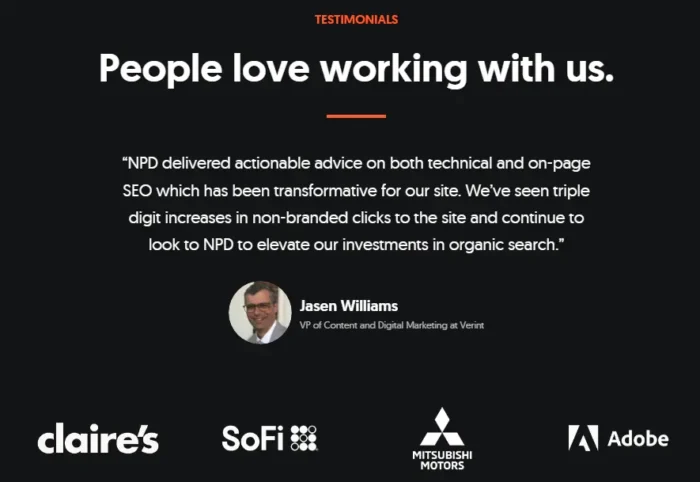
- Social proof You can add things like media mentions, accreditations and awards, and usage stats. Testimonials also work:
Landing Page SEO Best Practices
In this section, we look at some essential landing page optimization elements.
- Headings: Use H1, H2, H3, and H4 headings to make your site easier to scan so search engines can understand what your website is about. Include your main keyword in your title and H1 and secondary keywords in your other headings.
- Meta tags: These text snippets give context to search engines so they can understand your page.

- Alt text: This describes your images when an image isn’t displayed. They can help SEO, but they’re needed for accessibility and screen readers, too.
- Local SEO: For landing pages targeting local customers, develop localized content to drive traffic to your door.
Also, consider search intent (why people are searching) and write content that matches searchers’ needs.
Best Converting Landing Pages: Examples
Anyone can build a landing page, but not everyone can build a high-converting one that gets results. Look at these examples and use them to inspire your landing page optimization:
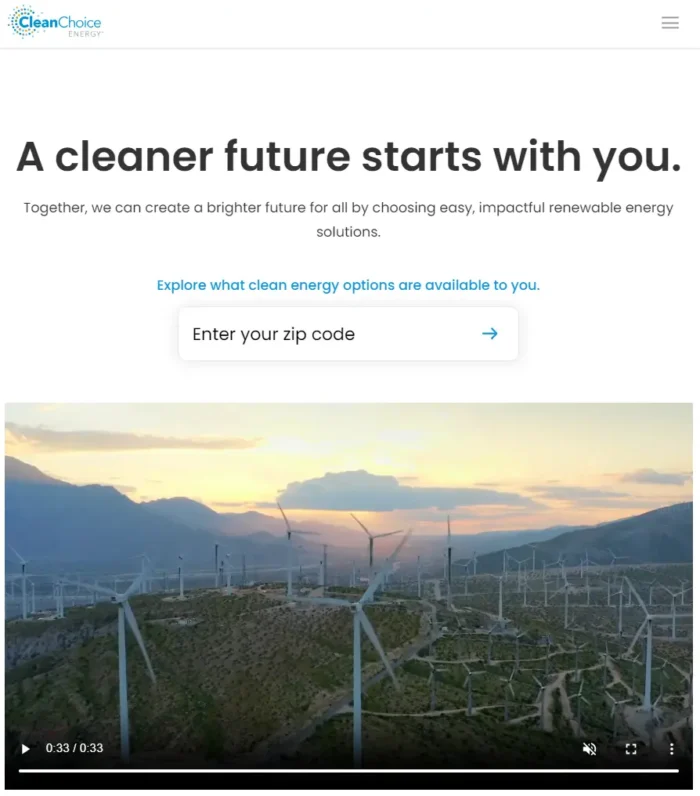
1. Clean Choice Energy
CleanChoice Energy uses a clear design, a clear CTA, and adds video to engage visitors. It uses a simple, one-field form for lead capture and includes motivational statements to motivate visitors.
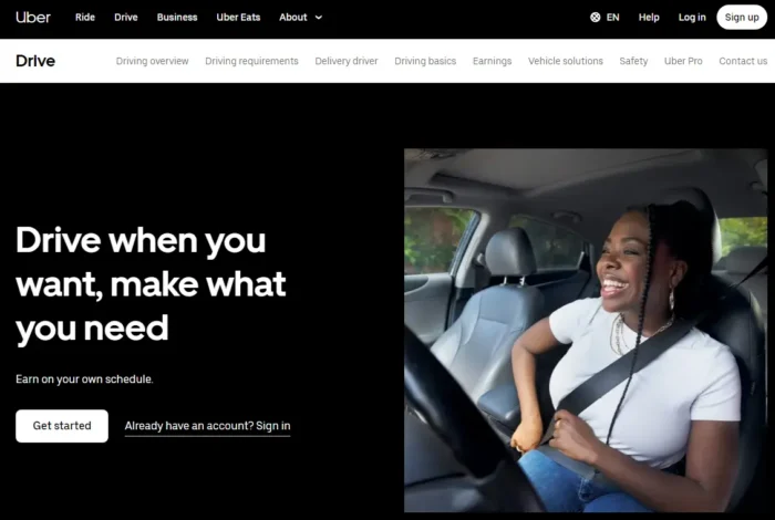
2.Uber
Uber’s simple headline and subheading capture the attention and spell out the benefits of working as a driver (flexible hours, extra money).
It has a simple CTA in a color that contrasts with the background and a user-friendly navigation menu. To keep things simple, it combines this with a single, positive image.
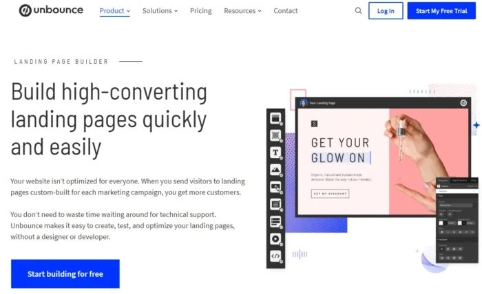
3. Unbounce
Unbounce’s landing page relies on clutter-free design. It spells out the benefits clearly throughout the landing page and couples this with its many features, and CTAs. It uses testimonials to build trust.
FAQs
What are high-converting landing pages?
High-converting landing pages are a type of web page designed to encourage visitors to take a specific action, such as signing up for a newsletter or making a purchase. These pages are optimized for conversion rates, designed to maximize the number of visitors who take the desired action.
How to build a high-converting landing page?
Start with a clear and compelling headline that highlights the main benefit of your product and ensure your copy focuses on the needs and pain points of your target audience.
It’s also important to include high-quality images and videos that showcase your product in action and give visitors a sense of its capabilities, include a CTA, and keep text brief. Always A/B test content to see which option works best.
Finally, be sure to add testimonials, simplify navigation, and state your value proposition clearly.
Can you have too many landing pages?
The general consensus is no. Digital marketing experts agree that it makes sense to have multiple landing pages. For instance, you might want to target different demographics.
What’s the average conversion rate for landing pages?
It depends on the sector you’re in. However, Unbounce’s analysis says the average conversion rate is 4.3 percent.
Conclusion
We often talk about successful websites and what makes them convert like crazy. However, it’s vital you don’t overlook landing pages and the value they can give your business.
You could use several models to create high-converting landing pages, so don’t be afraid to see what works best for your company and your offer.
Start with knowing your buyers and what appeals to them, understanding their pain points, and then create pages that provide a solution. Round it with a CTA to compel them into action and see how your conversions grow. Additionally, ensure you include all the essential elements for landing page optimization I’ve listed on the page and use A/B testing to see what works best.
Are You Using Google Ads? Try Our FREE Ads Grader!
Stop wasting money and unlock the hidden potential of your advertising.
- Discover the power of intentional advertising.
- Reach your ideal target audience.
- Maximize ad spend efficiency.