


Does the word “pivot table” make you want to scream?
You aren’t alone.
But, if you aren’t using pivot tables, you could be missing out on valuable insights about the effectiveness of your SEO, social media, or content marketing campaigns.
Data is the most powerful resource on the planet right now — some are even calling it the “new oil.” But, are you making the most of your marketing data?
If you already have a good grasp of the basics of Excel or Google Sheets, then you have a head start.
But I’m here to take you beyond the basic functions like SUM, AVG, or adding new rows.
You should be using Microsoft Excel to analyze and organize data from your marketing efforts.
Why? Because it’s one of the most underutilized marketing assets out there.
It’s safe to say that you probably know how to input numbers, words, dollar amounts, and other figures into the rows and columns of an Excel spreadsheet.
If that’s all you’re using Excel for, you’re not utilizing the software to its full potential.
Why?
It’s tough to analyze large data sets without the help of visual aids.
This is where you can use a pivot table to make your life easier.
What is a Pivot Table, Anyway?
A pivot table is an interactive table that allows you to sort and display data based on filters.
For example, say you have a massive Excel document of all your customer complaints about your large e-commerce business. It’s a lot of data — but it doesn’t actually tell you anything.
A pivot table could display averages about complaints by category, location, date purchased, and any other fields that you have.
But that’s just the basics. These fairly simple tables can do a lot more.
You can also use them to compare similar data and figures from different perspectives.
Despite their reputation, pivot tables are not as complicated as you might think. At their core, pivot tables help:
- Summarize large data sets
- Analyze large data sets
- Explore data insights
- Present those insights in an easy-to-understand format.
These are all crucial elements in your marketing efforts.
How can you tell if your efforts are successful or profitable without crunching the numbers? You can’t.
That’s where pivot tables come into play.
How to Create a Pivot Table
Pivot tables are fantastic tools for analyzing large amounts of data.
I’ll show you how to create them — and how to analyze your marketing data effectively.
Step 1: Find Your Source Data
Before you can make a pivot table, you need to get all your information organized in an Excel spreadsheet.
So, the first step is to figure out what the source of your data is.
Here’s a breakdown of how companies are spending their digital marketing budgets.
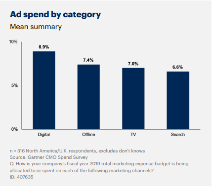
Each of those channels can then be broken down into more categories — digital ad spend might also include social, content marketing, and other digital efforts.
It’s a lot of data — so making sure it’s organized is the first step.
You might also have your data on another platform or software that’s not in Excel.
If you’ve been manually inputting the information into an Excel spreadsheet, chances are it’s already somewhat organized.
However, if your data is somewhere else, like an online marketing tool, you need to get those numbers on a new spreadsheet.
There are a couple of ways you can make this happen.
The first is by manually typing everything. I do not recommend this.
Sure, if you’ve been manually putting figures into an Excel sheet daily or weekly over a long period of time, it’s not the worst idea.
With that said, however, manually typing a year’s worth of data into Excel is not practical (or even realistic in some instances).
Depending on how much data you have, this process could take hours, weeks, or even months. That’s definitely not an efficient use of your time.
If possible, I recommend importing your data.
Step 2: Import Data Into Excel
To save some time and to maximize productivity, you can import data to an Excel spreadsheet. Here’s how:
Open a new Excel spreadsheet, then select the “Data” tab at the top.
Select the import option that fits your data. Your data is probably in a CSV or HTML file format, but all of the choices are a possibility depending on the platform or software you’re using.
For example, if you are uploading data from a CSV file, you’d select “From Text.”
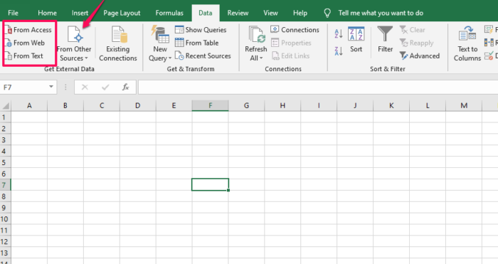
You can also select “From other sources” if you need to upload data from an SQL server or other sources.
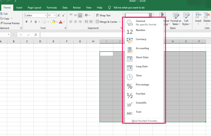
Step 3: Clean Up Your Imported Data
While Excel is extremely useful, it’s not always flawless.
It’s possible that your import process didn’t go 100-percent perfect.
Take some time to go through your information and fine-tune any incorrect fields.
For example, columns that are supposed to be a currency, such as USD, may appear as regular numbers.
That’s an easy fix.
Just highlight the cells and select your currency under the “Number” section on the “Home” tab.
There could be some other minor import problems, but it’s nothing you can’t sort out quickly.
If you’re struggling, Microsoft has a troubleshooting guide to walk you through some common issues.
It’s important to get all your data organized before you attempt to create a pivot table.
For the most part, you may just need to delete some empty rows, columns, or blank cells.
Step 4: Create a Pivot Table
Now that you’ve imported all your information into Excel, you can create a pivot table to organize and compare the data.
Right now, your spreadsheet contains raw data.
To take things a step further, you can create a pivot table to analyze the information.
Here’s an example containing some data about a hypothetical sales team.
Select the Data You Want to Analyze
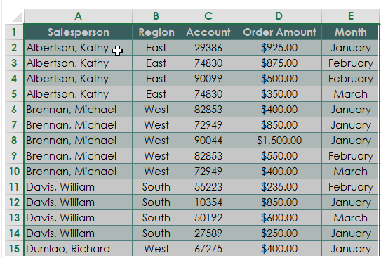
This raw data is great information, but what can you do with it? Not much.
You don’t know the total order amount for each salesperson, and you don’t know the total for all the orders.
If you want to analyze your marketing campaign, these are important pieces of information.
First, narrow down the data.
You don’t need to select the entire spreadsheet to create a pivot table.
For example, the screenshot above may contain additional columns for the date of each sale or the customer’s home address.
However, that’s not necessary to compare the sales team and their monthly order amounts.
Just go with the important information.
Highlight all of the cells containing the data, including the headers for each column.
Choose “Pivot Table” from the “Insert” Tab
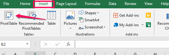
This will create the table.
Select the Data You Want to Add to Your Table
By default, your pivot table will open in a new worksheet tab.
I recommend leaving it that way.
It can get messy and tough to read if you put your pivot table on the existing worksheet with all your data.
If you need to refer to your datasheet, it’s easy to switch back and forth between tabs.
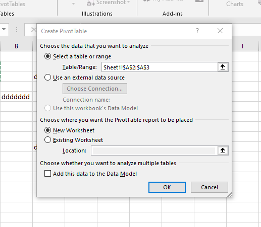
Since you’ve previously highlighted the information in the spreadsheet, the “Select a table or range” option is already marked.
Open the New Worksheet Tab
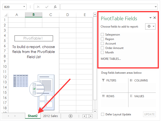
The new worksheet will automatically be labeled “Sheet 2,” but you can rename this to anything that helps you stay organized.
Notice the top right section of the screen.
The pivot table fields section contains all the headers we highlighted back in the first step.
Remember how I said to only select the important information from your data source?
Well, now you have the option to narrow those choices down even more.
Choose the Fields for Your Pivot Table
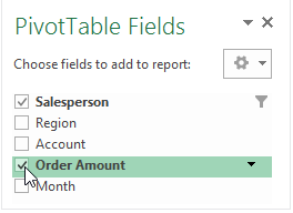
For this example, we’ll select the “Salesperson” and “Order Amount” fields.
Drag the Fields to the Desired Area
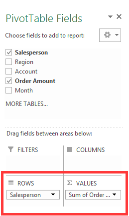
You can put a selected field into one of four areas.
- Filters
- Columns
- Rows
- Values
For this example, I put the “Salesperson” field under “Rows” and the “Sum of Order Amount” under the “Values” section.
Change the Value Field
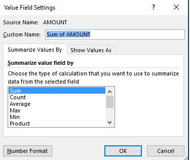
If you want to summarize the value field by something other than the sum, you have some options.
Just click the value field settings, and you can adjust the calculation.
For this example, the only other relevant option would probably be an average.
However, I’ll leave it as the sum for now.
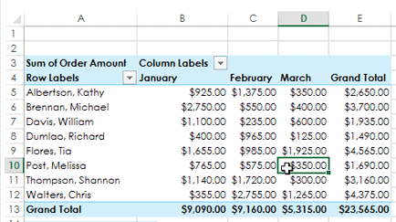
View Your New Pivot Table
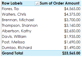
Take a minute to assess what we’ve accomplished here.
Remember how our data looked back in the first step? If not, take a second and scroll back up.
It’s much easier to analyze the information now.
Each salesperson is only listed once, and their total sales are calculated for you.
You can even see the grand total from your entire sales force.
We turned the raw data from the initial spreadsheet into an organized pivot table.
Pivot the Data
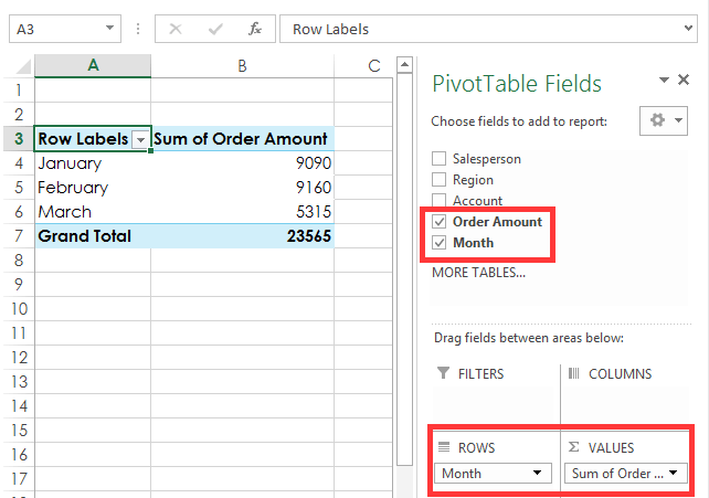
Let’s say you want to see the total order amounts each month.
You don’t need to start from scratch.
This information is easily attainable with a few simple clicks.
Just uncheck the salesperson box and click on the month field instead.
Make sure the “Month” field appears in the “Rows” section on the bottom right of your screen.
That’s it.
The data is calculated for you in seconds.
Continue to mix and match which boxes you want checked off depending on the information you’re trying to analyze.
You can also take advantage of other analysis tools while you’re evaluating the data.
Step 5: Analyze Your Results
Now that you’re an expert in creating pivot tables, it’s time to apply that information to your business.
What should you be looking for?
All your data should help you scale and measure the results of your marketing campaign. For example, you might ask questions like:
- Is it effective, or is it burning a hole in your company’s checking account?
- All your data should come back to the user experience.
- Where do your customers hear about you?
- What’s driving sales?
- Which marketing efforts are translating to high-conversion rates?
Try to use the results from your data to maximize your conversion rate optimization.
One of the best ways to analyze your marketing data is with visual aids.
Take a look at this example from Chandoo. These graphics were made with a pivot table and slicers.
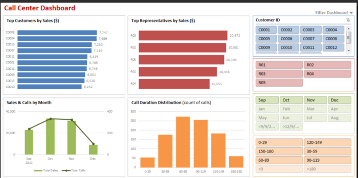
These make it much easier to understand data trends, right?
If you’re presenting the information in your pivot table to your sales force, marketing team, or accounting department, you can use visuals like these to convey your message.
Sure, the pivot table is great. We’ve already established that.
But you can take the information from your table one step further if you’re giving a presentation.
How? With a pivot chart.
Step 6: Create a Pivot Chart
To keep things simple, I’ll continue with the same hypothetical data from the example we used earlier.
Click any Cell in Your Pivot Table
It doesn’t matter if it’s a word, number, total, or header.
Just make sure a cell within the table is highlighted.
Go to the “Analyze” tab in the Top Ribbon
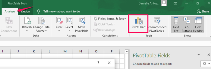
Then click on the PivotChart icon.
Choose a Chart From the List
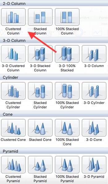
I’m selecting a clustered column for this data set. It’s a good visual representation of the information over three months.
When you’re doing this, feel free to choose any option.
With that in mind, it’s best to keep it simple, especially if you’re giving a presentation.
Analyze the Chart
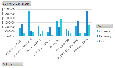
It’s a great visual aid to measure performance and compare it to your marketing strategy.
Let’s dive a little deeper into this information.
Michael Brennan had an outstanding month of January.
In fact, it was the highest-performing month out of every sales team member in the data set.
What caused him to drop off so drastically over the next two months?
It could be based on several factors, but let’s play out a couple of reasonable scenarios.
It could be a marketing issue. Compare this information to what changed in his region over these months.
Did you scale back your marketing efforts? Did you change your strategy?
You need to create an effective marketing strategy and stick to the plan.
If you changed something on your e-commerce website, it could impact your data as well.
Here’s a video where I explain how to optimize your e-commerce product pages.
Maybe Michael lost motivation, and his numbers dropped as a result.
Motivated employees tend to work harder, which results in a higher customer satisfaction rate and better productivity.
If Michael has already met his maximum commission quota for the quarter, he won’t be as motivated to continue selling your product.
To fix this problem, you might give your employees uncapped commissions or find other ways to keep your staff motivated.
You need to motivate your personnel to keep your team tightly aligned.
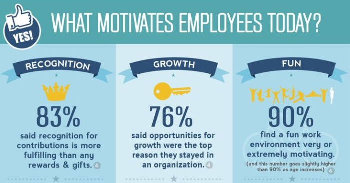
Outside of financial motivation, here are the top reasons employees stay motivated, according to KMI Learning.
What can we learn from this?
Sure, the numbers we used to create the pivot table, and pivot chart was hypothetical.
But they still speak volumes to scenarios you may encounter while analyzing your own data.
It’s not always a lack of advertising or error in the marketing department that impacts your sales numbers.
There are other external factors to take into consideration while you examine these figures.
Here’s something else to consider about your marketing data.
You need to have clear goals set, so you know what to measure and analyze.
Write down your marketing goals.
These are the steps you need to take to analyze your marketing data effectively.
- Set your goals and objects.
- Manage your data (using a pivot table).
- Analyze and report (with a pivot chart).
When you break it down into these three simple steps, it’s really not that difficult.
Conclusion
Data is an essential component of a successful marketing campaign.
And it’s underutilized by most businesses.
How can you effectively analyze your marketing data?
First, you need to get all your information organized in Microsoft Excel.
From here, you can easily create a pivot table that will turn your raw data into something you can analyze to evaluate your marketing campaign.
Then take this evaluation one step further with a pivot chart. It’s a simple process that only takes a few extra clicks.
Pivot charts aren’t as complicated as they sound.
Now that you’re familiar with making them and using them as a marketing tool, you can get started analyzing your data to better understand the effectiveness of your marketing plan.
You’ll have it done in minutes. Then, use these Excel hacks to take your marketing even further.
What data will you use to create your first pivot table? What might you learn about your marketing efforts?
Are You Using Google Ads? Try Our FREE Ads Grader!
Stop wasting money and unlock the hidden potential of your advertising.
- Discover the power of intentional advertising.
- Reach your ideal target audience.
- Maximize ad spend efficiency.