 Sign In






High conversion rates have become somewhat of a myth.
Some people talk about them as if they’re Bigfoot. They believe converting well doesn’t really happen, that it’s just fiction.
Others say that only an elite few can achieve super-high conversion rates.
Me? I think that’s total baloney!
It’s completely possible to convert well. The rates you’ve dreamed of can become reality.
I know because I’ve done it, and I’ve watched others do it.
While there’s no magic equation that you can follow, there are certain elements that every high converting page has in common.
I don’t want you to have to figure those out on your own, so I’m going to talk about them in this article.
Some of my clients have been able to build pages that convert at 26%.
Yes. You read that correctly.
How would a 26% conversion rate change your business? How much more money would you make?
I’m going to show you exactly how to replicate that success.
Specifically, I’ll be talking about e-commerce.
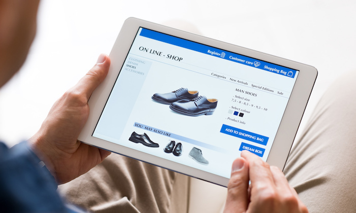
It doesn’t matter if you’ve just started an online store or if you’ve been in business for years. If you need a product page that converts like crazy, this article is for you.
Start with your unique value proposition
Your unique value proposition (UVP), also known as a unique selling proposition, is the main benefit you offer.
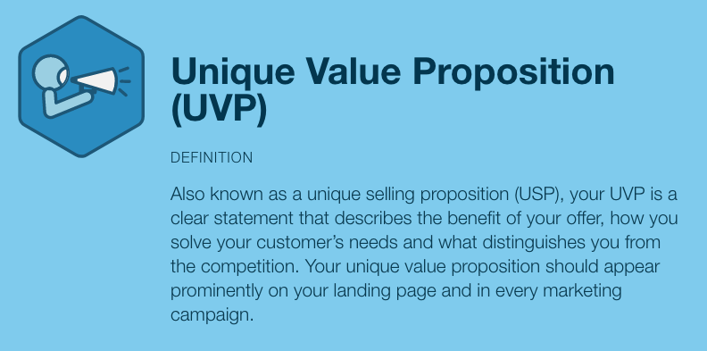
Your UVP is the focal point of your product page. It’s what everything you do should revolve around.
Your customers have to know what they’re going to get out of your product. If they don’t, they’re not going to hang around your page to find out.
You might have heard of the saying “sell benefits, not features.”

Your UVP is the big benefit you offer.
It’s easy to tell what Shopify’s UVP is:

See how it’s plastered front and center on the page? That’s what you should do.
This is how several of the best product pages I know are structured.
But you have some flexibility here.
Shopify tells its users exactly what it is. But you can also lead with a bit of intrigue.
Look at RainmakerPlatform.com:
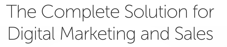
The big text is definitely a benefit, but it doesn’t tell you what specifically you’re looking at.
It makes you want to keep reading, right? Sure enough, you find the UVP in the next paragraph:

That’s another way to approach the UVP.
Whatever you choose, make sure your visitors know your UVP within 10 seconds. Within 5 is even better.
Each second is precious. 55% of people spend less than 15 seconds on a page.
Every second counts––literally.
That’s why it’s important to make your benefit clear right from the start.
But what if you don’t know what your UVP is?
It’s pretty easy to come up with one.
First, think about what value you bring. What does your product or service actually do for people?
The more specific, the better. “Get 2x your current sales in 3 weeks” is much better than “get more sales.”
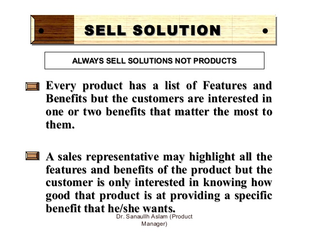
Second, ask yourself what makes that value truly unique. There are tons of businesses in your space. Why do you stand out?
It’s a tough question, and it may help you find some areas for improvement.
If you can’t answer that question, you need to figure out why.
You should be one-of-a-kind at something. Find that something.
Once you’ve answered both questions, you can create your UVP.
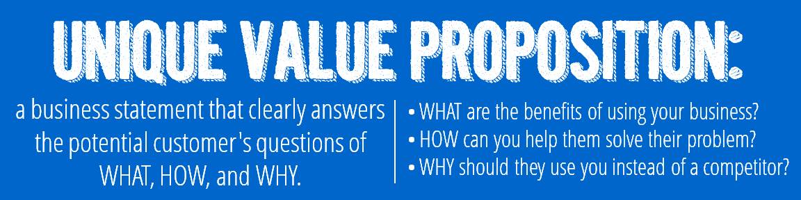
If you want to read more about UVPs, check out this guide.
Don’t move on until you have a killer UVP. It will make or break your page, so don’t continue without it.
Nail the copy
Copy is a crucial part of any strategy. Whether it’s SEO or marketing, it’s one of the most critical parts to get right.
If you want to sell your product, you need to have remarkable copy. That shouldn’t be a surprise.
What might be surprising is just how much your copy affects your customers.
German company L’Axelle found that making their page copy more action-focused led to a 93% increase in clicks. No joke.
Here’s the old copy:

And here’s the revised copy:

A few small changes led to almost double the number of clicks on the page.
That’s how important copy is.
For e-commerce, I like to use the AIDA formula.
If you haven’t heard of it, it stands for Attention, Interest, Desire, and Action.
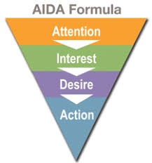
It’s a go-to formula that almost every copywriter uses.
Why? It produces some amazing results. It’s a tried and true strategy that always works.
I’ll break down AIDA specifically for an e-commerce setting.
Grab your users’ attention
If you want to draw attention, you have to read your customers’ minds.
I know that sounds impossible, but you can actually do this.
Reading your customers’ minds is all about figuring what they want at this point in the sales funnel.
If someone is visiting your product page, they’re at the top of the funnel.
This fits into the AIDA formula:

This doesn’t mean that you have their attention. It means that the user is at the stage where they want their attention to be grabbed by something.
That’s where your copy comes in.
On most e-commerce pages, there’s a headline or “marquee” copy.

This is usually the first thing your visitors will see.
This copy carries a lot of weight for your page. It has to capture your visitor’s attention and keep them interested.
There are other elements at work too, but we’ll get to those later.
Your headline copy has to scream a benefit.
It doesn’t have to be long, but it has to be impossible to ignore.
You know when you hear a song and it gets stuck in your head? That’s what you want your copy to do.
Specifically, your copy should give your visitors a reason to be interested.
Let’s look at Wistia’s headline text.

Wistia won’t get any awards for being an exceptionally cool product, but it’s clear what Wistia is.
If you were in need of video hosting for your business, this headline copy would immediately demand your attention.
It’s short and to the point, but it doesn’t sacrifice any detail. That’s important.
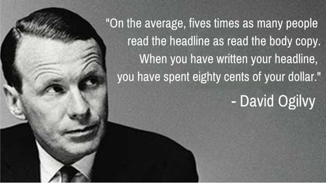
Spend a good amount of time on your headlines.
It’s not unusual for a copywriter to spend more time on the headline alone than any other part of a page.
Specifically, I’ll be talking about e-commerce.
Like I mentioned earlier, the copy isn’t the only thing that’s going to grab your users’ attention.
Photography and other media play a huge role in this.
When’s the last time you saw a product page that was just text? I’ll bet you never have.
That’s because media goes hand in hand with your copy. It will emphasize your copy and paint a vivid picture for your customers.
Take another look at Wistia’s site right below the headline.
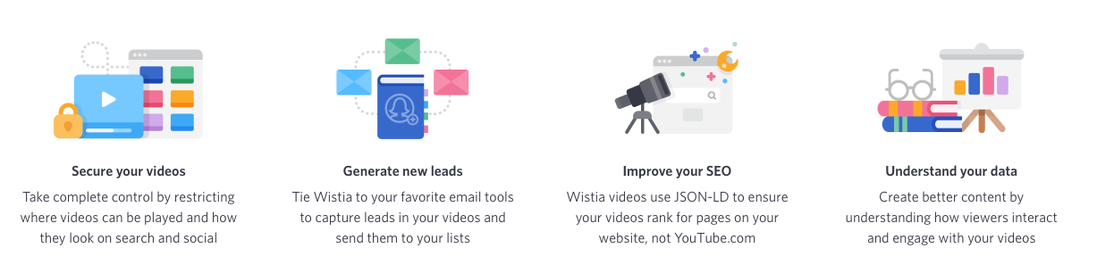
They include nice graphics to accompany the copy.
Even though you don’t see the product itself in action, you know exactly what it can help you do.
Square’s product page for their credit card reader is even better, in my opinion.

You see the product front and center, and there’s a super simple explanation of what it is.
Just like with Wistia, if you were in the market for a way to swipe credit cards, this would grab your attention.
It’s important to create a ton of appeal at this stage. Your visitors should think that your product or service is the absolute best in its class.
Keep their interest
Let’s look at the next part of the AIDA funnel: the interest stage.
You’ve already earned your visitors’ attention. Now you have to keep them on the page.
This is when you should go all out and describe the benefits your product has to offer.
Wistia emphasizes the ability to get detailed metrics:
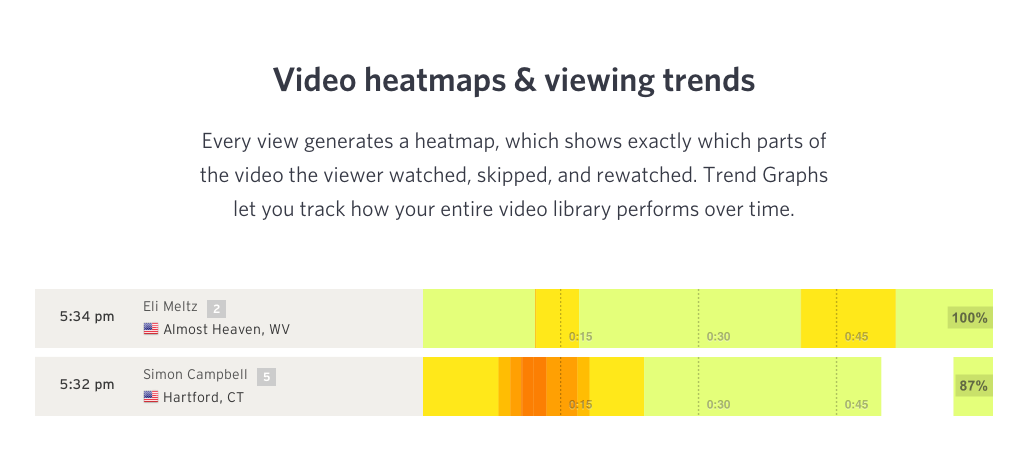
You can also get handy graphs:
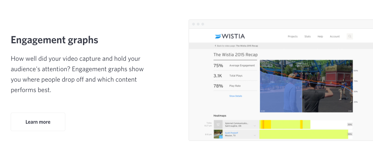
You might be remembering that I said to sell benefits, not features.
And it might seem like Wistia is selling features, but it’s not.
This copy is highlighting the benefits by describing what the features do.
For example, one benefit is being able to see which parts of a video someone watched. Wistia shows that benefit by describing the heatmap feature.
Make sense? Great.
Square’s page also excels at keeping interest:
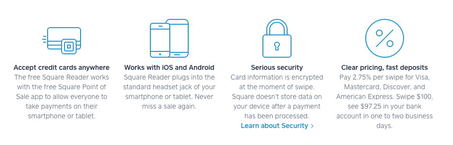
They hook you with an eye-catching headline and product image, then they draw you in by telling you everything it can do for you.
That’s a winning recipe in my book. But it’s not over yet––there’s still two more stages to go.
Create a burning desire
This is probably the trickiest part of the AIDA formula to get right, but it can make a big difference.
Somewhere on your page, you need to make your user feel an immense desire for your product. They need to know that your product meets their needs, and as a result, they should feel like they have to have it.
I personally think you should create desire throughout your product page by using copywriting techniques.
But it’s also okay to dedicate a section to creating this desire. There are a few ways you can do this, and they all involve using social triggers.
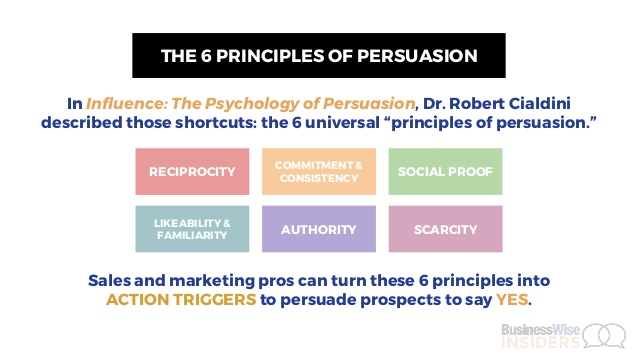
There are six main social triggers: reciprocity, commitment, authority, social proof, scarcity, and liking.
For your product page, the last four triggers can work wonders.
For example, Square creates desire by including testimonials:
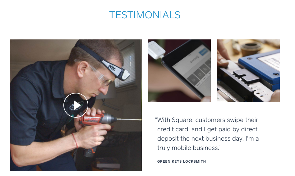
This creates social proof and lets your visitors know that other people are benefiting from your product. This makes your visitors want to join in.
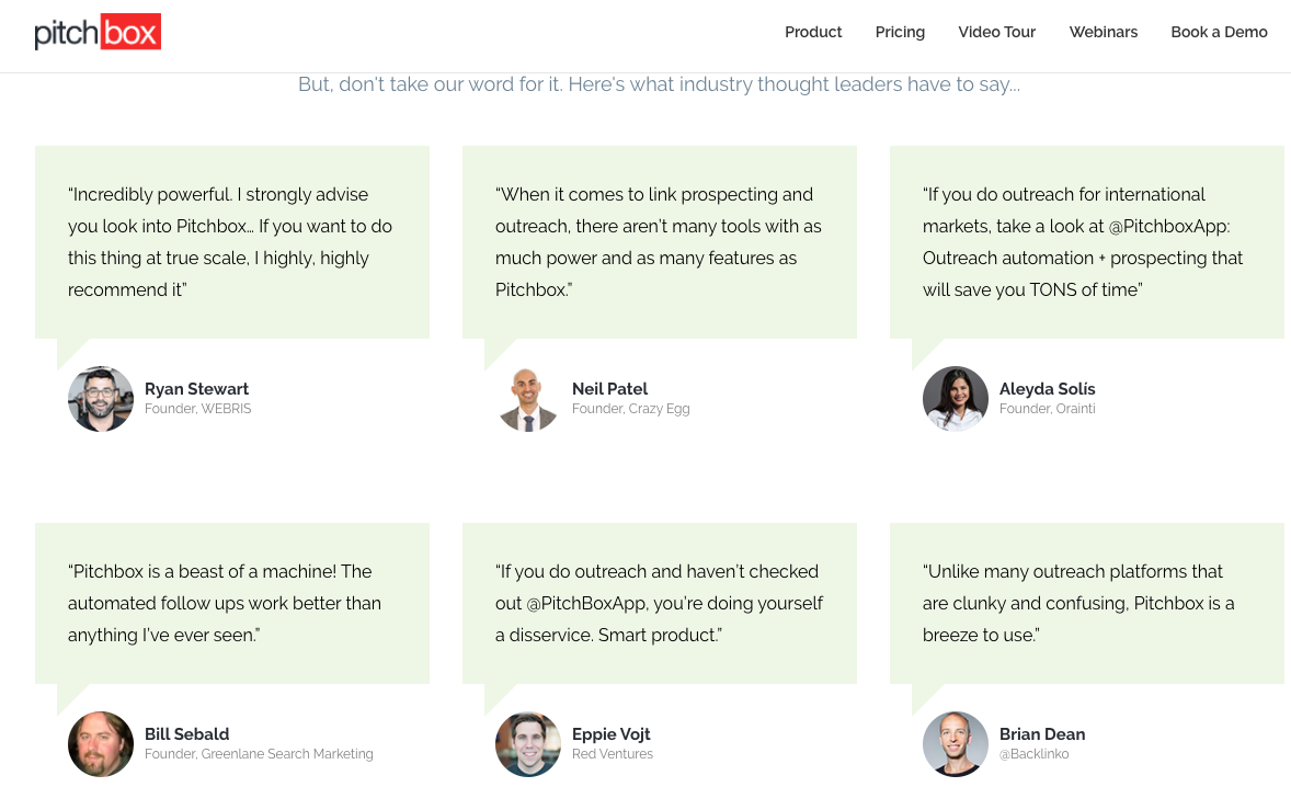
You could also use quotes from influencers to create authority.
Pitchbox has a testimonial section from influencers like Brian Dean, Ryan Stewart, and yours truly:
You should leverage at least one social trigger to help create desire. If you want to use more, that’s great.
Make your users take action
At this point, your visitors are ready to commit. They’ve made it all the way through your page, and they want your product.
It’s time for your visitors to take action.
Unsurprisingly, this is where your call-to-action (CTA) comes in.
CTAs are a big deal. I mean big. If you have a weak CTA, you’re not going to get those sweet conversions you’re after.
Writing CTAs is an art form in itself, and I recommend you research it.
But there are some elements that are crucial for e-commerce.
First, make sure the CTA isn’t boring. I see hundreds of boring CTAs every single week.
It makes me sad.
These pages are losing sales just because they didn’t put enough effort into their CTAs.
So don’t make your CTA boring.
By “boring,” I’m talking about CTAs that use stock phrases like “Buy Now.”

You’ve seen these thousands of times before. They’re not interesting, and they don’t compel you to click on them.
On the other hand, if you use an exciting CTA, you can push your users over the edge and make them click.
To make a CTA that stands out, you need to let users know that by clicking on it, they’re able to get a benefit.
Let me show you what I mean. Square’s CTA is amazing:

I’ll bet you want to click on that even if you don’t need a card reader.
You instantly know the benefit. No question about that. That’s why this CTA works so well.
I know, I know, your product probably isn’t free, but don’t worry.
This CTA isn’t great just because it says “free.” It’s great because it’s compelling and specific.
Don’t believe me? Here’s another engaging CTA without “free” in the text from MyPerfectResume.com:
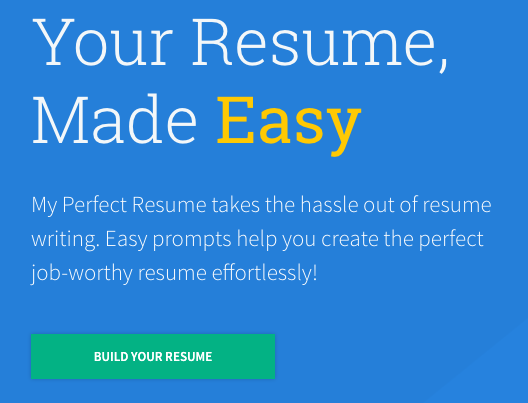
It’s still a highly clickable CTA. You know what the benefit is right away, and you know how to get it.
See the pattern?
Your users need to know what benefit your CTA will give them.
Clicking on the CTA is the action you want your users to take.
This doesn’t have to be a buy now CTA, however. You can also use the CTA to link to more information about your page and send users down the funnel.
Zendesk uses two CTAs to cater to users at different levels of interest:
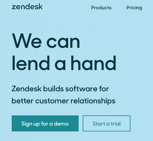
You don’t have to take this approach, and truthfully, it won’t work for every site.
But it goes to show that an e-commerce page can have a variety of CTAs that compel the user to take action.
One last note on page copy. Pay attention to the way you format your text. ConversionXL found that text formatting and images can make a big difference.
Optimize your checkout page
While your checkout page is technically different from your product page itself, it still plays an important role in the conversion process.
This is what separates the okay sites from the great ones.
If your checkout page is standard, you’ll probably get a lot of sales. But you could also lose a lot.
However, if you go above and beyond on your checkout page, you’ll maximize conversions.
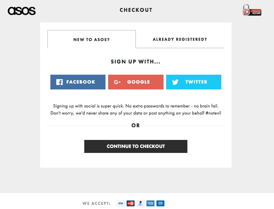
ASOS has one of the best checkout pages I’ve seen. When you go to check out, you get several options to continue:
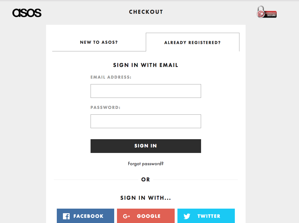
After just a couple of clicks, you get to the actual checkout page, which is super simple but oh so effective:
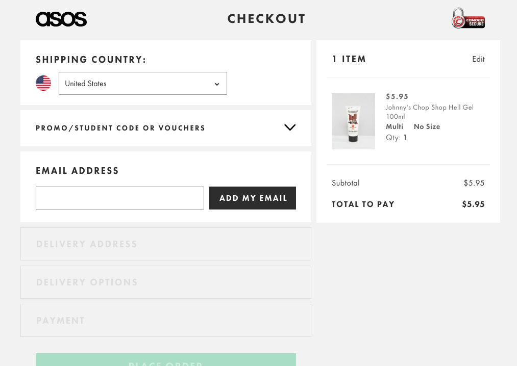
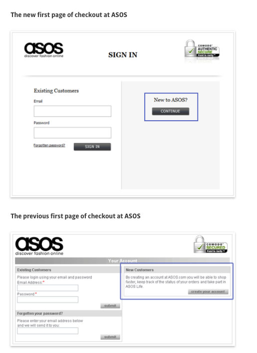
This checkout page has proven successful. ASOS was able to decrease abandonment by 50% with the new design.
So how can you optimize your checkout page? Here are a few tips.
Make checking out simple. Don’t force customers to create an account. Too much hassle will drive away customers who are ready to buy.
Focus on reducing cart abandonment. This is one of the biggest epidemics for e-commerce sites. You’ve probably experienced it yourself.
The good news is that it’s totally avoidable. Read up on how to defeat cart abandonment, and your bottom line will thank you.
Optimize for mobile. You’re probably sick of hearing me talk about mobile optimization, but it’s integral to a high-converting checkout page.
Most of your users will be on their mobile devices, so design your checkout page accordingly.
Conclusion
Is there such a thing as the perfect e-commerce page?
Think about that question for a moment. Is there really?
To be honest, I’m not sure. But I want you to try to find out.
Try to build the perfect e-commerce product page. The product page to end all others.
Does this sound ambitious? Sure it does.
But I think you should aim as high as you can. That goes for everything you do.
Your product page deserves a lot of attention. After all, your customers are going to be scrutinizing it, so why shouldn’t you?
Putting in the effort now will mean more sales in the future.
While these tactics won’t instantly make your conversion rate sky high, they will help you in the long term.
Keep pushing yourself and finding new ways to make your product page even better. You’ll be glad you did.
What techniques do you use on your product page to increase conversions?