

Key Takeaways
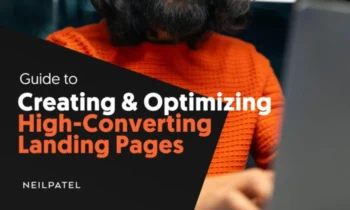
- A landing page is a webpage created with a singular purpose—to generate a conversion, whether that’s a lead, sale, subscription, etc.
- There are five main elements that every successful landing page should have—a bold headline, consistent copy, social proof, one singular offer, and a call to action.
- Looking at landing page examples can be a great way to gather inspiration before you start building out your own landing pages.
Would you rather have a beautiful website or a website your customers love?
From a business perspective, you shouldn’t choose either. You should want a high-converting website, instead. And this is where landing pages are so important.
A landing page is a key component in any marketing campaign. Whether you’re running a digital ad, sending an email letter, or posting on social media, you need a webpage that you can send interested visitors to that can help generate leads and conversions.
Many people get caught in the trap of creating designs they like without thinking about what their prospective buyers want and need. Unfortunately, this creates a leaky funnel that’s hard to fix.
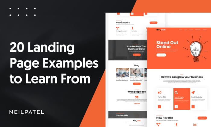
But if you want to buck that trend and create landing pages that convert, I’m here to help. In this article, we’ve compiled a list of 20 landing page examples you can gather inspiration from.
We’ll go over each one’s strengths and weaknesses, so you’ll be able to walk away knowing what it takes to create a high-converting landing page for your business.
What Is a Landing Page?
A landing page is a single webpage designed with a single goal in mind. That goal could be:
- Selling a product
- Signing customers up for a service
- Promoting a product feature
- Sharing an e-book, report, or white paper
- Increasing newsletter subscribers
Potential leads or customers “land on” the webpage, giving it the name “landing page.” It’s a simple page that dives fully into a single offering with the intent of selling the visitor whatever it’s promoting.
5 Elements of an Effective Landing Page
As you scroll through the landing page examples we share below, you might notice that they all appear to follow a similar formula. That’s because you don’t fix what isn’t broken, and the key landing page elements are not broken.
There are five main elements that any high-converting landing page needs to include:
- Bold value proposition at the top of the page. The top of the landing page should clearly state what it’s promoting and why the webpage visitor needs it.
- Messaging consistent from the ad or post that led to the landing page. Upon clicking to your landing page, viewers should see a consistency in messaging from the ad or social media post that initially led them there. That messaging should clearly communicate what the page is promoting, giving further information than the bold heading at the top.
- Social proof, case studies, reviews, testimonials. Social proof is where people tend to lean towards choices that they’ve seen others make, which is why reviews and testimonials can make such a big impact. Include this type of social proof on your landing page to convince people to take action.
- One single, hyper-focused offer. You should be focusing your landing page on one single topic or offer, whether you’re promoting a single software feature, a single service, or a single lead magnet.
- A clear call to action. What do you want people who visit your landing page to do? Use that as your call to action. Make it clear, bold, bright, and easy to click.
20 Amazing Landing Page Examples
Need some inspiration for your next landing page? Check out these 20 examples that you can get inspiration from.
1. GetResponse
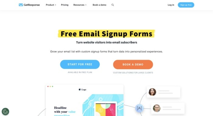
GetResponse is an email marketing platform. This landing page is highlighting a key feature—email signup forms meant to help businesses build their email lists. Powerful headline, check. Eye-catching image, check. List of current clients, check. List of features, check, You get the idea.
It’s quite long, but that just gives the Get Response team more to convince you to create a free account. And there are plenty of CTAs along the way in case you missed the one at the very top of the page.
Three takeaways from GetResponse’s landing page:
- Highlight your copy to make it even more impactful. GetResponse highlights important words and phrases throughout the landing page, drawing your attention to them and making their copy pop.
- Use social proof. The landing page includes a slideable widget filled with customer testimonials that mention this specific feature and how well it works.
- Use multiple CTAs. Because GetResponse’s landing page is so long, they scatter it with CTAs at the end of every section.
2. Slack
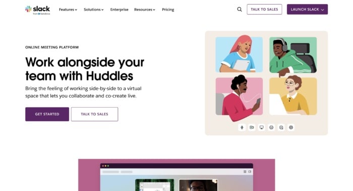
Slack is always on top of its game when it comes to creating some of the best landing pages. They are constantly optimizing for conversions, and that’s the best way to find your winning landing page. This landing page showcases one of its features—voice or video huddles that happen in real time, letting team members essentially call each other to hash something out quickly.
Three takeaways from Slack’s landing page:
- Keep your navigation bar bare. Slack only includes the most important elements in the navigation bar on this landing page: letting current user login and prospective users talk to sales.
- Show the difference between free and premium. If you have a popular free version, use your landing page as a chance to show what users are missing out on by not upgrading.
- Take advantage of multimedia. The page includes looping animated videos that showcase each of the main features, letting interested users see them in action before signing up.
3. CrazyEgg
This landing page for heatmapping software CrazyEgg showcases a specific feature that the software offers. In this case, it’s the ability to create website pop-ups to increase conversions.
The page leads with a demo link and breakdown of the feature, before you see more detailed information on how it works further down on the page.
Three takeaways from CrazyEgg’s landing page:
- Provide basic instructions. The landing page includes a basic step-by-step for how users can set up pop-ups using the CrazyEgg tool, showing just how quick and easy it is and further selling them on the software.
- Show versatility in applications. The use cases section shows how a variety of different industries can benefit from using this tool.
- Use trust badges. CrazyEgg’s landing page is dotted with trust badges from the likes of G2 and Capterra, adding instant credibility to their offering.
4. Lyft
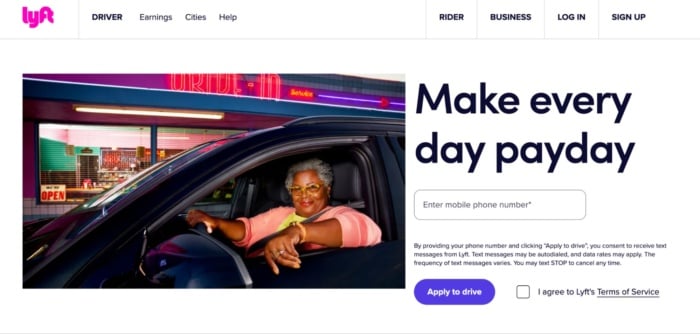
Lyft has been growing in the past years, and its website, landing page, and overall online funnel is a driving force, too. They focus on attracting new drivers that want to control their own life.
Once again, we see a giant, attention-grabbing headline that entices users. Now check out the button “Apply to drive.” It implies that it’s not 100 percent sure you’ll be able to get the position — which makes it even more enticing while also stopping candidates from getting carried away.
Three takeaways from Lyft’s landing page:
- Make a point with your images. I’d bet Lyft wants to attract female drivers, which is exactly why they’ve chosen the feature image on the landing page.
- Customize data requests. Most landing pages ask for an email. But because Lyft is an app, it asks for your phone number instead.
- Link off to learn more. You don’t want to overwhelm users with information on a landing page, that’s why linking to other pages (as Lyft has done) can be a useful strategy.
5. Zoho
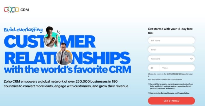
Zoho’s landing page is a great example of a more full-on, but still extremely powerful messaging. They use more text than the average landing page in the industry, but that’s not necessarily bad. It just means users have more information to make a decision. And in a crowded industry like the CRM space, that can be a highly effective thing.
Three takeaways from Zoho’s landing page:
- Give your users a why. Don’t let users guess how your software stands out. Show them exactly why they should use your software.
- Show how you compare. Comparison tables are a highly effective way to stand out in a crowded marketplace.
- Talk price. If price is a USP for your brand, then mention it. Zoho shows how much users can save by using them instead of a competitor like Salesforce.
6. Squarespace
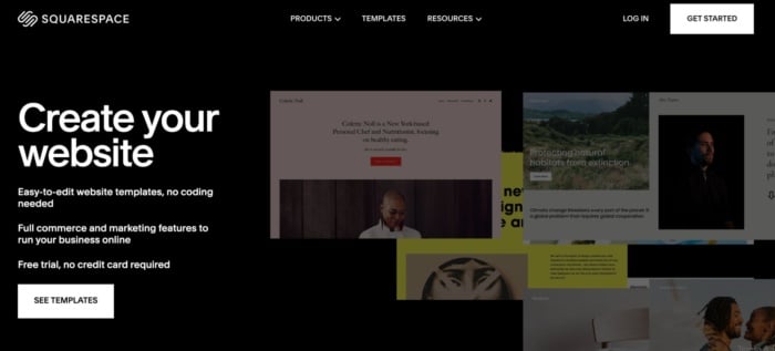
Squarespace is a contender for the shortest landing page ever. Seriously, there’s not much more to it than the screenshot I’ve taken above. But that doesn’t mean it isn’t effective.
Rather than trying to get you to create an account, all Squarespace wants you to do here is look at the templates. I reckon they know that once you see how good the templates are and how easy the platform is to use, you’ll be hooked.
Three takeaways from Squarespace’s landing page:
- Short can be sweet. You don’t have to have a massive landing page to convince users to take action. A couple of enticing benefits may be all you need.
- You don’t need much color. Everyone knows color can be used to convey emotion to users. But it’s not essential. And because it’s not on-brand for Squarespace, it’s not used.
- The rule of three. Three is a magic number in marketing and Squarespace uses it to get across their core USPs.
7. ActiveCampaign
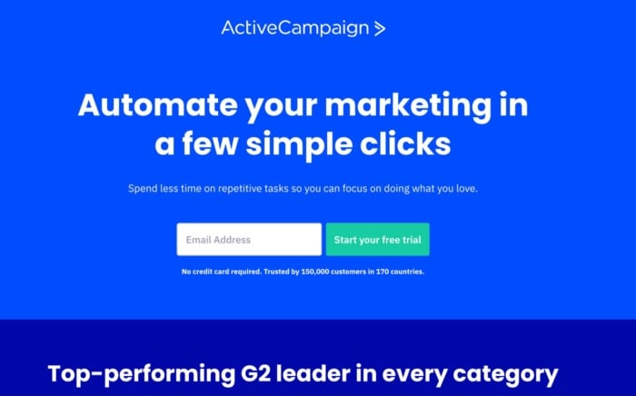
If there’s one thing you can’t fault ActiveCampaign’s landing page for, it’s brevity. They get straight to the point with the key benefit of their platform and encourage you to start a trial by entering your email address. Scroll down further and the rest of the page is similarly pared back, only including key information users need to know.
Three takeaways from ActiveCampaign’s landing page:
- You don’t need fancy graphics. There are no eye-catching images above the fold and only two in total.
- Lean on an authority. Are you highly rated by a trusted authority like G2? If so you can do what Active Campaign has done by showcasing all of your badges.
- Show how your platform works. Images are great, but showing how to use your platform can make a huge difference in your conversion rate.
8. HubSpot
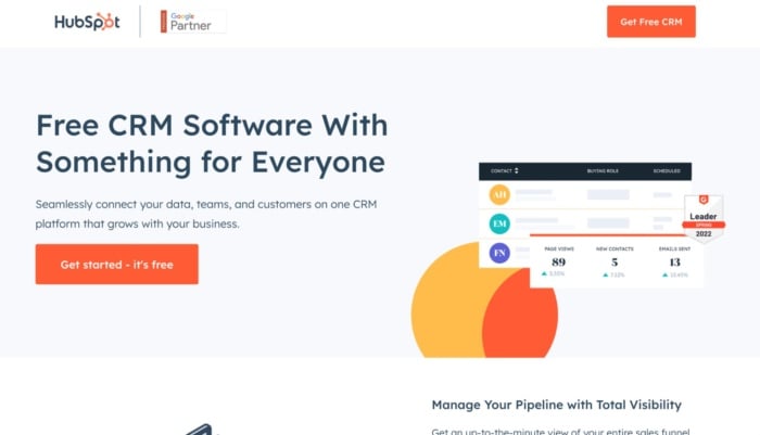
Cost is a big hurdle for any small business looking to purchase a CRM. That’s why HubSpot makes such a big deal of its free offering in this landing page. But just because you get the software for free doesn’t mean it’s limited. That might be your first thought, but HubSpot assuages those fears by showing all of the features you get below.
Three takeaways from HubSpot’s landing page:
- Get your point across fast. The first three words users read on this landing page will be exactly what they are looking for: free CRM software. They don’t need to know much more to get started.
- Reiterate your USP in your CTA. You can use your CTA to back up your headline by tacking on a short message or reason to take action as HubSpot has done here.
- Use white space. HubSpot’s landing page isn’t too busy or crowded. There’s loads of white space, which makes it super easy to read.
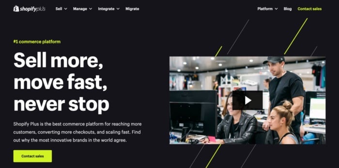
9. Shopify Plus
Source
Shopify Plus isn’t designed for bootstrapped e-commerce stores or side hustlers. It’s an enterprise product and that shows in this landing page. It talks directly to big businesses, addresses their specific concerns, and shows them the kind of results they can achieve. Best of all, it’s topped off with a piece of ultra-professional video marketing that’s also designed to appeal to the brand’s target audience.
Three takeaways from Shopify Plus’s landing page:
- Tailor your CTA. Enterprise customers aren’t going to make a purchase straight away. That’s why Shpoify encourages them to contact their sales team rather than book a demo.
- Use statistics. The landing page gives hard data about how much better stores can perform by using Shopify Plus. This is much more powerful than a throwaway comment.
- Speak to your customer’s values. Shopify devotes a large chunk to talking about the performance of their platform — something enterprise companies care about deeply.
10. Webflow
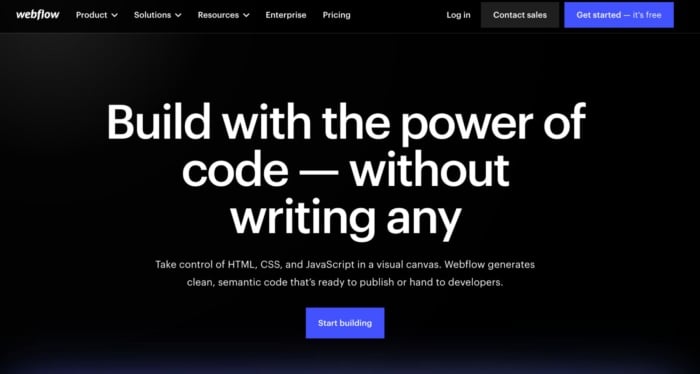
There’s a reason designers aren’t web developers — most don’t know how to code. That doesn’t stop them from designing great-looking websites, but it does mean they need help. Not if they use Webflow, however. Webflow lets designers design and code powerful websites without having to write any themselves. And because the company knows its target audience, everything on the landing page is designed to appeal to designers — from the images to the testimonials to the copy.
Three takeaways from Webflow’s landing page:
- Tailor your landing page to your target audience. This landing page won’t appeal to anyone who can’t design. But that’s the point. Those people won’t use Webflow, designers will.
- Double down on social proof. Webflow understands the power of social proof, which is why they highlight their existing customers multiple times on the page.
- Show, don’t tell. Webflow ends the landing page by showing designers exactly the kind of sites they can create with the platform.
11. ClickFunnels
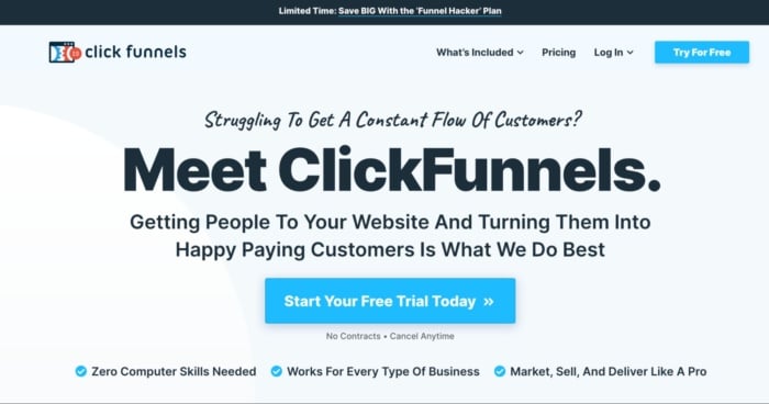
The goal of the ClickFunnels landing page is to get you to start using its software. They know that once they’ve got you on their platform, you are way more likely to start paying. With that in mind, everything on the page is geared at showing how easy it is to get started and what you can accomplish with the software. There are dozens of testimonials of high-profile salespeople who have made serious bank with the software and copy that challenges any preconceived ideas you have. It’s a masterclass in persuasive landing page design.
Three takeaways from ClickFunnels’s landing page:
- Let your customers sell for you. Testimonials are so powerful. If you have them from the right people (the kind your prospective customers want to emulate) then they’ll do most of the hard work for you.
- Attack objections early. ClickFunnels does a great job of overcoming common objections (like you need to have good computer skills or your business isn’t a good fit) above the fold.
- Use CTAs liberally. There is a CTA banner after every section on this page, giving users every opportunity to convert.
12. Conversionlab
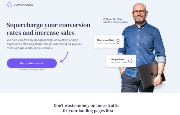
Conversionlab has been using this landing page design for years now. I’ve noticed they split test different button CTAs, like book a call, get a free consult, and many more. Keeping their Founder on the main page of the website builds a long-term relationship many businesses nowadays miss out on. They clearly state their services through their persuasive headline and, even if you’re not ready to book a consultation, a pop-up will appear collecting your email.
Three takeaways from Conversionlab’s landing page:
- Put your team front and center. You can build instant relatability with users by putting your team members on your landing page.
- Don’t be afraid to give it all away. Conversion Lab’s landing page explains in detail what it’s like to work with them, so every prospect knows exactly what to expect.
- Try twice to convert. Following up with an email (collected via pop-up) is a great way to ensure that a high percentage of prospects that land on your website will end up booking a call with you.
13. Semrush (404)
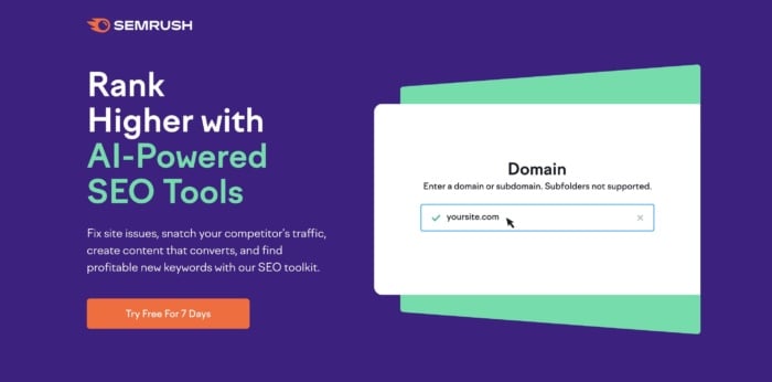
Semrush is an SEO platform. Here’s a landing page example for their tool that showed up as an ad in organic search. The button is bright (and on-brand) and makes it clear what your next step would be. The main headline focuses on the benefit — grow your online visibility — and the third line focuses on another key benefit — you only need one platform. That’s appealing to marketers who are juggling a ton of tools.
Three takeaways from Semrush’s landing page:
- Know your audience. The landing page’s CTA focuses on a known pain point of digital marketers: that they have to juggle dozens of different tools.
- Roll out the big guns for testimonials. Semrush lists some of their biggest customers prominently on the homepage. If these massive companies use the platform, surely you should, too?
- Use variety with your CTA buttons. Each of the CTA buttons lead to the signup form, but the copy is different in each one, ensuring they hit the pain point that will get someone to click, no matter where they’re at on the page.
14. HelloFresh
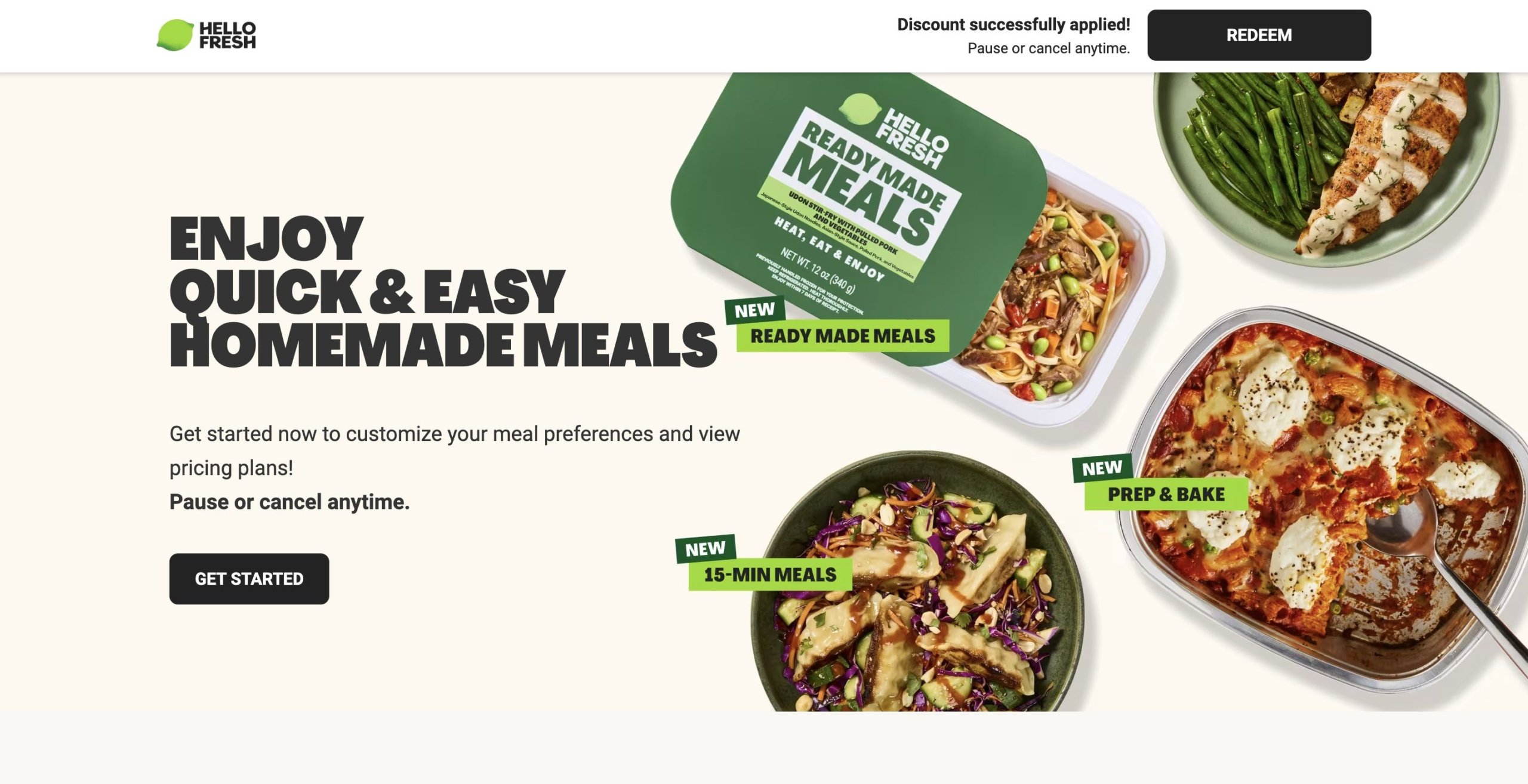
Source
HelloFresh is a meal-kit delivery service, and this landing page is another ad-based page that’s focused entirely on its offering, with no additional navigation.
Like other landing pages, the content is limited. They use a heading, CTA, and images to show how the platform works and some of the user options. However, I suspect that’s on purpose — after all, the premise is relatively simple, it’s more about showing how the service fits into people’s lifestyles.
Three takeaways from HelloFresh’ landing page:
- Strategic discounts make a difference. The page is offering a discount, but it’s automatically applied the second someone clicks on the page, creating an enticing offering that requires no additional effort on the customer’s side—they just have to click “Redeem” or “Get Started.”
- Use high-quality visuals. HelloFresh prides itself on high-quality, fresh ingredients, and the images here present these front-and-center.
- Strategic link placement. The carousel at the bottom is neatly aligned with different dietary needs and preferences, helping move users down the sales funnel.
15. Doordash
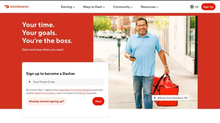
Doordash probably doesn’t have to worry as much about getting customers as it does about recruiting new drivers to meet demand. That’s the goal of this landing page that shows users what they stand to gain from becoming a Dasher. It’s on-brand, carefully lays out the benefits of becoming your own boss, and shows you how much you could earn. The only thing it’s missing is social proof.
Three takeaways from Doordash’s landing page:
- Put the user front and center. Everything on this landing page, from the copy to the images revolves around the user. It’s about what they can achieve and speak directly to them.
- Pre-qualify users on your landing page. Doordash clearly lists the requirements drivers have to meet, meaning they’ll need to spend less time vetting candidates in the future.
- Don’t rule out the impact of social proof. The lack of testimonials from current Dashers really lets this page down. The experience of current drivers is probably high on a prospective driver’s checklist.
16. Airbnb
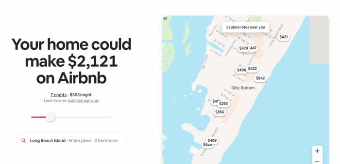
Want to know how much you could rent your property for on Airbnb? That’s exactly what the company’s landing page helps you to understand. This fun and interactive landing page gives users a taste of what they can earn by renting out their property on Airbnb and then shows them how easy the process is.
Three takeaways from Airbnb’s landing page:
- Dynamic pages can work a dream. As soon as you land on Airbnb’s landing page it automatically changes the content depending on your location. That creates a highly personalized and interactive experience that’s more likely to convert users.
- CTAs don’t have to take center stage. The CTA to create an Airbnb account is tucked away in the right-hand corner of the page. But that doesn’t make it any less prominent or visible.
- Make it interactive. Users can play with the slider bar to see how much they could earn by renting out their property for longer. The more you slide, the bigger the number gets, and the more tempting it is to create an account.
17. Zillow
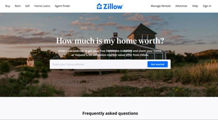
Every homeowner wants to know how much their property is worth. It’s that simple desire that Zillow capitalizes on with this landing page, which aims to generate leads for the company’s mortgage business. It’s short, simple and incredibly alluring for both curious homeowners and buyers looking to understand the potential value of a new home.
Three takeaways from Zillow’s landing page:
- Eye-catching imagery can play a big role. The biggest element on Zillow’s landing page isn’t the CTA, but the image behind it. It’s doing a lot of legwork creating an aspirational feel to the page.
- Clearly contrast copy and images. There’s a danger that the overlay copy on the background image could get lost. But Zillow does a great job of ensuring the contrast is clear and the copy is readable.
- Give users more information, but only if they want it. There’s a tendency for the best landing pages to overwhelm users with information. Zillow avoids this by providing FAQs that only appear if users click on them.
18. Visme
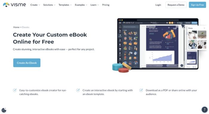
Visme is a graphic design tool that offers a number of templates for different types of business-centric designs, like presentations, infographics, e-books, and the like. This landing page is all about the fact that you can create e-books with the tool, highlighting only e-book templates and other features related to e-book creation.
What I like:
Three takeaways from NP Digital’s landing page:
- Brand consistency matters. All of the copy and images are related to this singular type of design. This page is perfect for ebook-related ads but also a great SEO play as well.
- Showcasing different product. The examples section does a great job showing off the variety of different e-books that this product can make.
- CTAs after key features. The page design here places the CTA button after all the different breakdowns of major features, meaning that the user can buy as soon as they see the feature that matters most to them..
19. Wix
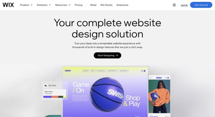
Wix is a website builder, and this landing page goes all in on its website design capabilities. It showcases all features related to getting a new website up and off the ground.
Three takeaways from Wix’s landing page:
- Don’t neglect the visual factor. As you scroll, you’re met with colorful blocks that each highlight its own feature, making this a visually appealing landing page that keeps users engaged the entire time.
Show your work. The examples section here does a great job of showing the full breadth of sites that Wix can help build. - Use FAQs (when it makes sense). FAQs can be very useful for helping go into greater detail about a product without clogging up the page experience. They are great for SEO, too!
20. NP Digital
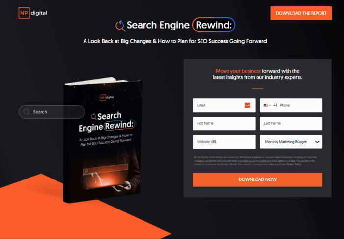
Let’s end with one of the best landing page examples from my digital marketing agency, NP Digital. Unlike some of the other examples in this list, the goal of this landing page isn’t to get people to buy a product or sign up to a service. I want users to download a market research report my team and I created.
As you can see, it’s quite a bit shorter than a normal landing page. That’s because it doesn’t need elements like social proof or loads of images. All I want to get across is a snapshot of what you can read in the report and how you can download it.
Three takeaways from NP Digital’s landing page:
- Don’t let users enter fake information. I email the document to the address you provide in the form. That means you have to enter your correct email address to get the document and I don’t have to waste time scrubbing fake emails from my database.
- Sometimes you can ask for more information. Your opt-in form doesn’t have to be tiny in order to convert. Because I’m giving away a lot of information for free, I can ask for more information in return.
- Long landing pages don’t necessarily make the best landing pages. If you don’t want users to waste time scrolling, don’t make them. Only give them the information they need to convert.
7 Tips for Creating Killer Landing Pages
You’ve seen the best of the best. Now you’re ready to create a landing page that drives business growth. These seven tips will help you create the high-converting landing pages you’ve been dreaming of:
- Include clear calls to action. Your call to action should be specifically tied to your goal and should be supported by everything else on your page, from the headline and body copy to the images and overall layout. Avoid bland CTAs like “Submit” that don’t explain the next steps.
- Keep your landing page forms simple. Only require users to provide the minimum amount of information they need, usually just their name and email. Asking for too much information early on decreases the chances a user will complete the action you want them to take.
- Ensure your copy is clear and concise. The best landing page copy should be clear, easy to read, and make a specific point. Use bullet points, headings, and bold font to make content easier to read. Every single sentence and word on your landing page should serve a purpose, and that purpose should be to support your call to action. If it doesn’t do that, cut it.
- Include vital information above the fold. That includes a benefit-focused headline and a CTA. Hopefully, at least a small percentage of your visitors will be ready to buy as soon as they arrive on your landing page.
- Ensure your landing pages look the same as your campaign ads. If your page is tied to an email or PPC campaign, make sure the landing page echoes the look and feel of the ad or email. The easiest way to do this is to carry over fonts, images, and colors from your campaign to your landing page. This is especially important for paid ads, as it can increase your quality score.
- A/B test your landing page. A/B testing means running two different landing pages and changing just one element to see which performs best. For example, you might use two different images and see which one drives the most conversions.
- Use fewer images and a large font. Visual clutter detracts from the message and CTAs. Larger font sizes are also a good idea to keep visitors’ eyes focused on what matters and reduce eye strain. Just don’t go overboard and put everything in a headline-size font — no one wants to be yelled at.
In general, a great landing page includes:
- A strong heading that includes your main keyword
- A subheading that clarifies the heading
- Copy that explains the offer
- An image, video, or illustration that supports the offer
- A form or CTA button where the user can convert
You might also include social proof or trust symbols, such as reviews, testimonials, and logos of previous customers.
Building Out Your Next Landing Page
While there are some consistent elements between all strong landing pages, the exact design will depend on your goals, your business, and your industry.
Let me ask you a couple of questions that will guide you in the right direction.
What do you want to accomplish with your landing page?
The most common landing page goals are:
- Getting people to opt-in in exchange for free value on a subject.
- Selling a low-ticket product like a book or a mini-course.
- Promoting a free trial offer for a monthly service or software.
You’ve got to know exactly what offer you want to present on your landing page before creating it.
Are you committed to this project or are you just trying out an offer?
Building a high-converting landing page is not an overnight effort.
You might find yourself optimizing a non-profitable landing page for months before it starts generating real returns. If you’re not ready for that, then I recommend you quit before you even start.
Yes, you can get lucky and hit a home run on your first try, but don’t count on it.
Be ready for the long game so you catch the long-term gains that are so much sweeter than a short-term spike in traffic.
What’s your budget?
Before you begin designing your landing page, you need to prepare a solid budget.
You can’t expect everything to go smoothly throughout the process. Problems are going to occur and most times the easiest and fastest way to solve them is to pay someone who is an expert in the field.
That can be a developer, a funnel designer/builder, an ad specialist, or a CRO consultant. Either way, you should be ready to pay someone to do it right so you don’t face the same problems over and over.
In marketing and life, one of the best ways to test the quality of your work is to put it in front of an audience. For landing pages, you can do that by running ads to see if the traffic converts.
If it does, you raise your ad budget and try to scale. If it doesn’t convert at first, then you should let a professional take a look at it.
Even if you already hired someone to build it for you, don’t expect them to help you here. Yes, they could optimize your page, but you’ve got to keep in mind that people have an emotional attachment to their work.
That’s why you need a third party to help you out.
When it comes to optimizing a landing page for conversions, think about hiring an agency.
Big marketing agencies nowadays have had hundreds if not thousands of clients who have been in your exact situation. That’s why hiring a marketing agency to help you increase your conversion is the best bet.
Talking about CRO (conversion rate optimization) there’s no better choice than NP Digital.
I might be biased, but I think it’s the best marketing agency for both SEO and CRO.
If you’re at the stage where you want to optimize your existing landing page but you don’t know exactly how to do it, then book a quick call with a member of my team who can unravel the secret conversion optimization methods your business needs.
FAQs
A landing page is a specially designed page intended to encourage users to complete a specific task (i.e., convert.) They work by highlighting key points, using social proof or case studies to build trust, and providing a CTA to encourage conversion.
Any business with a website should have a landing page of some sort to encourage users to take an action like booking a demo, calling for a quote, or signing up for an email list, etc.
There are several elements that make a landing page effective. First, a clear and compelling headline that instantly communicates the value proposition is essential. Second, concise and persuasive copy that highlights the benefits of your product or service. Third, it needs a visually appealing design that is easy to navigate and optimized for mobile devices. Fourth, a strong call-to-action that is prominent and directs users to take action. Finally, I recommend trust-building elements such as testimonials or social proof to instill confidence.
Conclusion
I hope these best landing page examples can serve as an inspiration to create a high-converting landing page. To get the most out of your landing page, be sure to:
- Find what your best customers struggle the most with and then solve this problem with a short and punchy headline.
- Use credibility and videos if possible.
- Know your goals — Is it to get their email or phone number? Have them call? Start a free/paid trial or something else?
- Use clear and easy-to-follow calls to action.
Finally: always, always optimize your landing pages.
You can NOT be perfect from day one. Every business on this list tests its pages dozens if not hundreds of times before finding the best landing page.
Even then, they still optimize.
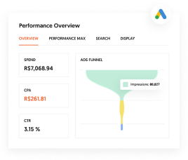
Are You Using Google Ads? Try Our FREE Ads Grader!
Stop wasting money and unlock the hidden potential of your advertising.
- Discover the power of intentional advertising.
- Reach your ideal target audience.
- Maximize ad spend efficiency.