


Struggling to convert your website visitors into customers? Many small businesses overlook one of the most powerful tools in their marketing toolkit: calls to action (CTAs). Let’s fix that.
In this article, you’ll learn how to write a call-to-action that captivates your audience and compels them to convert. I’ll even tell you my strategy for crafting effective CTAs for my blog.
So, if you want to increase your conversion rate, read on!
Key Takeaways
- A call-to-action (CTA) is a prompt that encourages users to take a specific action, like buying your product or signing up for a free trial.
- Calls to action (CTAs) don’t just drive sales—they encourage deeper engagement, like signing up for a newsletter, for example, or capturing customer information (with an e-book download form.
- CTAs come in many forms, including buttons, links, banners, popups, and images.
- Employ several tried-and-tested tactics to improve your CTAs like:
- Using action words
- Evoking emotion and curiosity
- Focusing on the benefits
- Leveraging FOMO
- A/B testing your CTAs
- I use multiple calls to action across this blog. You can see several in the sidebar to your right and one directly below this section.
- My most effective CTA is the full-screen interstitial quiz that appears when you first land on the site. It generates roughly 65 percent of this site’s leads.
- The keyword analyzer box is the second most effective CTA (generating just under 20 percent of all leads) and the “book a call” banner is third (generating 11 percent of leads).
What Are Calls to Action and Why Are They Important?
A call to action (CTA) is more than a website button—it’s your direct line to encouraging users to act, whether that’s signing up for a free trial or making a purchase. They can take several different forms, from text links to buttons and images.
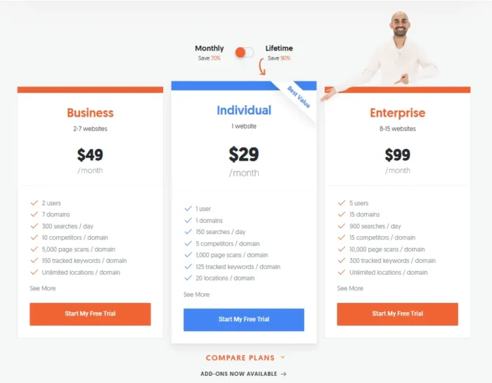
The “Start My Free Trial” buttons on Ubersuggest’s pricing page are examples of CTAs:
CTAs can be direct (buy now) or soft (find out more), depending on where customers are in the buying journey. The higher they are in the funnel, the softer your CTA should be.
Creating a compelling CTA can be tricky. That’s why we use CTA marketing strategies like A/B testing and conversion rate optimization to test different elements until we maximize our conversion rates.
Types of Calls To Action
In a lot of cases, CTAs are conversion-focused. They encourage users to purchase or sign up for a free trial (like in the example above). But CTAs can also get users to:
- Sign up for a newsletter
- Share your content on social media
- Submit a form
- Review a purchase
- Contact a sales rep
You’ll need to adapt your language to your CTA’s purpose. Conversion-focused CTAs can be more direct, but you’ll need to use softer language when asking users to review a purchase or share your content.
Your CTA’s format must also change depending on the use case. CTAs can be:
- Buttons
- Banners
- Links
- Images
- Popups
Buttons are the most common type of CTA. I use them on this blog as well as banners, popups, and link-based CTAs.
Benefits of Good Calls To Action
A CTA in marketing does more than boost conversions—it guides your audience, captures data, and fosters engagement. Here’s a look into other benefits:
- Increase revenue. Visitors won’t convert into customers without a push. Conversion-focused CTAs should increase sales and revenue.
- Capture customer information. Use CTAs to capture data (like an email address) from users who aren’t ready to purchase just yet.
- Direct your audience. CTAs act as signposts, making it easy for visitors to understand what they must do next.
- Increase engagement. A top-of-funnel CTA like an email sign-up form or a text-based link to “find out more” can encourage users to interact further with your brand.
Be careful of trying to achieve too much with a single CTA, however. You’ll only confuse the user. Focus on a single ask instead, says Doug Messel, Senior Content Writer, NP Digital:
“The best way to avoid overwhelming your audience with CTAs is to identify the highest priority action you want your user or audience to take and target your primary CTA to that goal, whether it’s entering an email address for lead generation or calling you for more information. Ask the user no more than once to do this, and try to position it as close to a piece as possible.”
Call-To-Action Tactics
Whether you want to create a high-converting call-to-action or optimize the existing CTAs on your site, you can employ plenty of tactics.
Here are 12 of my favorite strategies.
1. Use Strong Action Verbs
You want your users to take action, right? So, use action verbs. Strong action verbs create a sense of urgency, energy, and momentum. They propel users forward and elicit an equally strong response.
Here are some popular action verbs to sprinkle into your CTAs:
- Buy
- Save
- Subscribe
- Download
- Get
- Claim
- Reserve
- Discover
Cult Beauty uses two powerful action words on its homepage CTA:

The first “shop” is direct and targets users who know what they want. The second, “discover” targets newer customers who want to browse before purchasing. They’re very different words but equally powerful.
2. Selling The Trial
You can’t help but click certain calls to action. A free trial is one of them.
It works especially well for SaaS companies where users purchase a monthly subscription rather than buying the product outright. According to First Page Sage, the average conversion rate of free trials for organic traffic is 8.5 percent.
Free trials work so well because they remove many obstacles to purchase. Users don’t have to wonder what a product will look like or to what extent it will solve their problems. They get to try it for themselves.
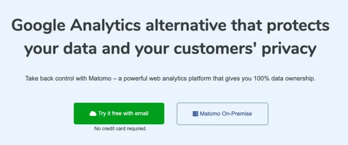
Analytics company Matomo has a free trial CTA on its homepage, which makes it clear users don’t have to enter a credit card to get started; just their email:
Increase conversion rates further by making your free trial as tempting as possible. That means not taking credit card details, limiting features, or offering trials for less than 30 days.
3. Write A Benefit-Oriented CTA
You need to let users know what’s in it for them. That’s why it’s best practice to add a benefit to your CTA that gives users a reason to take action. That could be something like:
- Reducing costs
- Saving time
- Losing weight
- Solving a pain point
This example from Evernote is a great example of a benefit-orientated CTA. The headline gets to the core benefits of Evernote and shows users how it can achieve a core goal of its target audiences: an organized life.
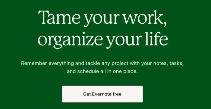
That’s supported by a subheading that offers even more benefits: “remember everything” and keeping it “all in one place”. If you want an organized life, Evernote positions itself as the answer.
4. Showcase Instant Value
Consumers need a clear reason to act. Show immediate value—whether it’s a free resource, time savings, or a solution to their problem.
This will be easy if you’re encouraging customers to make a purchase. But it’s a little trickier with an email sign-up CTA.
The solution? Make it clear what users will get and follow through on that promise when they click.
Take this example from Pipedrive, which encourages users to download an e-book in return for their work email:
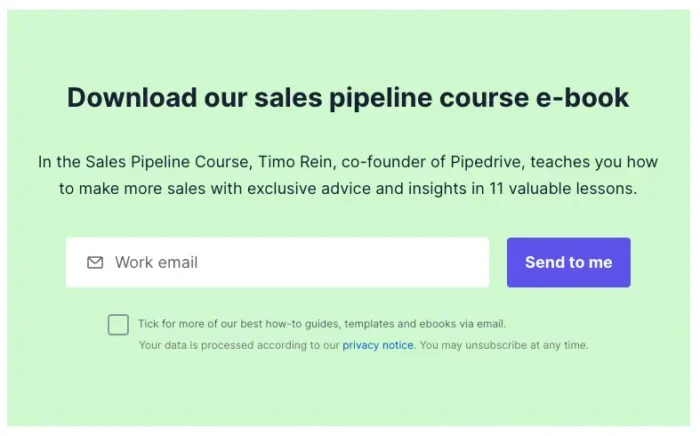
It outlines what you’ll learn, who will teach you, and even how many lessons there are. If that’s not showcasing value, I don’t know what is.
5. Evoke Curiosity and Emotion
Your CTA is meant to provoke a reaction. So, what better way to do this than to evoke curiosity and emotion in your visitors?
You can do this through your CTA’s copy by painting consumers a picture of how your product can solve their problems or how they can make their lives better. Or you can leverage social proof through reviews and client logos to make it seem like they’re missing out on something.
This pop-up CTA from Glossier does a fantastic job of evoking both curiosity and emotion:
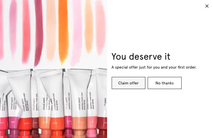
“Deserve” is an incredibly emotive verb that encourages users to treat themselves with the offer. But what is the offer? That’s where curiosity plays a role. By not telling users what the offer is, Glossier is encouraging users to click to find out.
6. Aggravate The Problem, Then Offer The Solution
If you get stuck writing your CTA’s headline and body copy, turn to a tried-and-tested copywriting formula to craft a killer CTA.
Problem, agitation, solution (PAS) is a framework for writing clear and persuasive copy. Here’s how it works:
- Present a problem. Start your CTA with one of your audience’s core problems
- Agitate the problem. Show readers why solving it is so important.
- Offer a solution. Explain how you solve the problem.
PAS works well by leveraging your users’ problems and fears to create a strong emotional connection. It makes readers feel seen before showing them how to make these issues disappear.
This CTA by Flux Academy is a great example of PAS in action.
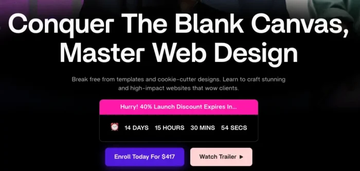
It highlights a major fear of designers in the headline, the blank canvas. It plays on this fear by calling out problems with existing solutions like “cookie-cutter designs” and “templates”.
Then it hits readers with the solution: a $417 course that shows them how to create websites that wow clients.
7. Leverage FOMO(Fear of Missing Out)
There’s a reason FOMO is such a popular phrase. People don’t want to feel like they are missing out on something. Take advantage of that by making clear what your readers could miss out on if they don’t click.
Time-sensitive CTAs are a great way to incorporate FOMO. Check out this example from Yoga International that uses Black Friday to heighten the reader’s FOMO:
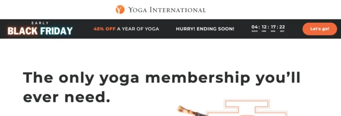
They don’t just highlight Black Friday, a notoriously short holiday event. They explicitly call out the fact the deal will end soon and even include a countdown timer to top it off.
8. Use Clickbait (Ethically)
Clickbait isn’t just for headlines and low-quality online ads. If you’re clever, you can use clickbait in your CTAs to lure consumers in.
You need to do this carefully, however. Fail to deliver on your promise, and you’ll alienate your audience.
Progressive does a great job of using clickbait ethically in this CTA for boat insurance:

If you have a boat, you’ll know that $100 per year is pretty low for insurance. It’s less than half the average cost in most cases. That makes the headline just tempting enough for consumers to click.
Most won’t get cover for that little, but that doesn’t matter. As long as it’s astronomically more, consumers won’t be too upset.
9. Offer A Bonus
Sometimes, you need to give something to get something. If you want readers to click on your CTA, give them something in return.
It can be:
- A discount code
- An e-book
- An online course
- A gift
- Exclusive access to a sale
It doesn’t matter what it is as long as your readers think it’s valuable enough to hand over their data.
Lead scoring software Breadcrumbs offers free templates to anyone who subscribes to their newsletter.

Given how complicated lead scoring is, many sales leaders will think their email address is a small price to pay to solve the problem. If that weren’t enough, Breadcrumbs makes the benefit of better lead scoring (higher conversion rates) clear in the headline and body copy.
10. Place Your CTAs Wisely For UX
While your CTA can go anywhere on your site, there are a few popular areas, including:
- At the top of the page
- In the sidebar
- In a banner above or below the navigation bar
- At the bottom of the page
You’ll have to test which placement works best for your brand, but I recommend having CTAs higher up the page where possible.
Even blog post CTAs shouldn’t go at the bottom. I place one of my CTA’s near the very top of my blog posts, for example:

Wherever you place your CTA, make sure it stands out from the rest of the content on the page. Achieve this by:
- Using contrasting colors
- Using different, eye-catching fonts
- Surrounding your CTA with white space
11. Match Your CTAs To Stages of The Marketing Funnel
Many users won’t be ready to purchase, so adding “buy now” buttons all over your site won’t work. Instead, you need to match your CTA to the relevant stage of the marketing funnel.
By all means, add “buy now” buttons to e-commerce product and category pages. But don’t add them to your blog, where readers are much more likely to be in the discovery or consideration phase of the marketing funnel.
In this case, a CTA encouraging them to “find out more” or “start a free trial” makes much more sense.
That’s what Buffer does in the middle of all its blog posts:
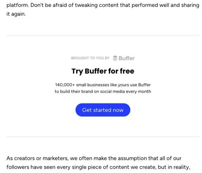
There’s no hard sell since users aren’t going to respond to one. Considering that all they blog about is how to build and grow a social media following, though, readers might be interested in trying the software for free.
Informal CTAs are particularly powerful in blog posts, explains Doug Messel:
“Anytime you use anchor text like ‘learn more about [a topic]’ or ‘explore the benefits of [your service]’ within the body of a paragraph, those are technically CTAs. But they may not feel as aggressive as something you might find at the conclusion of a blog post or a brightly colored ribbon or graphic. If you have to insert multiple graphic or ribbon CTAs into a piece, space them out as much as you can.”
12. A/B Test Your CTAs
Calls to action are some of the most popular website elements to A/B test. That’s because the only way to know if your CTA is really effective is to test it against other CTAs.
You can test one type of CTA, like a button against a completely different type of CTA like a banner or popup, to see which converts best. Or, you can try tweaking elements of your CTA like it’s:
- Placement
- Copy
- Design
- Offer
I recommend testing one element at a time so you know which change is driving the results. You can run tests yourself or use one of these 15 best A/B testing tools to automate the process.
How I Use Call-To-Actions on the Neil Patel Blog
Do you want to see how effective the CTAs on my own website are? I thought so.
First, let’s run through the four main CTAs across my site.
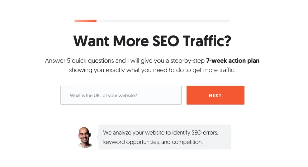
1. The interstitial quiz full-page pop-up that appears when you access any page:
2. The “book a call” banner for my agency that appears near the top of every blog post. You can usually find it after the table of contents or key takeaways and before the first H2:

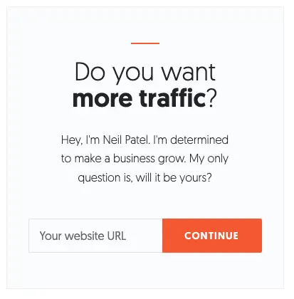
3. The “Do you want more traffic?” box that appears in every blog’s sidebar:
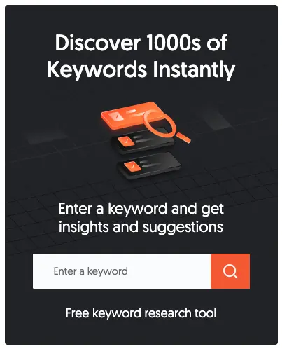
4. The keyword analyzer box that’s also found in each blog’s sidebar:
My site received 939 total conversions between July 2024 and September 2024. Here’s how those conversions were split between each CTA:
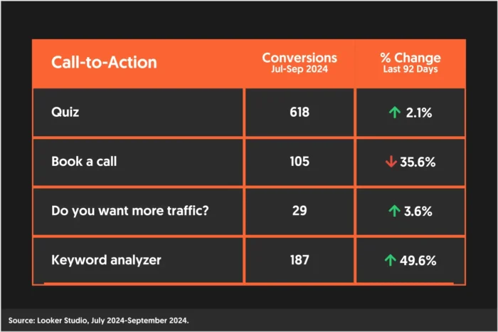
The quiz has the lion’s share of the conversions, which isn’t surprising given its prominence and value. You literally can’t miss it.
What surprised me was the success of my “Keyword analyzer” CTA. This is the most recent addition to the blog, and it’s quickly become the most successful. I think that’s because it offers a very specific benefit (finding thousands of keywords) that can be solved instantly using Ubersuggest.
My agency’s “book a call” banner saw the biggest decrease in conversions. We suspect this is a result of my team adding a table of contents to each blog post, which has pushed the CTA further down the page.
FAQs
What is a call to action?
A call to action (CTA) is a prompt that encourages consumers to take a desired action.
How to write a call to action
Write a call to action using strong action verbs like “buy”, “shop”, and “discover”. Then, address one of your target audience’s pain points and show them how you can solve it with your product or service.
What is a call to action example?
An example of a call to action can be found at the top of this page or in the sidebar of this blog post. You’ll see them all around the web; just look for a box with a heading and a button encouraging you to click.
Conclusion
A great call to action guides users to the next step, driving engagement and conversions. By applying these tactics and testing your CTAs, you can turn casual visitors into loyal customers.
You’ll need to hone your copywriting skills to make a splash with your readers and run statistically significant A/B tests to optimize your CTA’s design and placement. But if you follow the tactics listed above, you’ll be off to a great start.
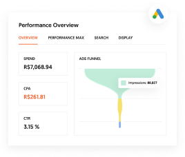
Are You Using Google Ads? Try Our FREE Ads Grader!
Stop wasting money and unlock the hidden potential of your advertising.
- Discover the power of intentional advertising.
- Reach your ideal target audience.
- Maximize ad spend efficiency.