

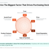
Key Takeaways
- High-converting websites clearly communicate their unique value proposition right away. Visitors should instantly understand what you offer and why it matters to them.
- First impressions are critical—websites have only a few seconds to capture attention with strong headlines and clear messaging. If users aren’t engaged quickly, they leave.
- Effective sites reduce friction by keeping things simple, focused, and easy to navigate. Clear CTAs, fewer distractions, and streamlined user journeys increase the likelihood of conversion.
- Continuous optimization is key, with tactics like A/B testing, improving site speed, and adding elements like videos to boost conversions. High-performing sites constantly test and refine to improve results.
Getting looks but no sales?
Let’s turn those window shoppers into buyers – and at a high rate.
Use conversion rate optimization to get the most of every dollar spent on PPC.
Hit the sweet spot for what persuades the greatest number of your visitors to take action.
My gut tells me the reason for this is MOST companies are too caught up in the “business as usual syndrome”, and they rarely take a second to stop and think about really focusing on conversion optimization.
In this post, we’re going to go over what the high converting websites do differently. But before we get into the details, we want to highlight a few points to get you thinking first:
- You have 0-8 seconds to make a compelling headline and landing page. After 8 seconds, the majority of visitors leave.
- Approximately 96% of visitors that come to your website are not ready to buy.
- The more landing pages you have, the more leads you are likely to get.
- Product videos can increase purchases of the product by 144%.
- A 1-second delay in your site speed can result in a 7% reduction in conversions.
- A/B testing is becoming the preferred method that has brought a lot of companies the most success.
1. They Make Their Unique Value Proposition(s) Clear
Visitors should clearly see on your homepage or landing page why they should do business with you and the benefits of doing so.
A great example of this is MailChimp:
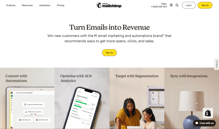
There are plenty of email service providers out there, so for a company like MailChimp it’s quite difficult to differentiate yourself from the pack. MailChimp made itself different by focusing on making email campaigns that make you money.
If you think about it, what’s the point of informing customers via email?
You want them to follow through with their cart or shop with you again. MailChimp shows they can help your team turn emails into revenue and even automate the workflow along the way. It’s a win-win deal.
Not to mention, if you have ever used their service – everything from campaign creation to sending out your emails is really simple and clear.
Another example is Helzberg Diamonds. They are a little more subtle about their USP, but they definitely address “Why you should buy from them.”
For example, they state free shipping on orders over $99:

Scroll down the page a little bit, and you’ll see some reassurances:
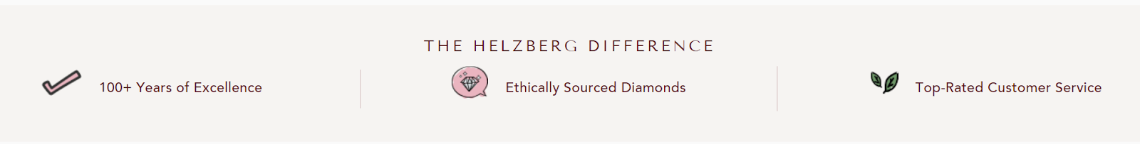


Certainly, having over 18,000 5-star reviews doesn’t hurt their conversion rate, either.
What are the reasons customers should buy from you? Is it a money-back guarantee? Free shipping? Find what yours are and make it clear.
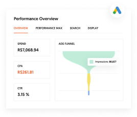
Are You Using Google Ads? Try Our FREE Ads Grader!
Stop wasting money and unlock the hidden potential of your advertising.
- Discover the power of intentional advertising.
- Reach your ideal target audience.
- Maximize ad spend efficiency.
2. They Test Their Calls-to-Action
HubSpot did a study and reported personalized CTAs converted over 202% better than basic, multivariate, and smart CTAs. To get personal with users, meet them where they are in the funnel. Say you offer student loan financing, set up CTAs like this:
Are You Using Google Ads? Try Our FREE Ads Grader!
Stop wasting money and unlock the hidden potential of your advertising.
- Discover the power of intentional advertising.
- Reach your ideal target audience.
- Maximize ad spend efficiency.
- Visitor CTA: 7 Helpful Tips on How to Deal with Student Loans
- Lead CTA: Financing Consultation
These CTAs will be effective for converting leads and increasing your conversion rate overall.
As a great historical example, Mozilla increased downloads of their popular Firefox browser by having a stronger call-to-action. “Download Now – Free” performed better than “Try Firefox 3”. This makes the psychology of CTAs clear that Firefox was free and drew the reader to download the program.
Instacart sees high conversion rates, with some estimates being around 70%. They make it really easy for customers who are in a hurry to buy groceries and other items – they can start by simply seeing their estimated delivery time if they order at that moment:
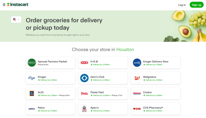
Instacart eliminates any initial questions that the prospect may have. The prospect knows right away the answer to the question “can you get this to me by __?” They’re helping to overcome any obstacles to a purchase. See if you can do something like Instacart has done—answer one of your most popular questions in a clear, above-the-fold headline. If some obstacles to prospects purchasing from you are:
“I don’t feel comfortable purchasing from a small company like yours” – then some ideas to help overcome this fear could be:
- Include a behind-the-scenes video of your company and how your operations work.
- Include a banner at the top with customer testimonials, each one showing for a few seconds.
- Give your unique value proposition right at the top. Tell how long you’ve been in business, how many orders you’ve shipped, customer satisfaction rate, etc.
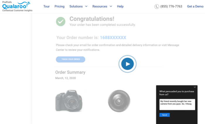
How Do You Find Out What Questions Your Customers have?
You should always be asking your customers questions to get their feedback. Understanding your customer’s pain points, confusion, and what they are really looking for can help you design a site that converts higher. Qualaroo is a tool that allows you to do just that:
3. They Test Their Headlines
The headline can make or break your website, and possibly a sale. As mentioned in the intro, the first impression is formed quickly, and the headline is a big part of that impression. It’s important to follow a guide to A/B testing and see what resonates most with your visitors. There is no magic formula, but there are some good guidelines that you can follow.
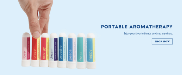
MOXĒ improved conversions by 30% by taking a personal approach. They reminded visitors how the smell of joy was something they deserved and made a short story with the line: 15 seconds of bliss anywhere you go.
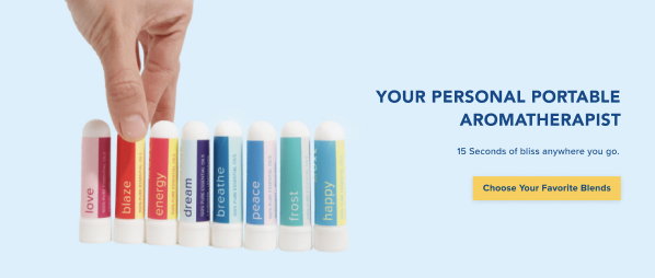
Source: Klient Boost
The key lesson from this is that it’s important to have a clear headline with an effective unique value proposition. “Enjoy your favorite blends anytime, anywhere” doesn’t tell of any benefit. They don’t give a reason why they should shop now. Consider adding “free trial” in your headline or try “Save __% and start [enter the benefit of your product here]”. The important thing is to test to see what works.
CityCliq improved their conversions by making a clear headline that tells the user what they’ll get. First, the tested headlines:
- Businesses grow faster online!
- Online advertising that works!
- Get found faster!
- Create a webpage for your business
The winner:
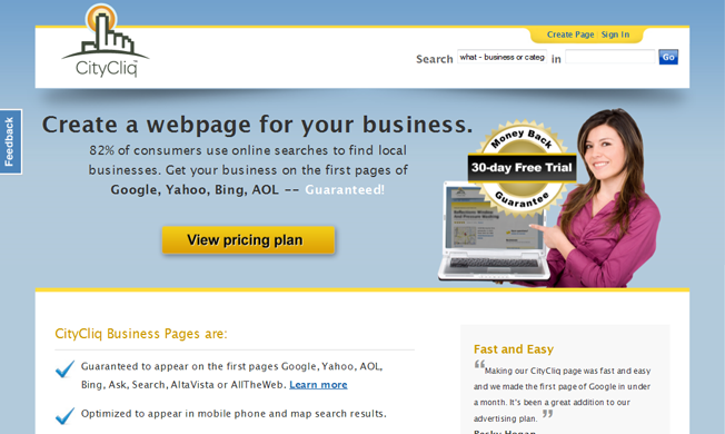
This is the best headline because it’s clear and avoids any language that you may find in your spam folder. Be creative with your headlines and inform the visitor of what you do or the benefits of your product.
4. They Tend To Have Short Forms
UX Conversion expert Omar Andani recommends keeping forms to only the essentials. How many times have you been ready to sign up for something, continue and see 25+ fields that you have to fill in? I’ve seen it a lot and I’ll often just leave the site. It’s important to respect the user’s time. If you’ve gotten the user as far as wanting to sign up, it’s pivotal that you don’t let them drop off because your form is too long.
Take a look at Dropbox’s signup form:
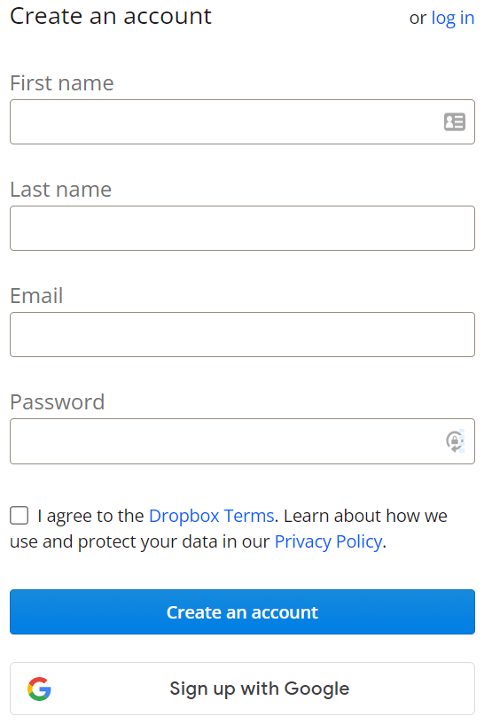
Dropbox is only asking for what they need. No username, no security questions, no birth date, no verification code, no re-enter password field, nothing unneeded.
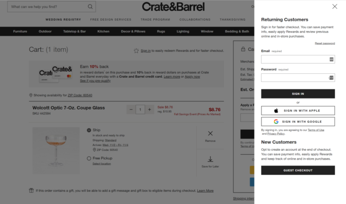
For Crate&Barrel, they don’t force you to signup before you order. If you’re a first-time buyer, they’re not interrupting your buying process at all. You don’t have to create a new account; you have the option to do that after you make your purchase. Crate&Barrel is removing any obstacles to ordering.
Building more concise forms is important.
Test The Number of Form Fields
Most conversion experts will agree that simplifying forms and making them clearer should be the direction you want to aim for when you ready to start iterating.
Sometimes, having more fields can improve your form conversion rate. However, in general, fewer fields tend to produce better conversions (it depends on what your form is for). The point is: Don’t look for rules of thumb, test and find out for yourself!
5. Their Sites Are Built To Convert
High conversion websites are quite obvious right away.
How?
They have good UX design, are well configured on desktop and mobile, and have a fast load time.
High converting website examples look like Mint and Discord.
With Mint, a financial management app, you get an appealing design that makes addressing finances a little less scary.
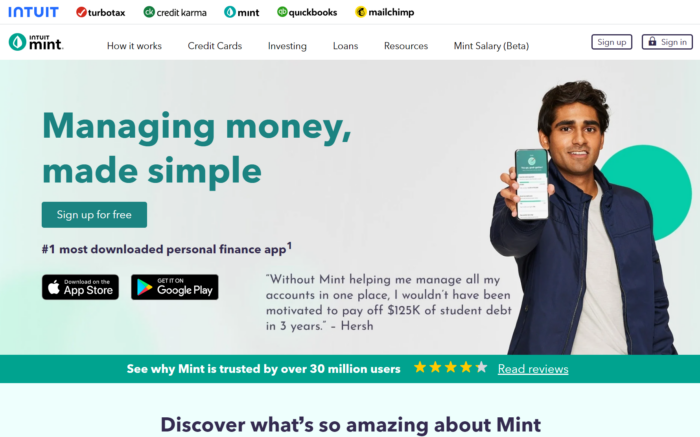
Additionally, you get everything you need to know about their services above the fold. Not only that but signing up is free.
Even if I was unsure of their credibility, there’s a note of their 30 million users with reviews and a significant testimonial to spring me into action as a user.
For Discord, an app targeting those in the gaming and streaming industry, provides an all-in-one experience for your various communities to communicate.
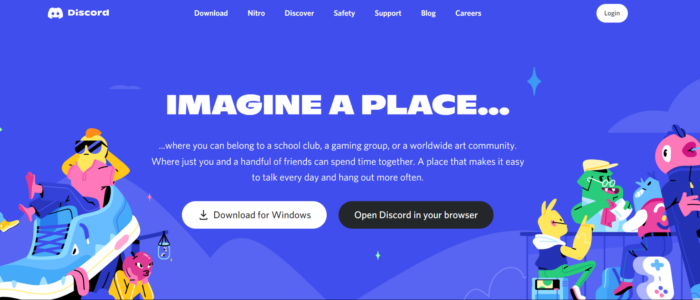
Their CTAs contrast where you’re starting in the funnel – as a returning visitor or a new visitor ready to join your community.
It combines form (being welcoming and inviting) with function (being a clear-to-understand design).
Even the phrase “imagine a place” opens the brand to answer the issue their users are visiting them for. They don’t have to imagine a place because this platform is that space for them.
Creating A Responsive Website
Attractive, high converting websites are fast loading, have an engaging layout, a seamless navigation, and especially, a responsive design.
It’s not enough for high converting websites to look good on desktop. Mobile view is equally in demand – if not more important. However, mobile vs desktop usage can vary based on your niche. If your pages are not responsive or load too slow, your user is likely ending their session within 3 seconds.
With so many people accessing your site via mobile, your site requires a responsive design that encourages users to convert.
Other Techniques To Try
Here’s a collection of other tested tips and tricks to yield the conversions you want:
- lmplementing a “Chat Now” button increased free signup form fills by 31%.
- Cars.com recently boosted their conversion rate 2.7% by having a security seal on their site.
- Including discount information in the title (e.g., 15% off Product A vs Product A) can generate interest on the spot.
- Benefits, social proof and credibility indicators led to an increase in sales by 34% on landing pages.
- Putting people on your homepage can have a huge impact on conversions.
- Including a pain point in a headline increases clicks and form submits.
- Changing your call-to-action button from green to red has been shown to increase conversions by as much as 34%.
- Try moving around your Buy Now button. The design and placement work together to convert users.
- Changing a button from “See Plans and Pricing” to “Get Started Today” increased conversions by 252%.
- Turning CAPTCHA off led to no conversions lost and very little spam mail in this case study.
- Showing testimonials can drive validation for a high converting website.
- Using natural language on forms has been shown to increase conversions by 25-40%.
- Having a nice mobile site can double conversions.
- Segmenting your users can increase conversion rates be giving more relevant content to the user.
- Putting your call-to-action button can really improve conversions.
FAQs
What are the highest converting websites?
Some of the highest converting websites understand user experience well and work to link it to landing sales. Some high converting websites of note are:
- Instacart
- MOXĒ
- MailChimp
What is a good conversion rate for your website?
Across industries, you should land at 2%-5% for a good conversion rate. If you hit over 10%, you’re over the average and on the right track with converting your offerings.
Is 100% conversion possible?
Landing at a 100% conversion rate is extremely unlikely. Ultimately, you can’t please everyone, with 96% of website visitors coming to your site not ready to buy. You can follow the formula of some of the highest converting websites and users still may not convert. Hypothetically, the formula for a high converting website should yield more conversions than if you weren’t able to execute it. With that said, there are always going to be factors beyond your control, like if a person isn’t ready to buy or realizes they don’t need your product anymore. Your goal should be to make sure the people most motivated to buy end up at your site, and that it’s easy for them to convert.. Your goal should be to make sure the people most motivated to buy end up at your site, and that it’s easy for them to convert.
Conclusion
How will you get to the status of these high conversion websites?
Test, test, test.
Across the high converting website examples I mentioned, that’s what it took – testing and pivoting.
Immersing yourself in marketing strategies directed to the customer is what will help you stand out. You can do this by knowing not just your brand, but know your competitors, and know what your audience wants to get them to convert.
Once you build your site that converts, you also need to maintain it, along with:
- Having a unique value proposition
- Strong CTAs
- A/B testing on headlines
- Forms requesting essential information
A useable and responsive site will be well received by your users.
Driving toward the challenging task of building one of the highest converting websites will take knowing your audience and knowing when to make changes based on your metrics.
The important thing is to test and experiment. What has worked for you? Let us know in the comments!
About the Author: Zach Bulygo is a content writer, you can follow him on Twitter @zachcb1.