
 Sign In













Key Takeaways
- Mobile SEO is critical due to the dominance of mobile browsing and Google’s mobile-first indexing model, which prioritizes mobile versions of websites for indexing and ranking.
- There are three primary methods for configuring a mobile-friendly site: responsive design, site speed, and mobile-friendly content and readability.g, and separate URLs. Responsive design is the most recommended for its seamless user experience across devices.
- Tools like Ubersuggest, Google Search Console, and Lighthouse are essential for monitoring and optimizing your mobile SEO performance.
- Improving user experience on mobile involves using larger fonts, shorter paragraphs, ample white space, and strategically placed buttons and calls to action (CTAs). Speed optimization, schema markup, and intrusive interstitial removal are also crucial.
- Speed is a key factor for mobile SEO success. Compress images, limit redirects, and use a content delivery network (CDN) to improve load times and the user experience.
Ever wondered why your site’s content isn’t generating more traffic?
It could have something to do with whether you’ve gone all in on mobile SEO—the practice of optimizing your site to rank in search engine results pages (SERPs) as they appear on mobile devices like your smartphone or tablet.
Statista estimates that by the end of 2025, there will be 7.49 billion mobile users. That’s up nearly 8% from 6.95 billion mobile users just five years earlier.
What’s more, the majority of searchers (about 60%) use a mobile device (not a desktop) to search the web.
If you haven’t optimized your site for mobile search, you’re not reaching the right audience. Mobile has been the main method of search for some time now, starting with Google’s 2015 algorithm update coined “Mobilegeddon.”
Google has since fully switched to mobile-first indexing, meaning that it now the primary platform you need to think about for any digital presence. That means mobile search engine optimization is more important than ever.
So, what exactly is mobile optimization, and how can you tell if you’re doing it right?
In this guide, I’ll cover everything you need to know to start ranking.
What is Mobile SEO?
Mobile search engine optimization is a specialized form of search engine optimization (SEO) that focuses specifically on optimizing a site for viewing on a mobile device.
At its core, mobile search engine optimization is about structuring your site so that the right people see it in a mobile-first search environment. A whole lot goes into it, from responsive design and page speed to user experience (UX) design (and more—all of which I’ll cover soon).
Why Is Mobile SEO Important?
Mobile SEO is important for many of the reasons I’ve already mentioned—namely, mobile search’s increasing dominance and Google’s shift to mobile-first indexing.
Due to these changes, Google’s algorithms now prioritize sites that offer an excellent mobile experience.
To put it bluntly, you risk lower rankings, significantly less traffic, and diminished user engagement if your site isn’t mobile-optimized.
Mobile vs. Desktop Sites
You might wonder why there’s even a difference between the mobile version of a site versus the desktop version. The simple answer is that mobile sites have a lot less “real estate” than their desktop counterparts.
For example, take a look at my website’s homepage, neilpatel.com. While the content is the same for both mobile and desktop versions, the mobile site includes an interactive call to action., so the reader can take that additional step without having to scroll or click another page.
It’s also a good visual example of responsive design because it’s displayed in portrait for mobile vs. landscape for desktop.


This is just one small example of how page elements and site design can differ in mobile vs. desktop versions of sites.
You might also wonder why it’s important to maintain a desktop site that maintains content parity with your mobile site at all, given that mobile-first indexing is the norm.
One of the main reasons is that there may be site features or elements that aren’t available or aren’t as useful for mobile sites. While SEO is important for getting your site seen, it’s still important to provide your users with the best user experience possible.
So, by all means, optimize for mobile, but continue to offer a desktop-optimized version of your site.
How to See Your Site’s Mobile SEO Performance
There are several tools out there to help you track how your mobile site is performing. They include:
- Ubersuggest: My free SEO tracking tool helps you uncover SEO insights for your site, including specific advice for improving mobile performance.
- Google Search Console (GSC): GSC gives detailed reports on your site’s overall search performance, pinpointing areas where your mobile site might need improvement.
- Google PageSpeed Insights: This assesses how quickly your site loads and provides tailored suggestions to boost its speed, especially on mobile devices.
- Lighthouse: This open-source automated tool helps improve web page quality. It performs audits for performance, accessibility, progressive web apps, SEO, and more, providing
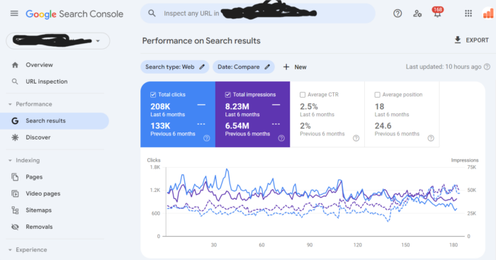
Here’s an example of me using Google Search Console to compare the overall search performance of a client of my agency NP Accel, from February to August of 2024 to the six months prior (September 2023 to January 2024).
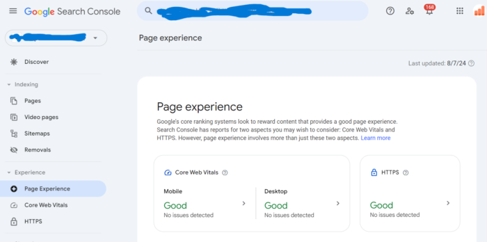
Next, let’s check the overall page experience for their homepage URL. Things are looking good!
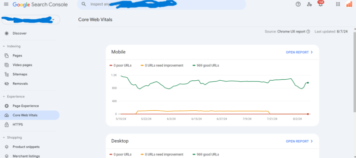
You can also check Core Web Vitals in Search Console:
Pro Tip: Need help navigating these tools? Google has a repository of information explaining how to optimize your website for mobile. It’s sorted by platform.
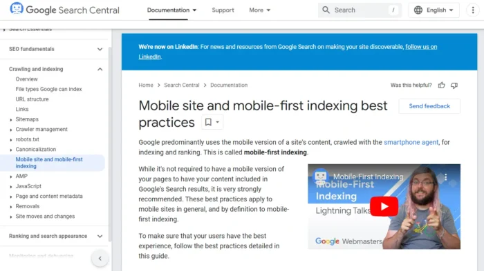
This means that whichever content management system (CMS) you use, you can optimize for mobile devices.
These helpful guides are just part of Google’s webmaster support ecosystem. It also has forums and live chat support.
Even Google Analytics includes more detailed mobile information.
By clicking Tech → Tech details, for instance, I can see detailed information about the specific mobile devices accessing my website.
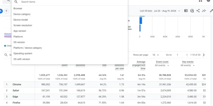
It’s important to get used to checking for mobile within all your normal data reports.
Segment your traffic whenever you can, and you’ll be well on your way to tracking mobile performance.
Tracking is just part of the equation, though. Next comes optimization.
How to Optimize Your Site for Mobile SEO
OK, so we know mobile optimization is key. But how, exactly, do we make it happen? Let’s break down some practical tips to ensure your site shines on every screen.
Choose Responsive Design
Ever since Mobilegeddon in 2015, responsive web design has been mandatory to maintain rankings.
Responsive HTML adapts according to the screen size and orientation of the device viewing the content.
For example, the code for a fixed-width column looks like this.
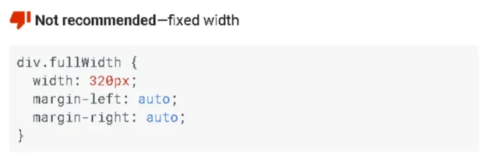
This is non-responsive HTML that fixes the width at 320 pixels (px). While it will display well on an iPhone, it’s going to look terrible on a desktop or tablet.
Instead of considering every possible screen size for every device, you can use this simple, responsive code.

It’s sleeker, simpler, and much more powerful.
These simple changes ensure that every image on your website displays exactly how you want.
Take another look at those screenshots of my website from earlier in this blog post. Remember how I said it’s an example of responsive design? This is the kind of coding that makes a page adapt to mobile devices like mine does.
I could write an entire blog post just on what goes into applying responsive design to your site, but the folks at Wix Studio have already created a pretty good one. This blog post, How to make a responsive website, details the main steps:
- Get started with wireframes: Wireframes outline the basic skeleton of a webpage. It brings together your site’s design, layout, and content. You’ll want to create wireframe versions for the most common devices people use (e.g., smartphones, desktops, and tablets).
- Define your breakpoints: These are the pixel values that dictate when a website’s layout changes. For example, Wix offers three default breakpoint options (1,001px and up for desktops; 751-1,000px for tablets; 350-750px for mobile devices).
- Design for small screens first: A mobile-first approach is the way to go when designing a responsive layout. In other words, start with your mobile design and work from there.
- Create a fluid grid: A fluid grid uses relative units like percentages instead of fixed pixels, enabling website elements to dynamically resize and adjust their layout based on screen size.
- Optimize images for responsive design: This involves resizing images for different screen resolutions or using scalar vector graphics (SVGs) that scale in size without sacrificing quality.
- Choose the right typography for responsive design: Use fonts that scale well and define your font size in fluid units.
Implement Schema Markup
Schema markup is a type of structured data that helps search engines understand the content on your site. For mobile SEO, schema markup can enhance your site’s visibility in mobile SERPs (search engine results page) by providing rich snippets like star ratings, product information, or event details.
You already know I’m a fan of structured data.
It’s a technical aspect of digital marketing I like to roll up my sleeves for.
That’s because structured schema data can trump all other SEO efforts by answering a specific user question well enough to be featured as essentially the only answer.
It doesn’t take a technical genius to get started. There’s a WordPress plugin called Schema App Structured Data that I love. It automatically creates schema markup for you.
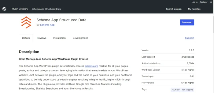
There are also many other free tools out there, such as Merkle’s Schema Markup Generator.

Implementing schema markup is simple with these tools, which don’t require any coding knowledge. Just add specific tags to your HTML that categorize the content, making it easier for search engines to index and display it.
Remove Flash and Switch to HTML5
I’m not negative about much, but Flash is something I was never excited about.
In the early years of the internet, Adobe Flash was all the rage.
Animated websites with overly complicated designs eventually became too much.
Designs like this may look cool, but they don’t translate at all to mobile.

Sleek, simple designs like Google, Medium, Craigslist, Facebook, and Amazon prevailed while flashy (pun intended) designs started to fall off.

HTML5 is the preferred alternative to Flash. It offers better performance, security, and compatibility with mobile devices.

HTML5 also allows you to embed multimedia content without relying on external plugins, ensuring that all users can access your site’s content regardless of their device.
Construct a Mobile-Friendly Website User Experience
Your website user experience (UX) needs to be mobile-friendly.
People naturally see websites in a certain way on mobile devices.
Here’s a handy chart showing the hot zones they focus on most.

It’s much different than the typical F pattern we use to read desktop pages.
No amount of design and development can replace looking at your mobile website from a customer’s perspective.
You’ll also be able to tighten up your page structure.
Here are some tips for helping you construct mobile pages that are well-optimized for a superior user experience:
- Increase font size: Use larger fonts to ensure text is easy to read on small screens.
- Shorten paragraphs: Break up content into shorter paragraphs to improve readability and reduce eye strain.
- Add white space: Incorporate ample white space between elements to create a clean, uncluttered layout.
- Optimize button and CTA placement: Position important buttons, links, and CTAs where they are easily accessible, such as near the thumb’s reach on the screen.
- Reduce clutter: Remove unnecessary elements that can overwhelm users and complicate navigation. Focus on simplicity and ease of use.

Speed Up Your Site Any Way Possible
Speed is important.
Studies have consistently shown slow page load times translate to high bounce rates. It’s also important to create responsive webpages that are fast for Core Web Vitals.
Here’s a list of action items to help you increase page speed:
- Identify issues: Use tools like Google PageSpeed Insights to diagnose what’s slowing down your page.
- Improve First Contentful Paint (FCP): Ensure initial elements like text and images load quickly.
- Optimize Largest Contentful Paint (LCP): Focus on reducing the load time of the largest content element on your page.
- Minimize Cumulative Layout Shift (CLS): Prevent unexpected shifts in page layout by ensuring stable content loading.
- Enhance First Input Delay (FID): Improve responsiveness when users first interact with your site.
- Improve speed: Reduce blocking time, optimize speed index, and enhance time to interact.
- Limit redirects: Minimize the number of redirects to speed up page loading.
- Compress images: Resize and compress images for quicker load times.
- Use a CDN: Implement a content delivery network to distribute content across multiple servers.
- Reduce plugins and extras: Remove unnecessary plugins, scripts, and page elements.
- Minify code: Simplify HTML, CSS, and JavaScript by removing unnecessary characters and spaces.
- Utilize caching: Enable caching to reduce load times by saving copies of your site’s pages.
- Choose the right web host: Opt for a web hosting plan that can handle your site’s traffic without compromising speed.
Compress Images
Images are often the biggest culprit when it comes to slow page loads.
Compressing images reduces their file size without sacrificing quality, helping your site load faster on mobile devices.
Use modern file formats like WebP, which offer better compression than older formats like JPEG or PNG. Don’t forget to add descriptive alt text to your images for improved SEO.
Remove Intrusive Interstitials
Interstitials, more commonly known as pop-up ads, can be extremely disruptive on mobile devices. While it might be tempting to set them up for certain reasons, the harm they could cause far outweighs the potential benefits.
That’s because Google penalizes sites that use intrusive interstitials that cover content or make navigation difficult.
What to Do Instead: Consider alternative methods like inline banners or sidebars that are less obtrusive and still effective for conversions.
Keep Mobile in Mind With Your Keywords and Meta Tags
When optimizing your site for mobile, consider how users search on their devices.
Voice search is becoming increasingly popular, so your keywords should reflect natural language queries.
Additionally, optimize your meta tags for mobile SERPs, with title tags and descriptions that fit within the character limits to avoid getting cut off. For title tags, aim for between 50 and 60 characters. Shooting for about 100 characters is ideal for mobile-friendly meta descriptions.
FAQs
How does mobile-first indexing affect my site?
Mobile-first indexing means that Google primarily uses the mobile version of your site for indexing and ranking. If your site isn’t mobile-optimized, it may not rank as well as it could.
What’s the best way to check my site’s mobile usability?
Google Lighthouse is a go-to tool for improving a web page’s quality. You can use it to audit site performance, accessibility, SEO, and more. Its insights are invaluable for mobile optimization, allowing you to address and identify mobile-specific issues and opportunities.
Is responsive design the only way to optimize for mobile?
Technically, no. While it is an essential part of mobile optimization, site speed and mobile friendly content and readability are important as well.
Conclusion
Adapting your website for mobile SEO isn’t a choice. It’s essential. After all, more and more searches are happening on mobile, and Google prioritizes mobile-friendly sites in its rankings.
So, make sure your site offers a first-rate mobile experience. Doing so is the ticket to visibility and success.
Where do you begin? Embracing responsive design, boosting your site speed, and focusing on user experience are good places to start.
Do it right, and you’ll be well on your way to dominating the SERPs.