 Sign In








Look, I get it.
You probably hate your conversion rates.
And I understand.
Conversion optimization is about one big thing: more revenue.
And who wouldn’t want more of that, right?
If you’ve been in the conversion scene for a while, you’ve probably read Larry Kim’s solid article about “good conversion rates.”
And you saw his charts.
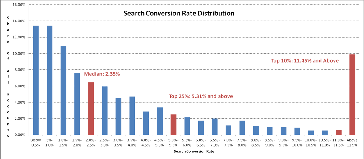
And you wanted to punch your conversion rate in the face because it wasn’t 11.45% or above.
Obviously, what’s coming in this articles are a few tips for boosting your conversion rates.
But before I deliver the goods, I want to set your expectations.
You’re probably not going to get 11.45% conversion rates. And that’s okay!
Larry’s data-packed analysis isn’t prescribing 11% conversion rates for everyone.
Instead, he is simply observing that there are some industry outliers whose conversion rates skew averages.
He calls them “unicorns.”
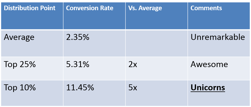
Don’t feel bad if you’re not a unicorn.
And even if you are at the low end of the “average,” don’t kick yourself.
What I want to do is point out a few of the reasons why conversion rates are low. What I’ve observed is that a lot of people misunderstand this point.
You can have great software and a solid strategy, but your conversion rate can still flop.
The biggest causes of low conversion rates are fairly basic. And so many businesses get these basic things wrong.
Does that mean there are tons of marketers out there who are just ignoring the obvious? Not necessarily.
It does mean that we’re often looking in the wrong places for the causes of decline.
We assume that low conversion is due to some tiny or technical flaw in our strategy, but really, the answers are basic.
So, again, if your conversion rate is low, don’t beat yourself up.
But you’ll have to reevaluate some element of your strategies and make some changes.
Keep in mind that my advice here is based on years of observation as well as a smattering of data.
Chances are, you’re going to settle in on one or two of these reasons, rejigger your strategy, and see an uptick in rates.
Don’t let the basic nature of these points fool you.
I’ve worked with incredibly smart digital marketers who exhibit blind spots around these points.
The very fact that these conversion killers are basic makes them easy to overlook.
Let’s check them out.
Reason #1: Your CTAs aren’t converting
It seems obvious, right?
All things being equal, a strong call-to-action (CTA) will produce conversions.
The better the CTA, the higher the conversion rates.
It’s simple as this:
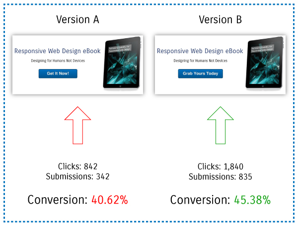
But what exactly is a “good” CTA? What really defines a compelling CTA?
First, keep in mind that the CTA is at the heart of a conversion action.
Everything on the page leads to one single goal: the CTA.
For the sake of clarity, let’s assume that the CTA is a button.
If all of your formatting, copy, images, video, and context lead up to a crappy CTA, you’re screwed.
You might think your CTA is perfectly fine, but if it’s not getting clicked on, something’s wrong.
And the first place to look for improvements is the CTA itself.
I’m not going to say that changing button colors will cause conversion rates to skyrocket. That’s the stuff of anecdotal and cliched CRO advice.
What I am saying is that making some basic adjustments to a ho-hum CTA could produce a considerable uptick in your conversions.
So let’s take this a step deeper.
What are the common CTA mistakes?
Mistake #1: The CTA is generic. Again, this seems obvious, but it flies under the radar more times than we’d care to admit.
CTAs like “Buy Now” are painfully generic. You’ve seen CTAs like this a million times before. These kill me.
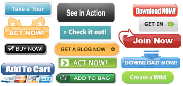
But there are some other CTAs that have become increasingly generic in recent years.
“Download Your Free Copy” is a good example. You might not think it’s generic, but the phrase is extremely common for CTAs in every niche you can think of.
Your CTA needs to be unique. Ideally, the CTA should be relevant to the specific offer or action at hand.
KlientBoost’s homepage CTA does a good job of saying something specific.
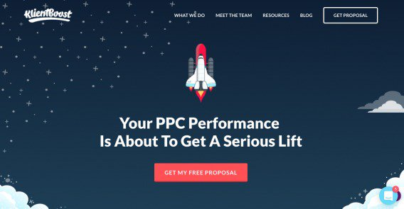
“Get My Free Proposal” is nowhere near as generic as “Sign Up.”
It’s clear what you’re getting, and pointing out that it’s free doesn’t hurt.
Mistake #2: The CTA isn’t immediately and obviously visible.
This also seems like basic CTA knowledge. Choose a contrasting color, place it in the middle of the page, and it’s good, right?
Maybe not. Take a look at this example:
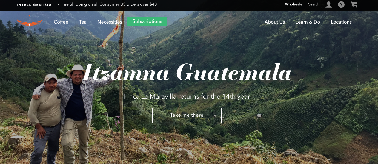
This fulfills the textbook definition of a good CTA.
The white CTA contrasts well with the green background, and it’s in a good place. The text of the CTA is excellent.
But it’s not an optimal CTA.
Why? The background is simply too busy, and the thin font of the CTA gets lost among the trees. The CTA isn’t impossible to spot, but at a glance, you might not notice it.
This goes to show that there are tons of little factors you need to consider when designing your CTA.
Here’s a good example of a CTA that’s way more visible:
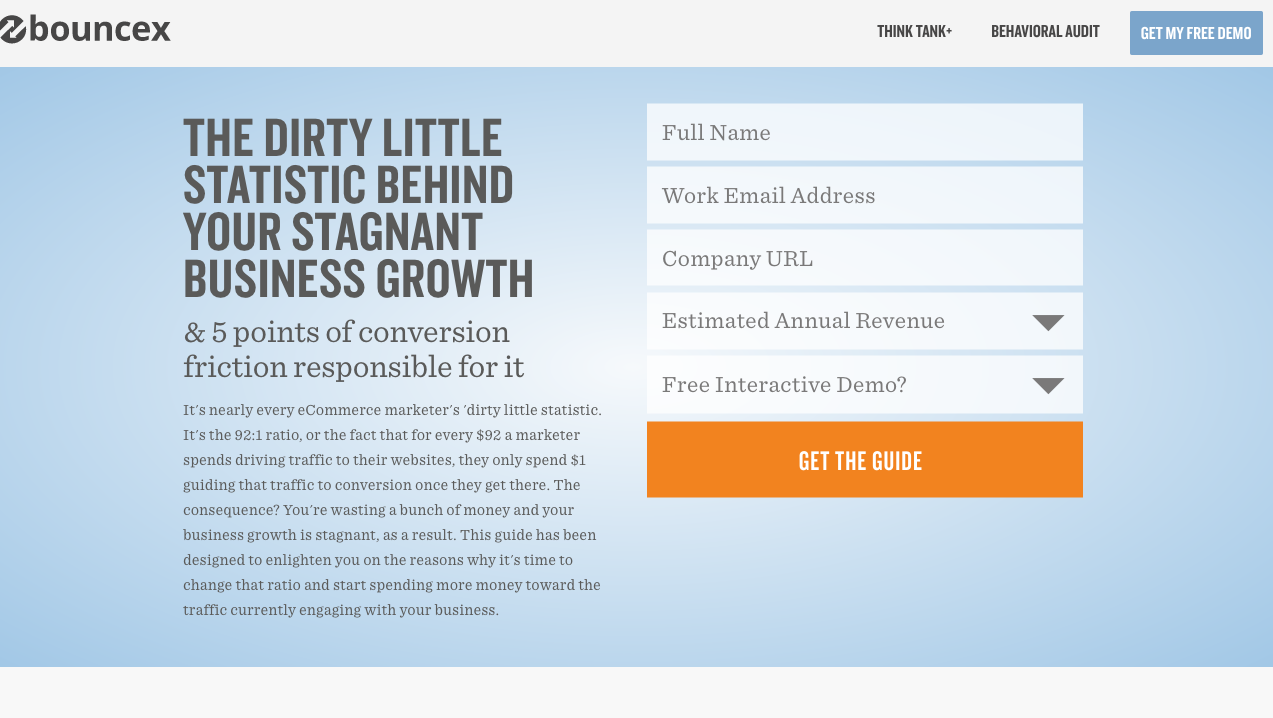
Have you heard of the Five Second Test for websites? Well, your CTA needs to pass the one-second test.
If you can’t spot your own CTA in a second or less, you need to redesign it.
Mistake #3: The CTA is asking too much.
Here’s an interesting idea that not too many people are thinking about.
Instapage published a blog post advising against using friction words in CTAs.
Friction words are words that suggest the user has to actively perform a task or action. In other words, they make it seem like the user has to give up something.
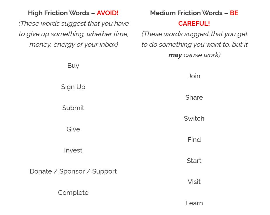
Instapage said that these words “imply that the visitor has to perform chores.’
Is that what you want your users to feel?
Of course not. So you need to be using low friction words.
The great thing about low friction words is that they imply the user will receive something.
That’s the opposite of high friction words.
Check out these examples of low friction words.
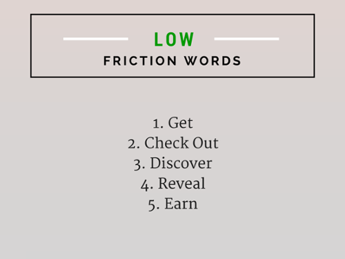
High friction words make clicking on the CTA seem like a laborious task, but low-friction words don’t because they emphasize the benefit the user will get.
If your CTA is using high friction words, that’s probably why it’s not converting your users. It’s simply asking too much.
I’m going to summarize and look at the CTA issue from a twenty-thousand-foot perspective.
I spent nearly half this article talking about CTAs because it’s the number one screw up spot for conversions.
And I’ll be honest. CTAs are tough.
Even the above mistakes run the gamut from graphic design to psychology to UX.
To go about fixing your CTAs, try this process:
- Run your CTAs through the above mistake filter.
- Settle on one mistake that your CTA could be committing.
- Create a new version of the CTA that reverses the mistake.
- Set up a split test to analyze the difference.
I think you’ll see a remarkable improvement.
Reason #2: Your value proposition isn’t clear
Value is a big deal.
It used to be that you could use sensationalism to sell products, but that’s not so anymore.
People ultimately invest in products or services because of the perceived value they will receive.
But there’s a difference between communicating your value and crafting an irresistible value proposition. You need to do the latter if you want to see your metrics jump.
A term that gets thrown around a lot is unique value proposition (UVP).
You might be familiar with it already, but here’s the basic idea.
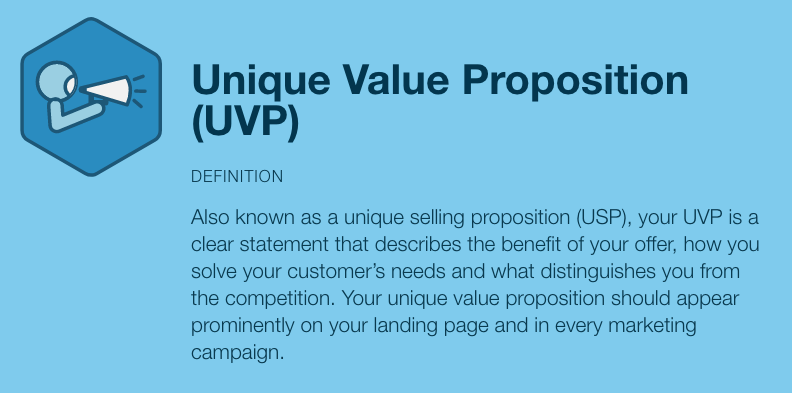
While the UVP (or USP) might seem like nothing more than a marketing buzzword, it’s a crucially important part of your marketing.
As corny as it sounds, you need to make sure your proposition is unique and, yep, valuable.
Take a second and focus on each part of the UVP.
Foundationally, do you have one?
If not, create one.
Then, ask yourself if your UVP is unique or not.
Creating a truly unique UVP is more difficult than it seems.
You might not think about it this way, but ideally, you want to be the only business that can solve your customer’s’ problems.
You want your customers to only have eyes for you. If they’re not dead certain you’re the one, they might not stay loyal.
Real uniqueness will catch people’s attention, but a lack of uniqueness will make customers roll their eyes. They’ve seen it all before.
Next, ask yourself if you’re providing real, tangible value.
Value isn’t simply a distilled summary of the benefits you offer.
You have to think of value as a way to help your customers transform themselves.
Maybe that sounds a little dramatic, but your users expect something fantastic.
Put your UVP through rigorous testing. Ask the three questions:
- What is your value? (Be specific!)
- How will your value help the customer?
- Why should they choose you over all of your competitors?
If you have rock solid answers to those three questions, then your UVP is solid. If you don’t, it’s time to go back to the drawing board.
What do you do with this new, shiny UVP?
You apply it all over your website.
It takes the form of images, taglines, messages, headings, slogans, videos, content, charts, and any other type of customer-facing asset.
Your UVP should be easy to identify and understand particularly on your landing pages and anywhere else that conversion is your goal.
Reason #3: Your popups are too intrusive
No, popups aren’t dead.
In fact, I strongly recommend that every marketer use and test popups.
One of the highest converting elements on my site is my exit popup. I break down some of my popup techniques in this conversion hacks video:
But I do see some problems with popups.
Specifically, I’ve seen marketers abuse popup techniques to the point that they are destroying conversions, not improving them.
How many times have you seen top bar, scroll box, and exit intent popups all on the same page?
At some point, it feels like too much, especially for the visitor who wants to learn more about your company without being bombarded.
While any popup can be used poorly, there are a few popup types that are naturally intrusive.
First, there are intrusive mobile interstitials.
In Google’s eyes, an intrusive mobile ad makes the user “unable to easily access the content that they were expecting when they tapped on the search result.”
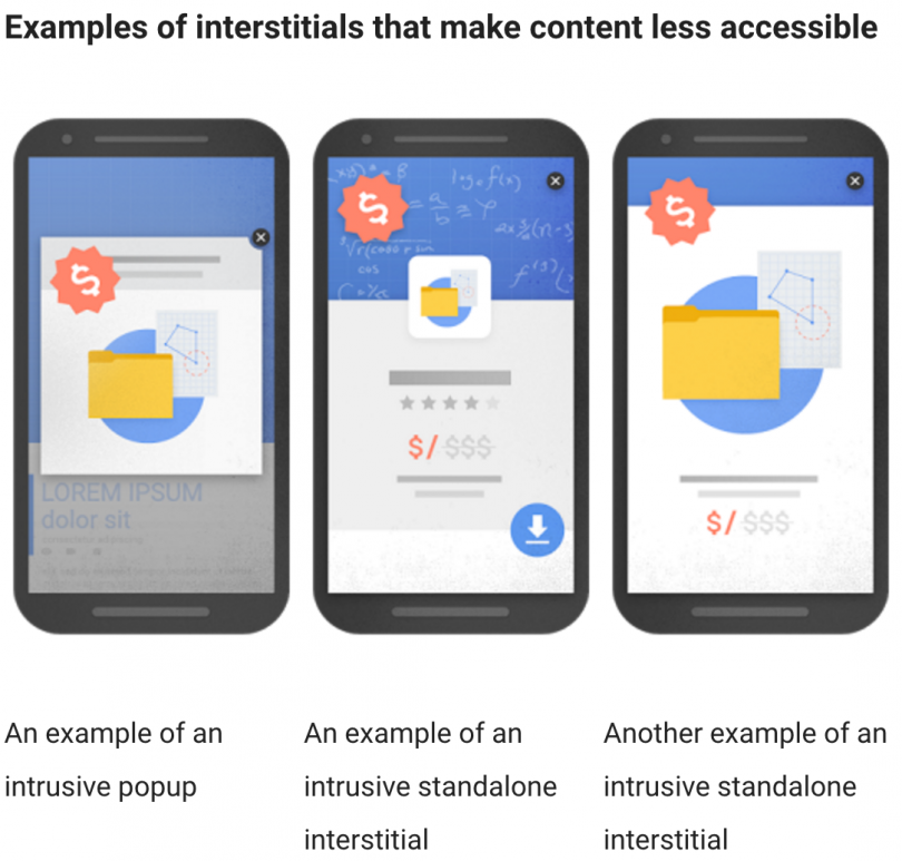
These popups make it difficult for the user to get to the actual content.
There are some cases in which you can use larger interstitials. For example, you could use one to alert users of cookie usage or ask a user to verify their age.
Mainly, Google says that banner ads that “uses a reasonable amount of screen space” are okay.
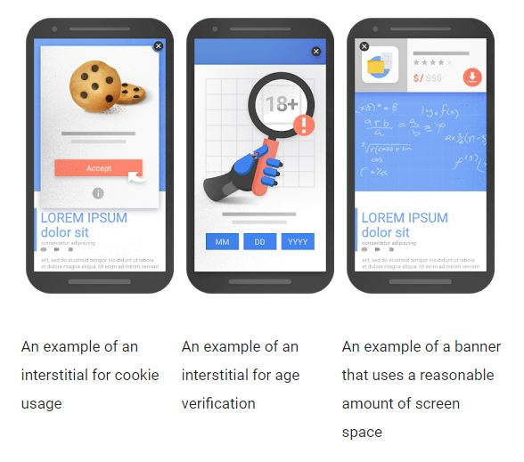
So what is a “reasonable amount of screen space” anyway?
Google hasn’t set forth official guidelines. That said, you don’t want to use full-screen interstitials, and even 50% of the screen real estate is risky.
In the end, you’ll have to use your judgment. If you keep user experience in mind, you should be able to decide what “a reasonable amount of screen space” is.
The second type of intrusive popup is what I’ll call the “bully popup.”
The term refers to the type of language these popups use. These ads try to force you to take a specific action by making you feel like crap if you don’t take that action.
Here’s an example:

You obviously don’t want to click “no” because you don’t want your visitors to bounce. But you also might not want to click on yes. What do you do?
Users simply do not like these kinds of shame-inducing popups. They create all the wrong feelings, and you don’t want people associating negative emotions with your site.
It’s much better to empower your users no matter what they choose.
Here’s a great example of how you can take the traditional bully popup and turn it into something awesome.
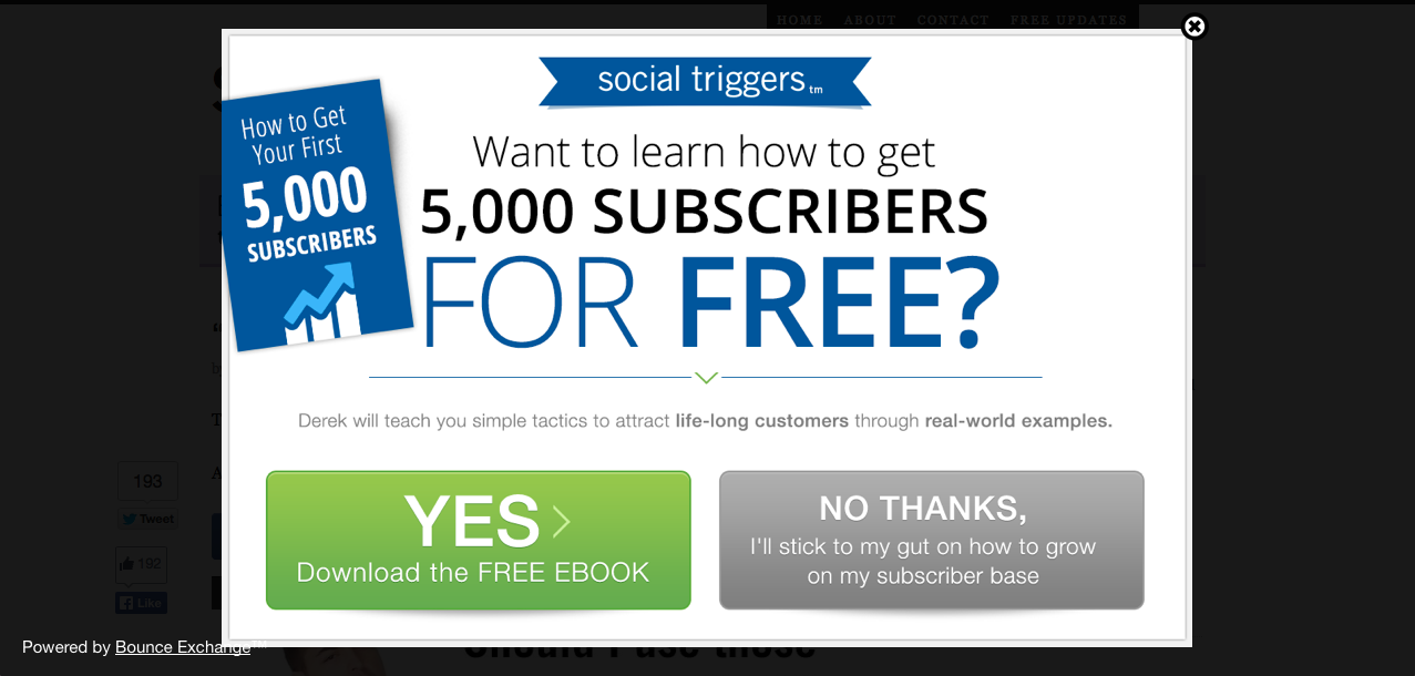
If your users choose “no,” they don’t feel like they’re crap. And if they choose yes, they get the benefit. It’s a win-win.
Keep the tone of your popups positive.
Even if people don’t take the conversion action you want them to, they make come around to their senses in a day, a week or a month.
There’s no need to push them away by making them feel like crap.
Reason #4: Your copy is missing something
Copy.
It’s the cornerstone of all things marketing. It’s what delivers the message.
What’s more, copy is a huge part of everything we’ve looked at already: your CTAs, UVP, and your popups.
So if your copy is mediocre, everything else probably shows it.
Regularly evaluating the effectiveness of your copy is the best way to prevent low conversion rates.
But it’s not always easy to diagnose poor copy. If you’re not a veteran copywriter, you may not know exactly what to look for.
Let me give you the inside scoop and show you exactly what you need to pay attention to.
First, make sure your copy is written for your audience.
I know what you’re thinking: “Isn’t all of my copy written for my audience?”
Well, yes and no.
Of course, you’re writing copy that your users will see, but you might not be writing with them in mind.
Because different types of people have different needs, you need to use the right language to deliver the right message. Your users need to resonate with the words you say.
How do you make that happen? Be specific, focus on value, and write on your audience’s level.
Here’s an example of copy that does all three things:
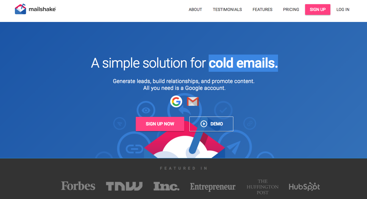
Let’s break this down.
The copy makes the value super obvious by using specific wording.
You know that the service will help you with the entire cold email process, from lead generation to content promotion.
Notice how specific those words are. It doesn’t stop at “cold emails.” It goes into detail about every little benefit you’ll receive.
The value is there. The copy claims that the service will make cold emailing more successful for you, and cold emailing is something lots of people have trouble with.
Finally, the language is aimed at the right audience.
The average layperson might not know what “generate leads” means, but this copy is written specifically for a business-oriented audience.
Second, your copy should tell a story.
We are creatures of stories. When someone asks you how your day went, you can keep their attention by telling them a story.
Your copy should also tell a story.
Bad copy often lacks a story, but good copy uses the elements of story to its advantage.
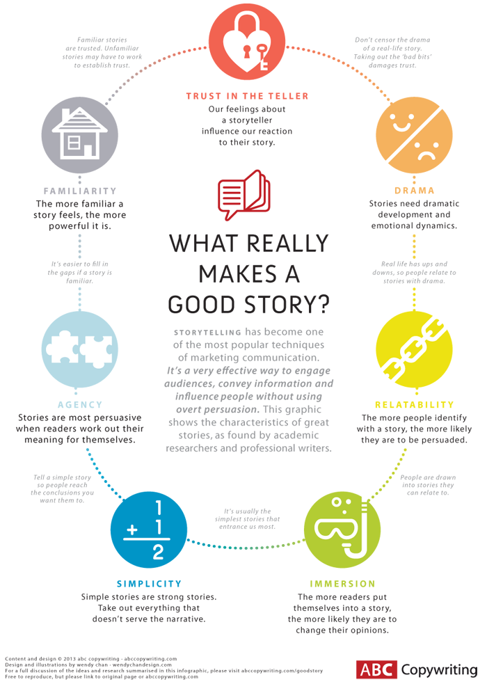
It’s like a basic sales pitch. You have to present the problem, talk about it, and then provide a solution.
That beginning → middle → end sequence is important. It helps the reader understand that you’ll help them go through a transformation or solve a huge issue in their life.
Without a story, your copy runs the risk of sounding limp and uninteresting. A story will help your customers connect to your copy.
Third, your copy should be interesting.
Even if you optimize your copy for your audience and tell a story, that doesn’t mean your copy will be interesting.
Many businesses still use dry and outdated copy that sounds like it’s from a piece of direct marketing from the 1980s.
You need to use copy that pulls readers in. Relaxed language and plain English go a long way toward achieving that goal.
Take a look at how Unbounce does it:
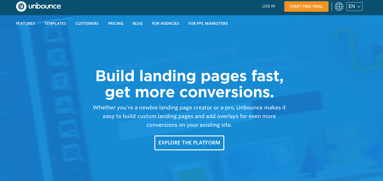
The copy is casual, but not too casual. It’s easy to understand and gets the point across in just a few words.
This kind of copy isn’t always easy to create, but it’s worth its weight in gold.
You can’t skimp on your copy if you want to see those awesome conversion rates you dream of.
Conclusion
Conversion rates are a big deal.
And they’re also a big pain.
Why? Because they require relentless work and tireless testing.
And you always want them to improve!
You have to get to know your audience, craft a message specifically for them, and communicate your value well. All of those factors impact conversion, so you have to stay on top of everything.
Yes, it takes work, but that’s how you’ll bump up your conversion rate and get your users to buy.
Okay, a quick parting bit of advice.
Don’t chance it with conversion tweaks, please.
There is a hard science behind conversion analytics.
Numbers don’t lie. When you set about to boost your conversion rates, do so by running legitimate split tests and cautious changes.
Always be testing this stuff, and always be making improvements.
Is your conversion rate lower than you’d like it to be? What do you think the reasons are?