 Sign In









Creating content without promoting it to get backlinks is a waste of your time (when it comes to SEO).
That’s why I write so often about different promotional tactics for your content.
I know that some regular readers of NeilPatel.com get great results putting those tactics into action.
I hope you’re one of them.
But, there are others that aren’t quite getting the results that they’re after, which is understandably frustrating.
There are a few areas where you can easily make a mistake that will drastically reduce the effectiveness of most promotional techniques.
One major area is content.
Modern promotional tactics aren’t based on trickery, they’re based on giving value to readers.
This is not easy to do and it takes some practice and training to learn how.
I’ve written before about writing better content and creating compelling content.
But, even if you understood everything in those articles, it’s possible that you’re still missing a piece of the puzzle – the reader.
Even if your content is objectively valuable, some readers will find it more valuable than others.
Why? Because value depends on the context.
Readers in different situations are looking for different information. If they can’t easily find it, they’re going to be disappointed, no matter how thorough or data-driven your content is.
Why making content more accessible for search visitors will improve your rankings
The point that I’m trying to reinforce is that you should create your content around the visitors that you want to please.
If you’re trying to satisfy visitors from Google, you need to approach your content differently.
Here’s why:
When most searchers enter a query on Google, they’re looking to solve a problem. If they click on a result, and the information that they are looking for isn’t immediately obvious, they won’t be happy.
This is accessibility in a nutshell. Users need to be able to not only access your content (load the page) but also to find relevant bits of content.
When someone lands on one of my massive guides on Quick Sprout from a random long-tail search query, I know that they probably don’t want to read the whole thing right away. They just want to read one specific part of it and need to be able to find it.
Why accessibility is important: When search visitors can’t find the answers that they’re looking for, they are unsatisfied, which is bad for Google.
It is in Google’s best interest to place the most valuable results (in terms of the searcher) at the top.
So, it makes sense that Google would try to incorporate user engagement metrics into their rankings.
Google has remained tight-lipped about this particular element of search.
But, regardless of if and how much Google uses engagement in their rankings, it’s something that they will always be looking to include more of. Focusing on satisfying search users is a good thing, right now and in the future.
Google has a few different patents relevant to user engagement. This one, in particular, describes a way that Google could use user feedback to rank sites. That doesn’t prove that they’ve used it but supports that they think about user engagement.
One of the most popular theories of how Google can measure user satisfaction is the “long click”.
The long click describes a searcher clicking a result and then never coming back to the search results (or at least not for a long time). This would suggest that the searcher found what they’re looking for.
The opposite of a long click is called “pogo-sticking,” which involves jumping in and out of search results because a searcher can’t find what they’re looking for.
If you use the techniques and tactics in this post to make your content more accessible to search visitors, you will cut down on the amount of pogo-sticking that your site is involved with.
This will be good for your on-site conversion rates, but could also result in a boost in the rankings.
We’re about to go over 7 different ways to make content more accessible for search visitors. Feel free to incorporate as many as you’d like into your site and content.
Way #1 – What do all books start with?
It’s not a trick question.
Right after you get past the first few title pages, you get to a table of contents.
It tells you what the most important things in the book are (the headings of each section), along with where they are located.
In the early days of blogging and web content in general, there was no need for any sort of table of contents. Think about what was considered standard “SEO content” just a few years ago – 500 word posts.
But now, there’s a shift occurring.
You’ve seen it on Quick Sprout, first with my advanced guides and then with my regular blog posts.
In short, they’re long.
Long enough so that you can’t skim it all in under a minute and find what you’re looking for if you’re a first time visitor.
It’s not a problem for any of my subscribers, because they know what to expect and generally like the level of detail I put into posts.
But, for someone who searches some long-tail phrase, and ends up on a massive blog post, I’ll admit that I could understand if they had a difficult time finding the section that’s most important to them.
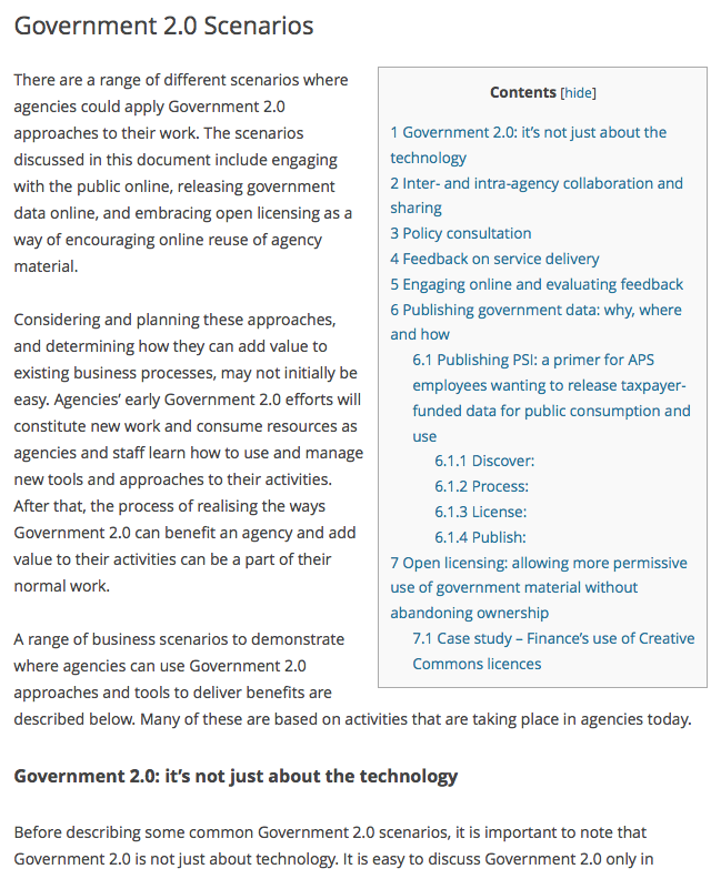
One thing that Wikipedia does well is to include a table of contents on every single entry. It’s not fancy, but it works as well as any other table of contents out there.
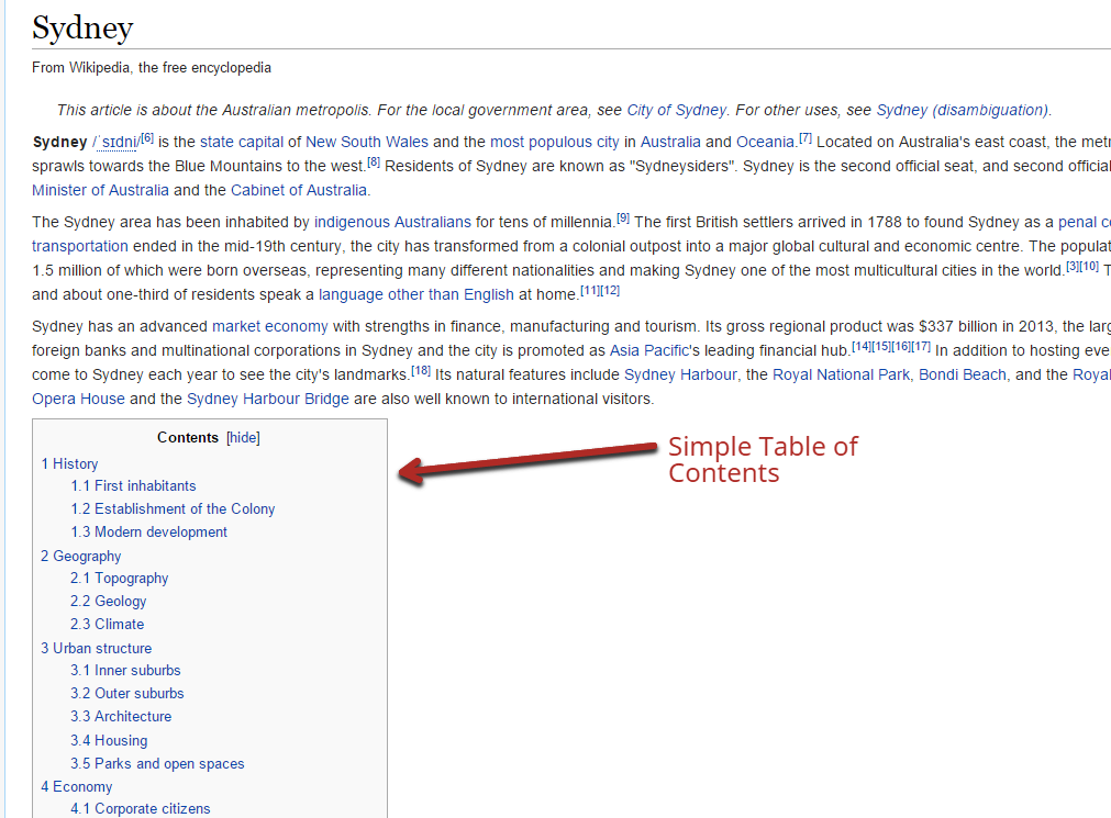
But, if you feel like that’s too simple for your website, or doesn’t really fit in with the design of your content, you can also create other types of tables of contents.
Just because it’s called a table, doesn’t mean it has to be one. An image-based table of contents is extremely attractive but still useful.
How to create a table of contents with minimal effort: Look, I get it. You already spend a lot of time creating content and you might be hesitant to add yet another task to your workflow.
But, it doesn’t have to be difficult.
If you’re going to create a fancy table of contents, like the above example, it will take some extra work, especially the first time.
But, even a simple table of contents will go a long way and it can be done automatically with a plugin.
There are many out there, but the top-rated WordPress plugin is the Table of Contents Plus plugin.
Once you install it, click on the plugin’s “settings” option in the left menu of your WordPress dashboard.
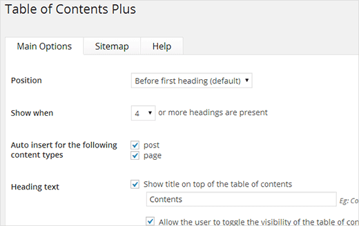
You can set the position of the table of contents. You could have it appear right away, or mimic Wikipedia by setting it just before the first subheadline in the article.
You can set it to auto-insert, by checking the option boxes (shown above). You can also set it to only show up for long articles (when there are X or more headings in the post).
By default, the plugin will create a table of contents that looks a lot like Wikipedia’s, but you can also choose from a few different themes to get a look that fits your website:
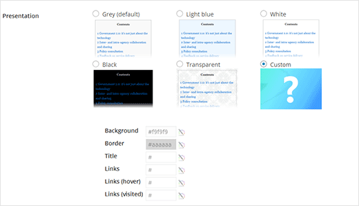
The best part about this plugin is that it takes virtually no effort on your part after you set it up. Even if you disable the auto-insertion, all that you need to do to put a table of contents in your content is to write “[toc]” somewhere in the HTML of any post or page.
When you get it up and running, you’ll see something like this on posts:
Way #2 – Get rid of the clutter
Distractions and the Internet go hand in hand.
But, not all distractions are welcome.
In an effort to increase page views and improve email sign-ups, many websites have gone overboard with the extra on-page elements.
What am I talking about when I say distractions?
- headers
- sidebars
- advertisements
- pop-ups
- scrolling elements of any kind
- social media buttons
It really becomes an optimization problem.
There is some benefit to utilizing the listed elements. However, there are good and bad ways to employ each of them.
In addition, even if you implement them well, if you go overboard and use too many together, you’ll also see negative results.
The first concern from having too many distractions is that it annoys regular visitors and they are your most valuable visitors.
I’ve often seen that the aggressive use of pop-ups can improve the email sign-up rate of sites, but in the long run, those subscribers convert poorly. While it seemed like there was an immediate gain, there was actually a long-term loss.
The second main concern is the effect these elements can have on search visitors.
Like we’ve discussed, searchers are looking for particular parts of your content that answer their queries.
The more distractions present, the less attention they have to focus on your actual content. That means they have less time to find what they’re looking for and are more likely to hit the “back” button.
In addition, some elements, notoriously pop-ups, often show up poorly on mobile devices. Some visitors will be unable to close certain pop-ups, which leaves them no other choice but to back out.
So, while these elements can help, it’s important to consider how they affect your user experience.
Here’s what I would suggest…
First, minimize distracting elements: You need to start by seeing how many potentially distracting elements you have on most content pages.
If you notice that the elements, other than your actual content, are taking up a large portion of the screen (let’s say 40%+), you definitely have a problem and will scare off visitors.
Other than your content, there should be one or two other elements on the page at any given time.
Next, evaluate how off-putting individual elements are: Two headers can be completely different.
One could be 200 pixels tall and neon orange, while the other one could be 50 pixels tall and match the background. Which one do you think is more distracting?
Always try to make the best version of any element that you include on your website.
If you use a pop-up, make sure that it’s easy to close and predictable. Nothing annoys users more than pop-ups continually popping up at random times.
One “sticky” subject is sticky elements. As the user scrolls down on the page, they scroll down with them, glued to the page.
If you’re going to include an element like that, do it correctly. The NeilPatel.com blog has a very minimalistic design and the header menu reflects that. It matches the background color and only the logo and CTA stand out.
Finally, move content up and center it as much as possible: The worst result of including any element is that they block out your content.
Any web page has content above-the-fold, and below-the-fold.
You see everything above-the-fold on your screen when you first load the page. Obviously, this differs based on screen size.
You need to make sure that your content (at the very least the title) is visible, even on small screens.
If your menu or any opt-in forms are pushing content down too far, visitors will think they landed on the wrong page and often leave immediately.
Way #3 – Cater to scanners (which most search visitors are)
The typical online reader does not read every word in an article. They don’t even read most words. Studies have shown that the average reader only reads 20-28% of an article.
Consider again how most searchers use Google.
They’re in the process of doing something and they run into a problem. They load up Google and search for a solution.
They don’t want to read your full guide to something, in most cases. They just want a quick solution. This automatically makes most search engine visitors scanners.
So, it’s important to cater to them.
There are a few key formatting changes that you should deploy to make your content more accessible to scanners.
Start writing descriptive subheadings: You should be spending at least a few minutes on creating a great post title.
However, you should also spend a decent amount of time on each of your post subheadings.
Think of it this way:
Your main headline gets a reader’s attention over any other headlines that he/she could click on. Your subheaders get a reader’s attention so that they know which sections of the article they should read.
Scanners only look for things that stand out and subheadings are the main thing that stands out.
Let’s compare 2 different sets of subheadings.
The first one is done well, in an article from Moz. Each subheadline clearly shows what the section will be about.
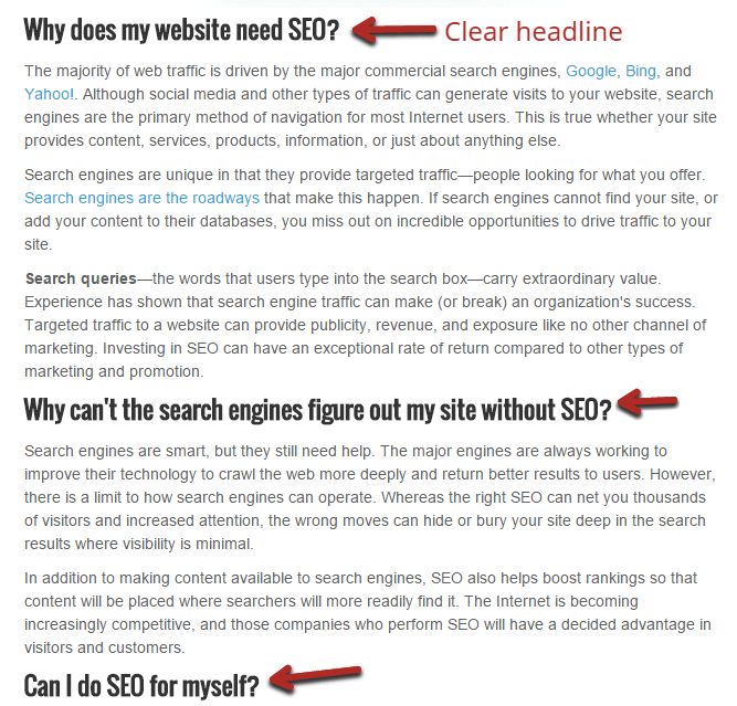
These are very specific headlines, which is due to the types of article it is.
In your own posts, there may be some ambiguity in your subheadings and that’s okay. As long as a reader can have a general idea of what a section is about, they can find any information they are looking for fairly easily.
But, often, headlines are left too vague.
Let’s look at the second set of subheadings (that I created as an example) for the same article:
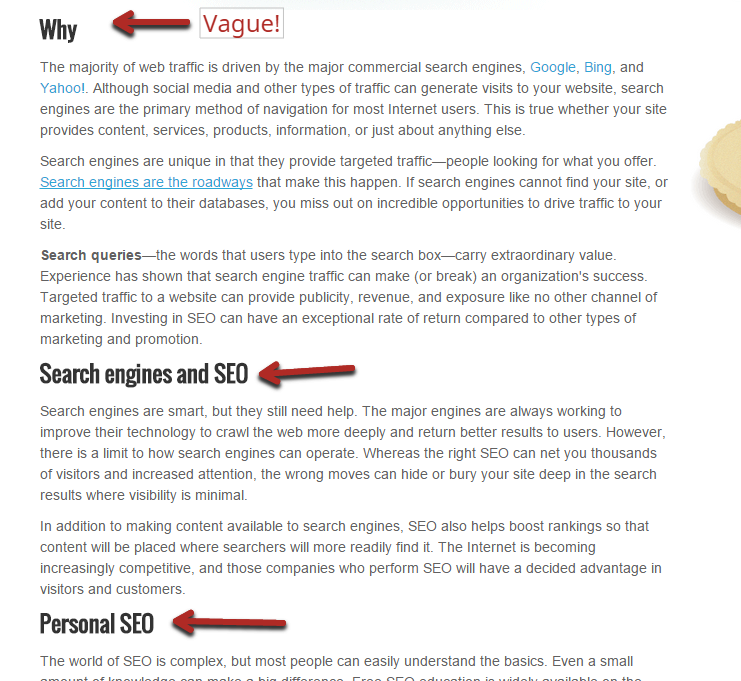
These obviously aren’t great. And, while they may be a little on the extreme side, I often see subheadings that are almost as vague in real life.
If you were scanning the article and saw “Search engines and SEO” as a subheading, it probably wouldn’t even register. That section could be about almost anything SEO related.
Ensure that your subheadings are clear: Once you’re writing good, descriptive subheadings, you need to make sure that scanners can easily identify them.
It’s not complicated, just make sure that they are sufficiently bigger and bolder than everything else.
On Quick Sprout, subheadings are the only text that gets their own line, which makes them stand out even more:
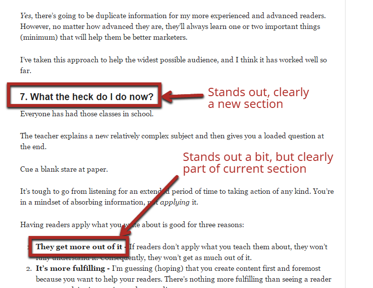
If I have any important sub-points within a section, I use bold, italics and indentation as needed.
Start long sections off with potent points: If your section is pretty short, it’s easy for a scanner to be interested in the headline and then just read the whole section quickly to see if it has the information that they’re looking for.
But, sometimes, your subheadings may leave a little mystery. It may contain what they’re looking for, but it may not either.
If that section is long, it may scare them away from reading it.
What you need to do is essentially make a mini-introduction for each section.
With the first 1 or 2 sentences, it should be crystal clear what the section will be about.
For example, in the following screenshot, that section could be about backing up a website or backing up claims with data.
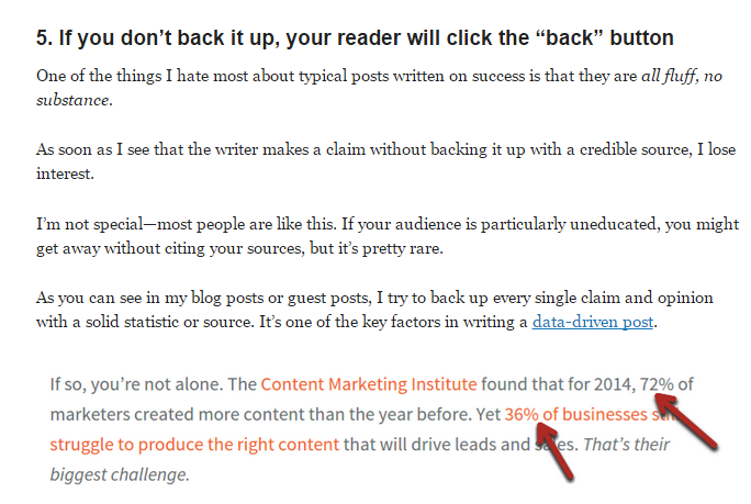
After reading the first 2 sentences, it’s clear that the section will be about why it’s important to back up claims with data and how to do it.
Way #4 – Let them know what to expect
If you don’t want to go with the table of contents option, you also have the option of including additional information in your introduction.
Ideally, an introduction should first hook a reader.
Of course, search visitors are scanners and will probably skim right to the meat of the content.
They look mainly at subheadlines, but also right above and below them as they stop to read them.
You can take advantage of this by quickly summarizing what the article is about, in bullet points, right above your first section.
I sometimes do this in exceptionally long posts that have very distinct sections:
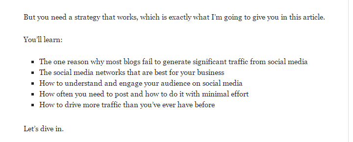
Even though these bullet points aren’t clickable, like the list items in a typical table of contents, they still tell the reader roughly what order they can find information in.
If a searcher came to that post looking specifically for information on how often they need to post on social media, they’ll see that it’s the 4th point in the list, so it’s probably about 80% down into the article.
Way #5 – Provide quick answers for quick questions
There is a massive disconnect between what visitors actually want and what writers think they want.
I don’t care how gifted you are at writing, you can’t force someone to read when they don’t want to.
While there are a ton of great lessons in old copywriting books, you have to know which parts to add to your web copywriting.
In most old copywriting books, there’s always an example of writing a compelling intro.
The writer teases you into the advertisement/article with a clever short story. Then, he segues into his actual point.
Many blog writers think that they can do the same thing. Very few ever have any real success with it.
The web is a very different medium than print, even if many principles carry over.
You also need to consider the context. Someone reading a magazine has leisure time to read an advertisement story, but someone using a search engine wants an answer fast.
So if you’re one of those writers who think they can suck in every single reader to read every sentence of a post – stop.
The practical applications of this: Don’t be obsessed with long content. Yes, writing in-depth, entertaining content can be a good thing, but not all the time.
If someone searches for a simple thing, they want a quick answer, so give it to them.
The lesson here is to give the searcher what they’re looking for. Don’t try to rope them into a story about the history of the United States, when all they want to know is when Independence Day is (July 4th, if you’re curious).
Way #6 – Avoid the perils of meta description optimization
You remember what a meta description is, right?
It’s that tag that you can add to every page that describes your article. In many cases, Google will display this under your title in the search results.
It’s good to make an attractive meta description to the searcher because it will get more clicks.
However, you better make sure that any major phrase that you use in your meta description is on your page.
Nothing frustrates searchers more than seeing a phrase in the meta description that they can’t find on the page.
Here’s what should happen:
Someone searches for help in making custom blog post images without a designer.
They see one of my posts on Quick Sprout, along with a description below it.
This is actually a description generated by Google, automatically created by extracting bits of text from the article.
Some part of that description might jump out at the searcher and compel them to click through to the article.
Let’s say that they’re dying to know what comes after “you’ll want to choose custom…” – it could be anything!
So, they click through to the article and use “Ctrl + f” to search for “to choose custom”. Since this text is actually on the page, they find exactly what they’re looking for and are happy searchers:
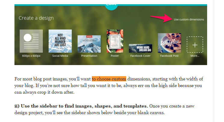
But, this doesn’t always happen.
Sometimes, SEOs will create meta descriptions like the following:

It creates a curiosity gap by revealing that I have a great “custom image secret”, which will naturally induce more clicks – that’s a good thing.
The problem is that when they load the article and look for “custom image secret”, they aren’t going to find any results.
They will likely spend a few seconds quickly skimming for it and then give up and try a different search result.
If you’re going to use a custom meta description, make sure that you use the same words in your article. In this case, I’d want to use a “custom image secret” somewhere in the article.
Way #7 – Don’t offer your guests something when it’s too late
A key way that you can make your content more friendly to searchers and non-searchers alike is by offering it in multiple formats.
Some people like to read, others like to learn through images or videos and some like to learn through audio.
The more formats that you can offer readers, the more people you can please. Of course, you’ll have to weigh the added benefit with the cost of producing content in multiple formats.
Some sites do offer blog content in multiple formats but fail to use it effectively.
Imagine going to a friend’s house for dinner. They serve you fish, which is okay, but not your favorite. Then, after you’re done eating that, they ask if you’d rather have pizza because they have that too.
Of course, you wouldn’t want it now, because you just finished eating!
But, if they asked before, you may have had pizza instead.
It’s the same thing with web content – it’s something that a reader consumes.
I’ll give you a personal example of how it could be done better, I’m not afraid to admit that my sites aren’t perfect.
For Crazy Egg, we have a podcast that primarily serves to attract new podcasting listeners and get them to visit the website later.
However, we know that some blog readers also like to listen to the podcast.
Since the podcast is based on blog posts (essentially the posts are narrated), we embed the podcast in the related post. That way, if readers wanted to listen to the post instead of reading it, they could.
Here’s the problem, we embed it after the post.
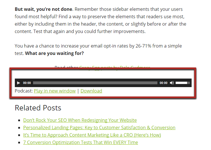
If you just read a post, you’re probably not too interested in consuming it in a different format now.
But, what would happen if we offered it right away, near the start of the article? A decent chunk of visitors would choose that, instead, because they prefer it – which is a good thing.
This is something that Brian Dean does well.
He frequently offers PDF versions of his posts, right after his intros, on Backlinko.
In his case, he even asks for reader’s email addresses if they want the PDF and most people don’t mind that tradeoff.
If you give them alternative options that they value, they’ll appreciate it.
Step one is to first give them alternative ways to consume content. Step two is to try and place it as early as possible (although late is better than never).
Conclusion
Creating in-depth content with lots of custom images and backed up claims doesn’t necessarily make it valuable.
Value is determined by the visitor alone.
There’s one thing that you must always ask yourself when writing content: “what does my reader want to see?”
Create content that delivers value to your readers and you will get great conversions.
But, to do that, you must consider all of the different types of readers you get (from search engines, email marketing, social media, etc.).
From an SEO standpoint, making your content more accessible to search visitors will result in better user experience and, likely, better rankings.
You can use the 7 techniques I’ve outlined in detail in this article to revise your website and content to better match the needs of search visitors – making your content more valuable.
If you have a favorite way of making your content better for search engine visitors, please share it with me and everyone else in a comment below.