 Sign In







Do you want to improve your website conversions? Well before you get started you probably first want to sign up for funnel tracking and an A/B testing solution. This way, not only will you figure out what you should work on that will provide the biggest lift, but you’ll also see how your changes are affecting your conversions in a positive way.
None-the-less, if you want to increase your conversions, here are 101 tips to follow.
101 Conversion Tips
1. Don’t require shoppers to register in order to checkout. Forcing them to create an account before they complete their order is just an additional stumbling block.
2. Test your Call to Action text. Try “Order Now” instead of “Buy Now” or “Checkout”.
3. Eliminate links that don’t serve a specific purpose from your landing pages. Make the objective clear and obvious to avoid distracting the customer.
4. Consider adding a Live Chat option that is staffed during normal business hours. You may attract customers who wouldn’t ordinarily take the time to contact you.
5. Always experiment and test options such as colors, placement of items, product image size and forms. You should never run out of things to tweak.
6. Create “personas” of your target audience members, based on your understanding of actual visitors. This lets you visualize the checkout process through their eyes.
7. Does your headline include some reference as to where the visitor clicked from previously? Tie in your landing page with your ad or the user’s search for seamless engagement.
8. Customers really do read your terms of service and privacy policy. How can you simplify the legalese and reassure them while protecting yourself?
9. Test different bonuses or tie-ins with your product. Free gift? Free shipping? Free training? What can you offer that will “seal the deal”?
10. Test different types of guarantees. If the industry standard is 30 days, make yours 60 or 90. Don’t be afraid to stretch the limits of what’s possible.
11. Put the most important information “above the fold” on your website. Make sure your visitor’s eyes are directed to exactly what you want them to see – without the clutter.
12. Take out every instance of “I” in your copy and rewrite it so that the emphasis is on “You”/”Your”.
13. Split test a holiday-theme for your website. Target it to visitors who come from areas where that holiday is celebrated.
14. For holiday shopping, notice trends on visitor shopping by time of day, day of the week, and how many days are left until the holiday. Maximize offer exposure accordingly.
15. Use active language like “Buy”, “Register”, “Subscribe” alongside text that creates urgency, like “Limited Time”, “Before December 31st”, and so forth.
16. Place your call to action up front – ideally above the fold and so that it stands out among any other buttons on your page.
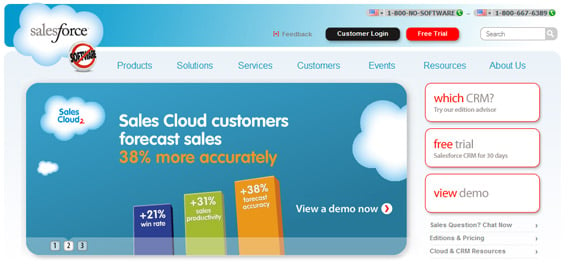
17. Use whitespace effectively in your design so that it draws the eye in toward the call to action. Empty space doesn’t have to be filled.
18. What happens after your user clicks the Call to Action button? Make sure the entire process flows smoothly and they know exactly what to expect.
19. Put the most important information you want visitors to read at the top and bottom of your page. People read those first, and typically only skim the middle.
20. Long copy can work as long as it continually motivates the visitor to keep reading. Write tighter and edit out the side thoughts, anecdotes, tangents and other gunk.
21. Can the visitor get to where they want to go on your site in 3 clicks or less? If not, make it happen. Don’t make them guess how to navigate your site.
22. Don’t put all your testimonials on one page. Put them alongside the product to help increase credibility and trust.
23. Your reputation can’t be bought. Make sure to address any customer complaints or bad reviews head-on. The online community is always talking.
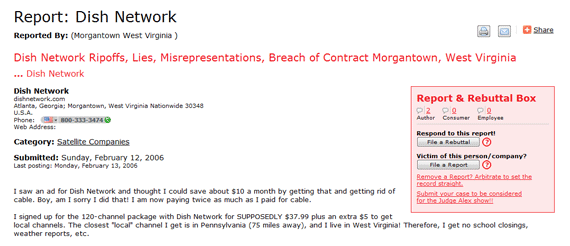
24. If you have several steps in your checkout process, show a progress indicator so the user knows exactly what steps they need to take.
25. Include shipping prices which update automatically in the cart as the user adds more items or adjusts quantity. Free shipping can have a huge effect on conversions.
26. Let customers know an approximate delivery time before they check out. Include tracking numbers if possible.
27. In your confirmation email, include information on how users can modify their order before it’s shipped.
28. Don’t ask for more information than what you truly need on your forms. Nobody should have to enter their physical address to subscribe to a newsletter.
29. Use alternate colors for your call to action buttons, otherwise they can be lost in the overall color scheme of your site.
30. Use real photos instead of corny stock pictures. Nobody believes for a minute that you’ve got a multi-ethnic, always-smiling, drop-dead-gorgeous staff.
31. Break up long paragraphs into small, easily scanned “chunks”. It makes reading on screen easier (especially if you’re on a mobile phone!)
32. Validate your forms so that they give real guidance. Point out that your form only accepts A-Z or a-z, not Error Code: x000303003.
33. Give your customer an incentive to fill out additional form information by placing it on the “Thank You” page and offering a freebie for their participation.
34. Try making the first letter of your body text a drop cap. It helps fill in the gap between the headline and body copy.
35. Instead of an ordinary image of your product, test an image of your product actually being used by a customer.
36. Allow visitors to zoom in on a product to see its detail, as well as the possibility to see the product from different angles.
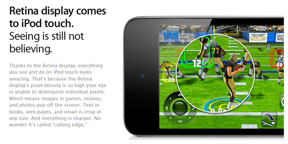
37. If you’re using long copy, add multiple calls-to-action throughout the copy. One above the fold, one at the end and others in logical places throughout the body text.
38. Customers don’t like unpleasant surprises. Don’t spring hidden fees, long contracts or other extra issues on customers once they begin checking out.
39. Have someone not in your team or department read your copy. They aren’t attached to it and can make some interesting suggestions.
40. Draw attention to important information with hand-drawn arrows, underlines and asterisks. Don’t overuse this effect to the point where it’s distracting though!
41. Put your most popular products or services into a single category and highlight that category above the fold.
42. Instead of a plain product image, consider adding an image of what the successful outcome or finished product looks like.
43. Test your sales copy as a more personalized “me-to-you” style rather than an “us-to-everyone” style.
44. Where applicable, include a FAQ about each of your products to help minimize customer inquiries or complaints.
45. Consider giving users the ability to increase font size on your site for easier readability (particularly on smartphones).
46. Test putting your order form on the same page as your sales letter, so that customers don’t have to click to another page to buy.
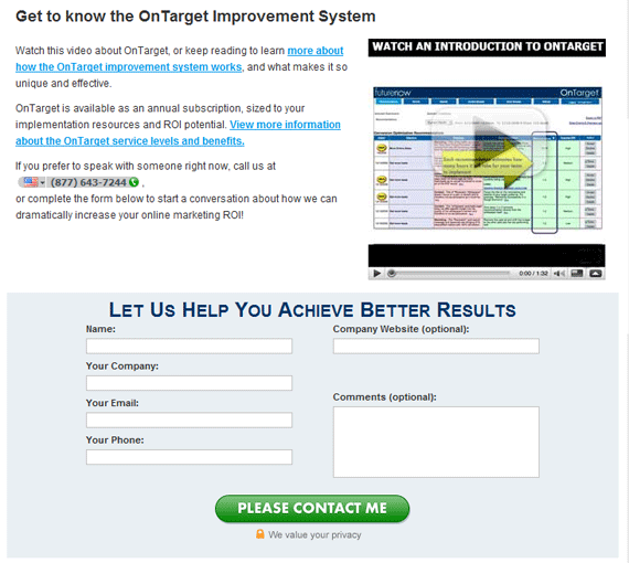
47. Can you include audio (or even better) video on your website to help demonstrate your product or provide tutorials on how it’s used?
48. Including miniature thumbnail pictures in your shopping cart reduces the likelihood of shopping cart abandonment (probably because it makes products seem more tangible).
49. Remind visitors of how much you value their privacy. Include unsubscribe options with every email, and a link to your privacy policy on your subscription form.
50. Consider including third party trust seals such as Verisign, BBBOnline or Hackersafe to increase credibility.
51. Put your refunds/return policy or guarantee below your checkout button instead of on a separate page or on a customer service page.
52. Write “evergreen” content. You may be surprised at how much traffic is still coming to your “old” pages. How can you freshen them up for today’s audiences?
53. It should go without saying, but don’t direct your PPC or ad traffic directly to your homepage. Create landing pages based around actual searches.
54. Answer the question that’s on your customer’s mind, which is “Why should I buy from you instead of a competitor?”
55. Go beyond your Unique Selling Proposition (USP) by asking “Why should customers buy from me versus doing nothing at all?”
56. Test the shape, color, size and wording of your Call to Action Button.
57. If you have a coupon or promo code section on your site, make damn sure you’ve got something to go in it. People WILL go offsite to check for coupon codes.
58. Make it simple for people to share a page with their friends on social networks or via email. Let them personalize the message.
59. Can you recommend other products that would complement what the customer just ordered? Cross-selling can be highly effective before an order is fully placed.
60. With WordPress, Google Free Search and most ecommerce and content management platforms, there’s no reason not to have a search area on your site. Use analytics to monitor it.
61. How else can people order on your website? By phone? Fax? Catalog? Not everyone has (or wants to use) Paypal.
62. Summarize the benefits of your product or service as bullet points before you ask for the order.
63. Use a heatmap tracking system like CrazyEgg to visualize exactly where users click. Is it where you want them to click?
64. Make sure you’re not creating a false sense of urgency by telling users there are “only 3 left” when it’s a digital product and that number won’t decrease once they order.
65. Is your sales copy addressing the customer’s most important objections up front?
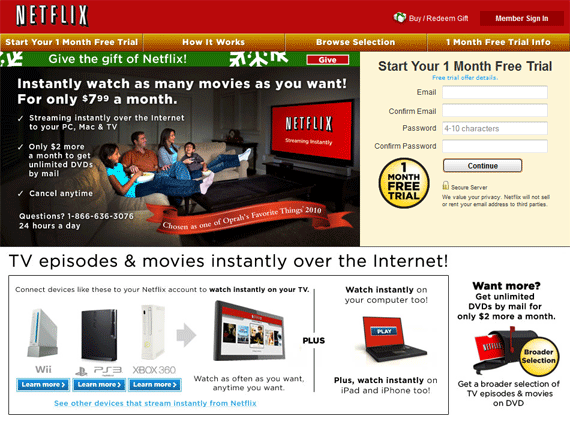
66. Can you shorten the number of steps the user needs to go through in order to complete an action (like checkout, subscribe, order, etc.)?
67. Test different payment terms to see which converts best. Buy now, pay later? A 20% discount if paid in full? Billed in installments? Buy 1 get 1 free?
68. Let customers know how much of an item is in stock through real-time inventory updates and if/when more will be ordered.
69. If you have a substantial number of email inquiries, consider adding a “Click to Call” option so that visitors can have you call them at their convenience.
70. Let users easily sort, filter and view columns of products or items per page to improve their overall browsing experience.
71. Don’t test something just because it’s unique and different. Test what makes sense to test based on your different user profiles or personas.
72. Add the option for customers to read and leave reviews and ratings for products. Consider offering a coupon or a reward for completing the review.
73. If your page contains multiple products, allow customers to filter by size, color, style and price via an AJAX-enabled side navigation.
74. People often make decisions based on what others have done. Include that social push in your product, as in “83% of moms would recommend this product to others”
75. Have a link to your coupon or current promotion right on the landing page. Better yet, automatically fill in the “coupon code” at checkout if possible.
76. Turn off images in your email program and view your newsletter. Is it still readable? Do people see where to click to learn more?
77. Include product testimonials in your email newsletter in addition to your product pages.
78. Use breadcrumbs on every page – even landing pages – to give people an at-a-glance understanding of where they are relative to the rest of your site.
79. Make valuable use of your “Thank You” page by including a coupon for their next visit and letting them sign up for notification of new sales on products that interest them.
80. People buy based on emotion, but they rationalize their purchase, too. Make sure you remind them of their smart decision and why it was such a good idea.
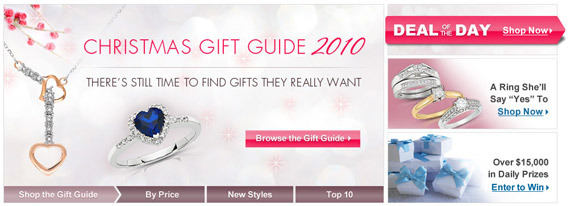
81. Keep the look and feel of your landing pages consistent with your ads and main website. No one wants a mental disconnect from clicking an ad to visiting the actual site.
82. Remember, one of the first things a visitor asks when they land on your page is “Am I in the right place?” followed by “How long is this going to take?”
83. Has your site been featured in the news or on industry-leading sites? Make sure you include their logos on your site to build authority.
84. Let visitors participate in your page. Have them fill out a simple “quiz” with a result, and recommend products accordingly. Interactivity can boost conversions by 30%!
85. Can you personalize your site based on what the user searched for, where they came from or other factors? A more personal approach breeds comfort and familiarity.
86. Don’t ask too many questions on your landing page. Instead, let the visitor click the call-to-action first. Even then, limit how much you ask for up front.
87. Everyone knows about the benefit of upselling, but what about downgrading? Can you offer a lower-priced or “lite” alternative?
88. Sometimes the best converting headlines bring out a user’s “pain point” and forces them to acknowledge that pain and take action on it.
89. Restate your guarantee. Try “we’ll buy it back from you!” or “if it doesn’t work, we’ll pay you!” If you’re confident in your product, your guarantee should be rock-solid.
90. Go beyond the holidays and offer discounts or special promotions for unusual reasons. Einstein’s birthday? National tomato month? That’s $10 off!
91. People love to know when they’re getting a good deal. If possible, show your price compared to that of your biggest competitors. Offer a price match guarantee or discount.
92. Include video testimonials or audio along with a customer’s photo. These greatly increase credibility compared to plain vanilla text testimonials (which can be faked!)
93. Make sure your subheadline flows smoothly into your body copy. Subheadlines are often the piece that clenches attention and gets the customer involved in your site.
94. Pre-qualify your users with questions up front – questions that they’re likely to answer YES to based on the “personas” you create for each of your target audience members.
95. Provide results-oriented testimonials. Rather than saying “It’s the best ever!” ask the customer to be specific, as in “conversion rates went up 10% overnight!”
96. Live up to what you say. If there are 5 left and the 5th has been sold, take down the offer. If the price goes up at midnight, make the price go up. No one likes a liar.
97. Remind your prospect of how painful, difficult or discouraging it can be not to take action at all, or to continue doing things the same way they always have.
98. Use a P.S. to throw in an enticing bonus or a reward for taking action within the specific timeframe. People often read headlines first, then read P.S.’s second.
99. Think about including your contact form into the sidebar of your website rather than forcing users to click a “Contact” link.
100. Check in with the customer after they order. A quick, friendly email along the lines of “How is (product) working out for you? Is there anything I can help with?” can go a long way.
101. Check your error pages. Use them as an opportunity to direct people to more recent/relevant content. Don’t just give them the 404!
Conclusion
Hopefully the tips above will help you improve your conversions, but before you start implementing them you need to know one thing. What works for one website may not work for yours, so you have to constantly test things out to figure out what your audience prefers.
If you have any other conversion tips, feel free and leave a comment.
About the Author: Sherice Jacob creates beautiful, high-converting landing pages, in addition to designing blogs and writing compelling content. Learn more at iElectrify.