


Key Takeaways
- Google Looker Studio is the new name for Google Data Studio. It is a data visualization tool you can use to generate insights and reports from over 1000 data connectors, including Google Analytics, YouTube Analytics, Meta Ads, and Stripe.
- The platform makes it easy for anyone to understand and report on the data you collect from various platforms. Its visualizations are often much better than those found in native platforms like Google Analytics.
- Google Looker Studio has several new features, including a new modeling method, better blending, and a premium version.
- It is an incredibly visual platform. You can use over 40 visualizations to tell a story with your data, alongside filter and control capabilities that help users find the information they need.
- You can customize Google Looker Studio with your branding and easily share reports with users inside and outside of your team.
Google Analytics is a great tool for recording what people do on your website. But it isn’t always the best option for presenting that data—or even making sense of it.
The information can be overwhelming and incomprehensible unless you’re an experienced marketer. Even if you spend hours downloading and reformatting screenshots, it’s never going to be a great way to present your progress to clients or stakeholders.
This is where visualization platforms like Google Looker Studio can make a difference. While these platforms don’t collect data, they let anyone understand data in a meaningful way.
In this guide, I’ll explain what Google Looker Studio is, how to get started with it, and the features you should be using to get the most from the platform.
What Is Google Looker Studio?
So, what is Google Looker Studio exactly?
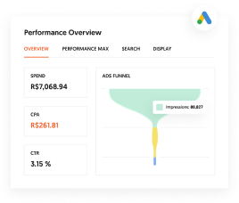
Google Looker Studio is an online data visualization tool that helps users convert data into informative reports and interactive dashboards. It centralizes various disparate data sources to turn information into clear and digestible reports like this one:

Google Looker Studio is essentially a streamlined version of data visualization tools like Tableau or Power BI. While you won’t have access to quite as many features or coding capabilities, the platform is free and very easy to use.
Unlike software solutions like a data analytics tool or a marketing automation platform, Looker Studio is not a data source. It doesn’t collect the data; rather, it combines data from different sources, analyzes it, and then lets you create interactive reports, charts, and dashboards.
As a Google product, Looker Studio excels at reporting Google-owned data. That includes Google Ads, Google Analytics, YouTube Analytics, etc.
But you aren’t limited to Google data. Looker Studio supports over 1000 data sets and connectors, including third-party platforms like:
- Meta Ads
- LinkedIn Ads
- Shopify Customer Events
- Stripe
- Bing
- HubSpot
Why should you consider adding Google Looker Studio to your marketing arsenal? Here are a few benefits:
- It’s free. (It is hard to beat that.)
- It combines data from several sources, providing a more accurate overview of your data.
- You can easily design charts, reports, and dashboards to help others understand what your data means.
- Dashboards allow you to sort and explore different data sets. For example, what is happening in a specific geographical region or during a particular month?
- It can save you a huge amount of time manually updating spreadsheets or dashboards.
If you’re hitting a wall with your data and need a way to better understand how sales, marketing, or online traffic impacts your business, Google Looker Studio is a tool you should use.
What’s New With Google Looker Studio?
Google Looker Studio used to be known as Google Data Studio. Google officially rebranded the platform in October 2022.
By and large, it’s the same platform as Google Data Studio. If you used the original tool, you’ll definitely be able to use the rebranded platform immediately. But there are a couple of new features you should know about.
The first is that Google Looker Studio has better blending capabilities than Data Studio. That’s because Looker first passes raw data into SQL databases making it easier to blend.
There is also a premium version of Google Looker Studio, Google Looker Studio Pro. This has additional team collaboration features (such as organizational-level permissions) and data governance features. It also offers premium support and service level agreements (SLAs) for a cost of $9 per user, per project, per month.
Finally, Google Looker Studio has a new modeling method, Looker Modeling Language (LookML for short). This won’t matter for the vast majority of users, but you can read about the language here.
Getting Started With Google Looker Studio
If it’s your first time using Google Looker Studio, let me help you get up to speed with the platform. Below, I’ve outlined everything you need to know to connect a data source and build your first report.
Build Your Google Looker Studio Template
Interactive reports and dashboards are the center point of the Looker platform. They are the visualization tools that bring your raw data to life.
There are two ways to create a report: create a blank report or use one of the templates. I recommend starting with a template, which you can customize to fit your needs. Once you have a better grasp of the platform, you can try your hand at a blank report.
You can choose from any of the five templates on Google Looker Studio’s homepage or click the Template Gallery icon to see more.

You can create and submit your own templates, but let’s choose an easy one to work with for now. Click Search Console Report, then Use Template.

Add your basic information, including country and company, and set your email preferences. I suggest opting into tips and recommendations to get a better grasp of the platform.
Add Your Data Sources
Now that you have a template, it’s time to create your customized search console report.
There are two ways to add a data source. The first is to click on the Data sources tab in the homepage navigation bar.

The other is by editing a template you’ve already created. You can also use this method to change your template’s name and sharing permissions.

If you are still getting a feel for the platform, I suggest using Google Analytics or Search Console as your data source. Both should be familiar if you use them and are easy to set up.
However, you can also add data from many other sources, including (but not limited to):
- Google Sheets
- BigQuery
- Campaign Manager 360
- Google Ads
- PostgreSQL
- YouTube Analytics
- AdRoll
- Facebook Ads
- Ahrefs
- CallRail
- ActiveCampaign
There are over 1,000 data connectors in total. Once you’ve decided which ones to add, select the account, property, and website data, then click Add.
FYI, there is normally a fee to connect non-Google data sources. For example, it costs $5 per month to connect Facebook Ads to Google Looker Studio using MetricWiz

You should also know that all of Google Looker Studio’s reports are dynamic. When your original data source is updated, the new data will automatically appear in your reports.
Customize The Report Visualization
Now that you have data, it’s time to make this template your own. Nearly everything can be adjusted. That’s great for those with very specific requirements but it can be overwhelming for new users.
Let me break things down by giving you a quick overview of things you can customize in Google Looker Studio:
- Data fields
- Visualization types
- Fonts and colors
- Layouts
- Conditional formatting
Customizing your report is easy. Say I want to change the metrics used in this line graph on my Google Search Console report:

Clicking on it brings up the chart’s Properties sidebar. I can then click on the metric and choose a different one from the dropdown menu. In this case I’ll change it from URL clicks to URL CTR:

That’s it. The chart updates automatically.
Share Your Google Looker Studio Report
Sharing permissions let you control who can access your report and what they can do with it.
Like most Google products, sharing your Google Looker Studio report is very easy. In fact, if you’ve ever shared a Google Doc or Google Sheet, you’ll be very familiar with Google Looker Studio’s sharing permissions.
Share your report by clicking the Share button in the top right corner. Google will present you with the following options:
- Invite people: Share the report with other users’ Google accounts
- Schedule email delivery: Send your report to a specified email at a given time or interval.
- Get report link: Generate a link for your report
- Embed report: Generate an embed code
- Download report: Save your report as a PDF

Don’t think that just because you’re sharing your report with another user, they’re going to be able to ruin your hard work by altering charts or deleting data sources.
You can choose to make the person you are sharing your report with a “viewer” (meaning they can only look at your report) or an “editor” (meaning they can change your report.)

Google also lets you limit sharing options by clicking on the gear in the right-hand corner. This will let you:
- Prevent editors from changing access and adding new people
- Disable downloading, printing, and copying for viewers
- Disable viewers from viewing and creating alerts
What Metrics and Dimensions Can You Track In Google Looker Studio?
Any time you connect a data source, you’ll draw in metrics and dimensions from the source platform.
Metrics are quantitative values that count or measure your data. They include numbers, percentages, currencies, etc.
Dimensions describe your data. They are names or characteristics of the things you measure. They include things like age, country, date, name.
Some sources may only have a few metrics and dimensions. Others may have dozens. Here are the metrics and dimensions that Looker Studio integrates with a Google Search Console data connection:

But there are dozens more metrics and dimensions when you connect YouTube Analytics:

You can change the metric or dimension of any chart in Looker Studio by clicking on the graph in question and selecting a new option from one of the dropdowns in the Properties sidebar.

Features That Help You Use Google Looker Studio Effectively
Now you’re familiar with Google Looker Studio, let’s explore how you can get the most from the platform. Use the following features to take your reports to the next level.
Create a Custom Template
The templates Google provides are a good place to start, but you can also create a customized template. Say you sent out a monthly report on organic traffic. You could create the report from scratch every month—or you could save a custom template and simply add the new data each month.
Here’s how:
- After you create a report, click File > Make a Copy.
- Change the data source to one of the “Sample” data sources if you plan to share outside of your organization. (This uses sample data so your template doesn’t include sensitive data.)
- Select Copy Report.
- Change the name of the report to differentiate it. I suggest adding “Template” to the name.
- Use Share to manage access.
This video walks you through the process step-by-step.
Next time you need to create that report, save time, and use your template.
Automation Capabilities
The great thing about Google Looker Studio is that it will automatically update every time your data connectors get refreshed.
But that’s not the only thing you can automate on the platform. For example, you create automatic date ranges. Clicking “today”, “this week” or “this month” when choosing a date range control will automatically update your report to the time period in question.
You can also use Looker Studio’s scheduled reports feature to send on a specific day, allowing you to automate report creation and delivery.
Here’s how.
After creating your report or dashboard, click the caret next to the “Share” button. The drop-down menu allows you to schedule the report to be sent at any time in the future.

Filters In Google Looker Studio
Filters make it easy to customize reports to each viewer’s preferences and give everyone access to the information they need.
You can add filters to individual charts or to your entire report. For example, you can let users filter a chart based on a data input (like device type or country). Or you can let users filter the entire report, by choosing a specific time frame, for example.
Add a filter to a chart by clicking on the chart in question and scrolling down to the bottom of the Properties sidebar. You can then choose a filter that’s relevant to your data set:

Add a filter to your report by going to File and clicking Report settings.

Google Looker Studio applies filters at the page level by default. You can make a filter report level by right-clicking the filter and choosing “Make report-level”.
Controls
Controls are a Google Looker Studio feature that lets you interact with data in several ways. These include changing specific metrics and dimensions, changing the date range of a report, and setting parameter values.
Controls are particularly good at letting people interact with your report without changing the underlying data. For example, members of your marketing team can use controls to find the information they need without messing with the data sources. Clients can use controls to see how their performance compares from one period to the next.
There are two types of control: data controls and specialized controls.
There are seven data controls:
- Drop-down list
- Fixed-size list
- Input box
- Advanced filter
- Slider
- Checkbox
- Preset filter
These let you filter data or set parameter values.
There are four specialized controls:
- Date range control: change the date range of a report using a customizable calendar
- Data control: change the data of a report without editing the connection source
- Dimension control: change the dimension of one or more of the charts
- Button: pre-set navigation controls or commands that help users interact with your report
Visual Data Representations
Use the visual representations in Google Looker Studio to make your data tells a story. There are 40 Looker Studio Visualizations in total, and each one has a different purpose—so it’s important to choose the right one for your data set.

Clicking Insert in a report’s menu bar will show you a core selection of tables and charts you can add. Here’s what they are and why they might be useful:
- Time series: Visualizes changes in data over time.
- Column chart: Compare two or more sets of data (also known as a bar chart).
- Combo chart: A combination line and bar chart.
- Pie chart: Aompare the proportions of a data set in a circle visualization.
- Table: To display data in rows and columns.
- Bubble map: Plot data in bubbles on an interactive Google Map.
- Filled map: Display data in filled shapes on an interactive Google Map.
- Heatmap: Explore data in Google Maps using color gradients.
- Line map: Show changes in values over time (also called a line chart).
- Geo chart: A color-based map to visualize data changes over a geographic area.
- Scorecard: Highlight a summary of a single metric.
- Scatter chart: Visualize the relationship between two variables using dots
- Bullet chart: Compare a metric’s performance against pre-defined benchmarks.
- Stacked area chart: A combination of a line and bar chart to show how one or more values change over time.
- Pivot tables: A more advanced way to show relationships between data than a standard table.
- Treemap: Organize your data into dimension hierarchies.
- Gauge charts: Measure the performance of a metric against a target or goal.
- Sankey: Display a flow of one data set to another.
- Waterfall: Visualize how positive and negative values add up to a total.
- Timeline: Show the relationship between different data sets over time.

If you want to turn an existing visualization into an alternative that isn’t listed in the drop-down menu, then click on the chart in question and then click the Chart dropdown menu in the data section on the left-hand side.
Branding Elements
Whether you plan on sending your visualization to clients or stakeholders, it’s a nice touch to customize your report with your company’s branding.
You can do this manually for each report and graph using the Theme and layout tab in your report’s menu bar. Google provides several pre-built themes which you can customize further.
This includes changing:
- Fonts
- Background colors
- Accents
- Link styles
- Textbox styles
Alternatively, you can have Google do all the hard work for you using the Extract theme from image option found at the bottom of the Theme and layout sidebar.
Upload a branded image or URL (your website banner will probably work well) and Google will automatically generate a custom theme based on the image’s colors.
Here’s what happens when I upload an image from my website:

Pretty good, right? These only need a couple of tweaks and they are good to go.
FAQs
Is Google Data Studio the same as Looker Studio?
Yes, Google Data Studio is the former name of Google Looker Studio. The two platforms are almost identical, except for a couple of recent additions to the Looker platform. These include a new modeling method, additional integrations (including Google Sheets), and a premium version with team access controls, SLAs, and advanced security.
Is Google Looker Studio free to use?
Yes, as of publication, Google’s LookerStudio is free to all users. There is a premium version that costs $9 per user, per project, per month.
Who should use Google Looker Studio?
Anyone who wants to make better use of their data should use Google Looker Studio. Marketers, sales teams, and business owners can use LookerStudio to turn hard-to-understand data into engaging, interactive reports. It’s also the perfect tool to create client or stakeholder reports.
What does Google Looker Studio do?
Google Looker Studio integrates data from over 1000 sources, including Google Analytics and Meta Ads, to create visual reports to help you and your team better understand how your data impacts your business. You can create interactive dashboards, pie graphs, charts, pivot tables, and more.
How is Google Looker Studio different from reports in Google Analytics?
Unlike Google Analytics, Google Looker Studio is not a data source. It does not gather data from your website or any other source. Instead, it collects data from other sources, blends it, and makes it easier to create charts, dashboards, and reports your team can use to predict trends, track marketing campaigns, or forecast sales.
Conclusion
Marketing plans should be based on data, not guesses. With Google Looker Studio, you can create beautiful interactive reports so you can use your data to make better marketing decisions—and present it to your boss, clients, or even investors. Google Looker Studio is easy to use. If you can get to grips with Google Analytics 4, you’ll have no problem creating beautiful, engaging reports with this data visualization tool. Just follow the steps above, and you’ll be sending out professional reports in no time.
Are You Using Google Ads? Try Our FREE Ads Grader!
Stop wasting money and unlock the hidden potential of your advertising.
- Discover the power of intentional advertising.
- Reach your ideal target audience.
- Maximize ad spend efficiency.